UI/UX 디자인 포트폴리오 템플릿 10가지: Nano Banana로 콘셉트에서 목업까지
이 섹션은 Nano Banana로 결과의 스타일, 구성, 소재와 사용 맥락을 안정적으로 제어하는 방법을 한국어로 정리합니다. 원본 프롬프트는 아래 코드 블록에 그대로 보존했습니다.
핵심 구조와 실전 흐름
이 섹션은 Nano Banana로 결과의 스타일, 구성, 소재와 사용 맥락을 안정적으로 제어하는 방법을 한국어로 정리합니다. 원본 프롬프트는 아래 코드 블록에 그대로 보존했습니다.
메타 프롬프트 구조(메타 로직):
- Mood/Concept: Core visual metaphors or real-world references.
- Wireframe: Low-fidelity sketches emphasizing layout logic.
- 핵심 조건을 명확히 반복해 스타일과 레이아웃의 일관성을 유지하세요.
- High-Fi UI: Pixel-perfect high-fidelity designs.
- Mockup: Application effects in real devices.
핵심 구조와 실전 흐름
1. Fintech: 프로페셔널 Stock Trading Terminal (Dark Mode)

Prompt:
Create a UI/UX case study panoramic image focusing on a [Professional Stock Trading Terminal], featuring 5 horizontal sections.
[Part 1: Mood] Photography of Wall Street trading floor at night, blue glow from multiple screens, intense data atmosphere.
[Part 2: Wireframe] Low-fidelity wireframe of a SaaS dashboard, drawn in blue lines, labels: Multi-window Layout, Real-time Data Stream, Modular Panels.
[Part 3: Design System] Dark mode Design System display, Neon Green and Alert Red color palette, Roboto Mono font samples, micro-interaction button states.
[Part 4: High-Fi UI] Pixel-perfect PC trading dashboard UI, complex Candlestick charts, depth charts, dark grey cards on black background, high contrast data visualization.
[Part 5: Mockup] Real shot on an ultra-wide curved monitor, sitting on a minimalist metal standing desk, blurred office night background.
Style: Cyber-financial, professional, rigorous. Top title "Fintech Pro Terminal".
분석:
이 프롬프트는 스타일 키워드, 캐릭터 디테일, 포즈, 조명과 배경을 함께 묶어 장면의 목표 분위기를 분명하게 지정합니다. 각 요소가 피규어 사진 같은 질감과 구도를 안정적으로 유도하므로, 원하는 스타일을 재현할 때 핵심 단서를 유지한 채 캐릭터와 소품만 바꿔도 응용하기 쉽습니다.
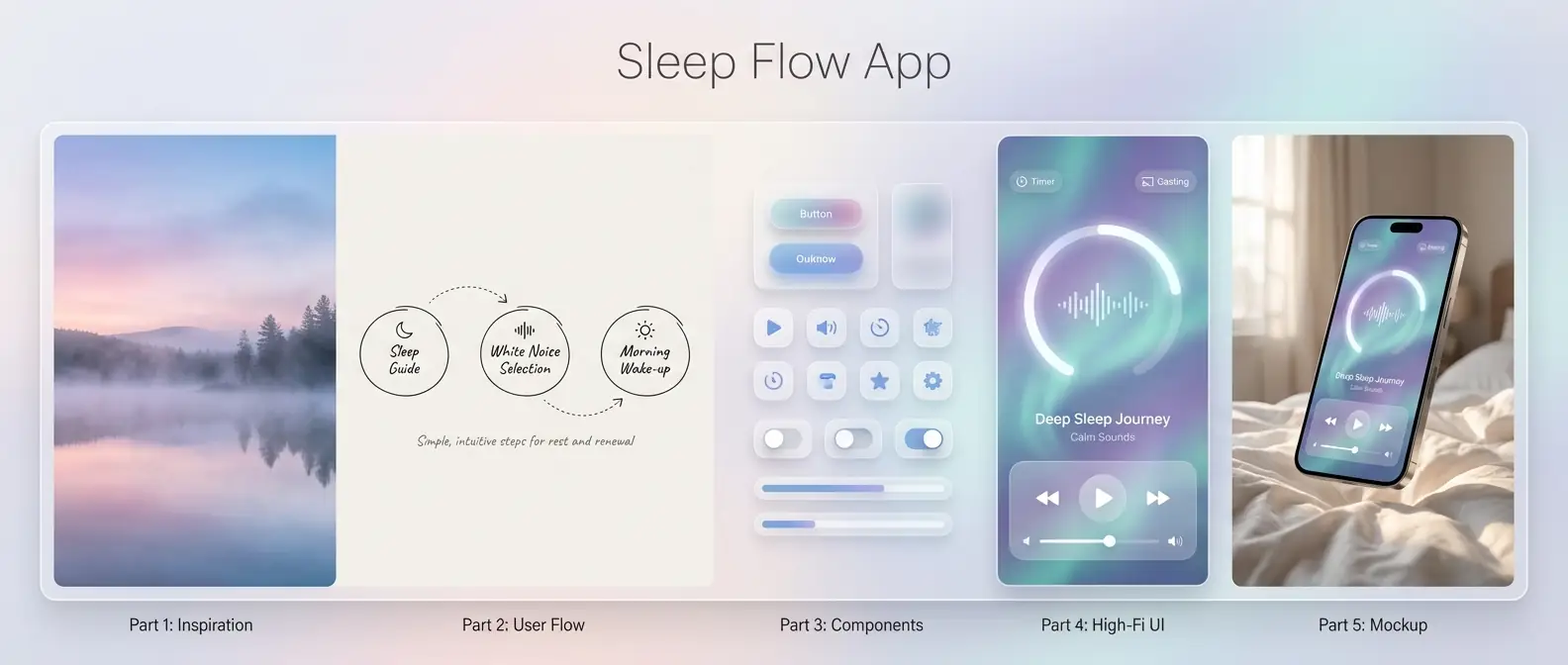
2. Wellness: Meditation & Sleep Assistant App (Glassmorphism)
Prompt:
Create a UI/UX case study panoramic image focusing on a [Meditation & Sleep App].
[Part 1: Inspiration] Photography of a misty lake at dawn, soft gradient sky, blend of pink-purple and pale blue, serene.
[Part 2: User Flow] Hand-drawn User Journey Map, simple circles and arrows, labels: Sleep Guide, White Noise Selection, Morning Wake-up.
[Part 3: Components] Glassmorphism component library, translucent frosted cards, soft diffuse shadows, rounded icons.
[Part 4: High-Fi UI] iOS mobile player page UI, huge circular progress bar, background is dynamic flowing aurora gradient, frosted glass playback controls, borderless design.
[Part 5: Mockup] iPhone 15 Pro floating above soft white bed sheets, screen lit displaying the UI, morning light on phone edges.
Style: Healing, transparent, lightweight. Top title "Sleep Flow App".
분석:
이 프롬프트는 스타일 키워드, 캐릭터 디테일, 포즈, 조명과 배경을 함께 묶어 장면의 목표 분위기를 분명하게 지정합니다. 각 요소가 피규어 사진 같은 질감과 구도를 안정적으로 유도하므로, 원하는 스타일을 재현할 때 핵심 단서를 유지한 채 캐릭터와 소품만 바꿔도 응용하기 쉽습니다.
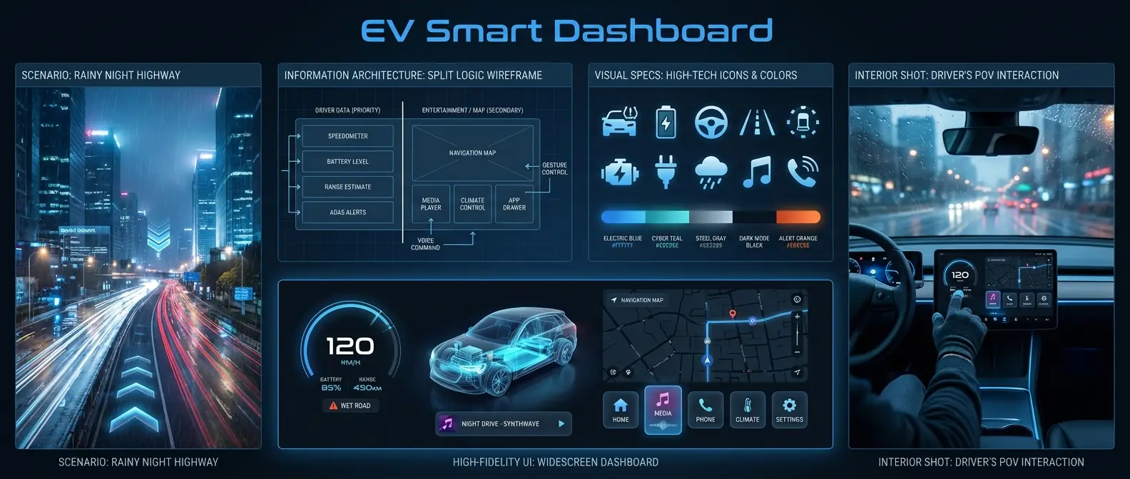
3. Automotive: EV HMI Infotainment System (Automotive UI)
Prompt:
Create a UI/UX case study panoramic image focusing on an [EV HMI Infotainment System].
[Part 1: Scenario] Future city highway at rainy night, flowing light trails, emphasizing speed and navigation needs.
[Part 2: IA] Wireframe layout of car system, emphasizing split logic between driver data (left) and entertainment/map (right).
[Part 3: Visual Specs] High-tech flat icon set, vehicle status icons (tire pressure, battery), cool tech-blue color scheme.
[Part 4: High-Fi UI] Widescreen dashboard UI, 3D car model in center, digital instrument cluster on left, dark map navigation on right, large card-style buttons.
[Part 5: Interior Shot] In-car shot from driver's POV, finger touching the central screen, blurred city view outside window.
Style: Driver-centric safety, high-tech, large typography, legible. Top title "EV Smart Dashboard".
분석:
이 프롬프트는 스타일 키워드, 캐릭터 디테일, 포즈, 조명과 배경을 함께 묶어 장면의 목표 분위기를 분명하게 지정합니다. 각 요소가 피규어 사진 같은 질감과 구도를 안정적으로 유도하므로, 원하는 스타일을 재현할 때 핵심 단서를 유지한 채 캐릭터와 소품만 바꿔도 응용하기 쉽습니다.
4. Wearables: Health Monitoring WatchOS (Wearable UI)

Prompt:
Create a UI/UX case study panoramic image focusing on a [Smartwatch Health Monitoring System].
[Part 1: Context] Close-up of a pro runner sprinting on track, sweat, emphasizing heart rate and physical limit.
[Part 2: Interaction] Circular watch face interaction logic, showing Tap, Swipe, Long-press gesture guides.
[Part 3: Data Graphics] Ring progress bar components, vivid heart rate waveforms, high-contrast neon colors (green/orange/red) for intensity zones.
[Part 4: High-Fi UI] Apple Watch Ultra style interface, black background, bold large numbers showing "156 BPM", outer colorful activity rings.
[Part 5: On-Wrist] Close-up shot, smart watch on wrist, screen clearly visible under sunlight, running track background.
Style: High contrast, sporty, intuitive info. Top title "Pro Health WatchOS".
분석:
이 프롬프트는 스타일 키워드, 캐릭터 디테일, 포즈, 조명과 배경을 함께 묶어 장면의 목표 분위기를 분명하게 지정합니다. 각 요소가 피규어 사진 같은 질감과 구도를 안정적으로 유도하므로, 원하는 스타일을 재현할 때 핵심 단서를 유지한 채 캐릭터와 소품만 바꿔도 응용하기 쉽습니다.
5. Gaming: Cyberpunk Game Launcher (게임 UI)

Prompt:
Create a UI/UX case study panoramic image focusing on a [Hardcore Sci-Fi Game Launcher].
[Part 1: Game Art] Visually striking cyberpunk character concept art, mechanical limbs, Glitch Art style.
[Part 2: Structure] Modular HUD-style wireframe, slanted lines, complex decorative border designs.
[Part 3: Visual Elements] Buttons with worn metal texture, holographic icon effects, yellow/black warning stripe assets.
[Part 4: High-Fi UI] PC Game Library Home UI, character art breaking the frame, weapon stats panel on right, friend list at bottom, full of tech details.
[Part 5: Gamer View] Screen shot next to RGB mechanical keyboard and mouse, screen displaying the UI, dark room, purple-red ambient light.
Style: Hardcore, destructive, immersive. Top title "Cyber Game Launcher".
분석:
이 프롬프트는 스타일 키워드, 캐릭터 디테일, 포즈, 조명과 배경을 함께 묶어 장면의 목표 분위기를 분명하게 지정합니다. 각 요소가 피규어 사진 같은 질감과 구도를 안정적으로 유도하므로, 원하는 스타일을 재현할 때 핵심 단서를 유지한 채 캐릭터와 소품만 바꿔도 응용하기 쉽습니다.
6. Dev Tools: Minimalist AI Code Editor (SaaS UI)

Prompt:
Create a UI/UX case study panoramic image focusing on an [AI-Assisted Code Editor].
[Part 1: Metaphor] Neatly arranged matrix blocks, symbolizing logic and order, pure grey/white tone.
[Part 2: Layout] 3-column layout wireframe: File Tree, Code Editor, AI Chat Sidebar.
[Part 3: Syntax] Syntax Highlighting color scheme, soft pastel tones (lavender, pale blue, mint), rounded code block backgrounds.
[Part 4: High-Fi UI] MacOS style editor UI, minimalist distraction-free mode, an AI auto-complete suggestion box floating near cursor, Fira Code font.
[Part 5: Desk Setup] MacBook Pro on wooden desk, screen showing editor, coffee cup and plant nearby, natural light.
Style: Developer-friendly, rational, efficient, sterile. Top title "Zen Code AI Editor".
분석:
이 프롬프트는 스타일 키워드, 캐릭터 디테일, 포즈, 조명과 배경을 함께 묶어 장면의 목표 분위기를 분명하게 지정합니다. 각 요소가 피규어 사진 같은 질감과 구도를 안정적으로 유도하므로, 원하는 스타일을 재현할 때 핵심 단서를 유지한 채 캐릭터와 소품만 바꿔도 응용하기 쉽습니다.
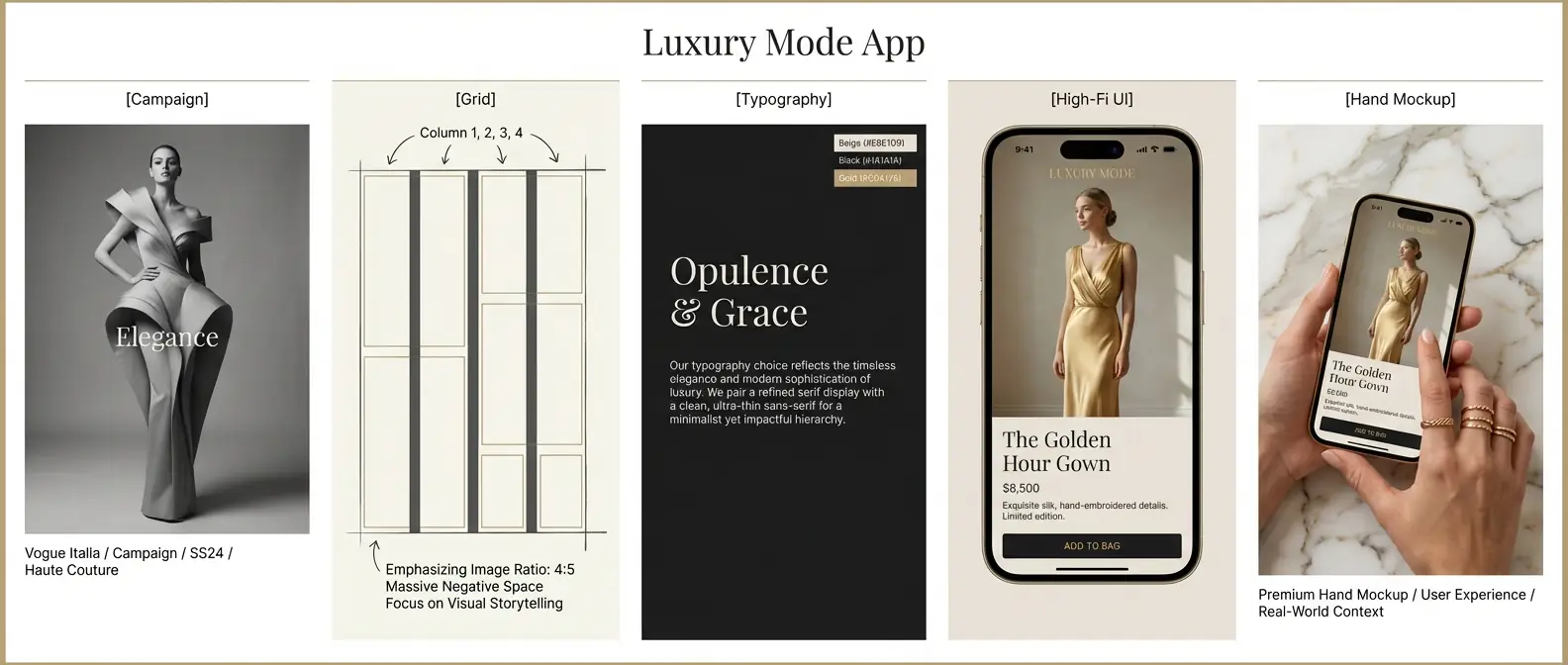
7. 이커머스: Luxury Fashion App (Editorial Style)
Prompt:
Create a UI/UX case study panoramic image focusing on [High-End Luxury Fashion E-commerce].
[Part 1: Campaign] Black and white fashion photography, model in haute couture, minimal composition, Vogue style.
[Part 2: Grid] Rigorous 4-column grid layout sketch, massive Negative Space, emphasizing image ratio.
[Part 3: Typography] Elegant Serif heading display, paired with ultra-thin Sans-Serif body text, Beige/Black/Gold color palette.
[Part 4: High-Fi UI] Mobile Product Detail Page UI, full-screen background image, floating minimalist "Add to Bag" button at bottom, editorial layout.
[Part 5: Hand Mockup] Female hand with gold rings holding iPhone, screen showing interface, premium marble texture background.
Style: Noble, typography-driven, minimalist. Top title "Luxury Mode App".
분석:
이 프롬프트는 스타일 키워드, 캐릭터 디테일, 포즈, 조명과 배경을 함께 묶어 장면의 목표 분위기를 분명하게 지정합니다. 각 요소가 피규어 사진 같은 질감과 구도를 안정적으로 유도하므로, 원하는 스타일을 재현할 때 핵심 단서를 유지한 채 캐릭터와 소품만 바꿔도 응용하기 쉽습니다.
8. IoT: Smart Home Control Panel (Smart Home Pad)

Prompt:
Create a UI/UX case study panoramic image focusing on [Whole House Smart Control Pad].
[Part 1: Home Env] Cozy modern living room, warm lighting, comfortable sofa, embodying the warmth of "home".
[Part 2: Module Sketch] Card-style layout wireframe, dividing lights, temp, security into rectangular modules of varying sizes.
[Part 3: Skeuomorphic] Neumorphism or Soft UI style buttons, slight embossed effect, rounded rectangles, warm white color scheme.
[Part 4: High-Fi UI] Wall-mounted tablet UI, left side showing indoor 24°C, right side showing scene modes (Home, Away, Cinema), interface clean and soft.
[Part 5: Wall Shot] Real shot of control panel installed on light grey painted wall, finger touching the central screen, realistic shadows.
Style: Cozy, usable, approachable. Top title "Smart Home Hub".
분석:
이 프롬프트는 스타일 키워드, 캐릭터 디테일, 포즈, 조명과 배경을 함께 묶어 장면의 목표 분위기를 분명하게 지정합니다. 각 요소가 피규어 사진 같은 질감과 구도를 안정적으로 유도하므로, 원하는 스타일을 재현할 때 핵심 단서를 유지한 채 캐릭터와 소품만 바꿔도 응용하기 쉽습니다.
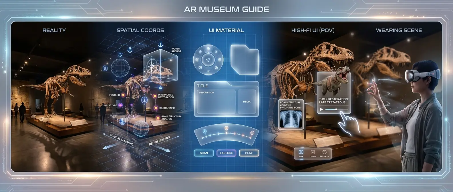
9. Future Tech: AR Museum Guide (Spatial UI)
Prompt:
Create a UI/UX case study panoramic image focusing on [AR Augmented Reality Museum Guide].
[Part 1: Reality] Museum exhibition hall, displaying dinosaur fossil skeleton, slightly dim interior.
[Part 2: Spatial Coords] 3D spatial anchor diagram, marking floating positions of virtual info points around the skeleton.
[Part 3: UI Material] Frosted acrylic texture floating panel assets, glowing edges, 60% opacity.
[Part 4: High-Fi UI (POV)] First-person view (POV) of AR interface, transparent info cards floating next to dino skeleton showing 3D restoration animation, cursor at fingertip.
[Part 5: Wearing Scene] Side profile shot of a visitor wearing AR glasses (like Apple Vision Pro), performing hand gestures in mid-air.
Style: Futuristic, spatial computing, mixed reality. Top title "AR Museum Guide".
분석:
이 프롬프트는 스타일 키워드, 캐릭터 디테일, 포즈, 조명과 배경을 함께 묶어 장면의 목표 분위기를 분명하게 지정합니다. 각 요소가 피규어 사진 같은 질감과 구도를 안정적으로 유도하므로, 원하는 스타일을 재현할 때 핵심 단서를 유지한 채 캐릭터와 소품만 바꿔도 응용하기 쉽습니다.
10. Education: Kids English Learning App (Playful UI)

Prompt:
Create a UI/UX case study panoramic image focusing on [Kids English Learning App].
[Part 1: Cartoon World] Colorful vector illustration forest, cute animal characters (bunny, bear), high saturation.
[Part 2: Gamification] Level map wireframe, winding path like Monopoly, marking reward nodes.
[Part 3: Visual Assets] Rounded "Chubby UI" button design, with highlights and 3D volume, bright Yellow/Blue/Orange palette.
[Part 4: High-Fi UI] iPad landscape learning screen, AI teacher character on left, huge interactive word card on right, star reward slot at bottom.
[Part 5: Usage] Child's finger tapping on iPad screen, iPad in a thick shockproof case, colorful kids room background.
Style: Playful, fun, high saturation, large border radius. Top title "Kids Fun Learn".
분석:
이 프롬프트는 스타일 키워드, 캐릭터 디테일, 포즈, 조명과 배경을 함께 묶어 장면의 목표 분위기를 분명하게 지정합니다. 각 요소가 피규어 사진 같은 질감과 구도를 안정적으로 유도하므로, 원하는 스타일을 재현할 때 핵심 단서를 유지한 채 캐릭터와 소품만 바꿔도 응용하기 쉽습니다.
완성도 높은 포트폴리오를 위한 Nano Banana 프로 팁
실무 팁:
결과가 흔들릴 때는 시점, 배경, 색상, 레이아웃 같은 제약을 더 명확하게 반복해 주세요.- 팁: 전체 이미지를 다시 만들기보다 문제가 되는 영역이나 조건만 좁혀서 수정하면 안정적입니다.
실무 팁:
결과가 흔들릴 때는 시점, 배경, 색상, 레이아웃 같은 제약을 더 명확하게 반복해 주세요.- 팁: 전체 이미지를 다시 만들기보다 문제가 되는 영역이나 조건만 좁혀서 수정하면 안정적입니다.
실무 팁:
결과가 흔들릴 때는 시점, 배경, 색상, 레이아웃 같은 제약을 더 명확하게 반복해 주세요.- 팁: 전체 이미지를 다시 만들기보다 문제가 되는 영역이나 조건만 좁혀서 수정하면 안정적입니다.
마무리
이 섹션은 Nano Banana로 결과의 스타일, 구성, 소재와 사용 맥락을 안정적으로 제어하는 방법을 한국어로 정리합니다. 원본 프롬프트는 아래 코드 블록에 그대로 보존했습니다.
Happy prompting!