10 UI/UX Design Portfolio Templates: From Concept to Mockup with Nano Banana
The biggest challenge for UI/UX designers isn't just creating interfaces, but demonstrating the "design thinking process." This tutorial is tailored for the UI/UX field, leveraging Nano Banana's multimodal understanding to transform design ideas into a five-stage horizontal visual narrative. covering 10 high-value vertical scenarios like Fintech dashboards, Automotive HMI, and Medical WatchOS, helping you generate Dribbble/Behance-level portfolio covers with one click.
Why Visual Storytelling is Key for UI/UX Portfolios
The core of a UI/UX showcase is "logical consistency." We need the model to demonstrate a complete evolutionary chain from "abstract concepts" to "concrete interfaces" and finally to "user scenarios."
The Meta Prompt Architecture (Meta Logic):
- Mood/Concept: Core visual metaphors or real-world references.
- Wireframe: Low-fidelity sketches emphasizing layout logic.
- Design System: Color palettes, typography, and icon library displays.
- High-Fi UI: Pixel-perfect high-fidelity designs.
- Mockup: Application effects in real devices.
10 Essential UI/UX Scenarios: From Concept to Reality
1. Fintech: Professional Stock Trading Terminal (Dark Mode)

Prompt:
Create a UI/UX case study panoramic image focusing on a [Professional Stock Trading Terminal], featuring 5 horizontal sections.
[Part 1: Mood] Photography of Wall Street trading floor at night, blue glow from multiple screens, intense data atmosphere.
[Part 2: Wireframe] Low-fidelity wireframe of a SaaS dashboard, drawn in blue lines, labels: Multi-window Layout, Real-time Data Stream, Modular Panels.
[Part 3: Design System] Dark mode Design System display, Neon Green and Alert Red color palette, Roboto Mono font samples, micro-interaction button states.
[Part 4: High-Fi UI] Pixel-perfect PC trading dashboard UI, complex Candlestick charts, depth charts, dark grey cards on black background, high contrast data visualization.
[Part 5: Mockup] Real shot on an ultra-wide curved monitor, sitting on a minimalist metal standing desk, blurred office night background.
Style: Cyber-financial, professional, rigorous. Top title "Fintech Pro Terminal".
Analysis:
Targeting the high-frequency demands of "B-end Dashboards" and "Data Visualization," this prompt uses Dark Mode to mask potential AI generation imperfections in details while highlighting an overall premium feel.
2. Wellness: Meditation & Sleep Assistant App (Glassmorphism)
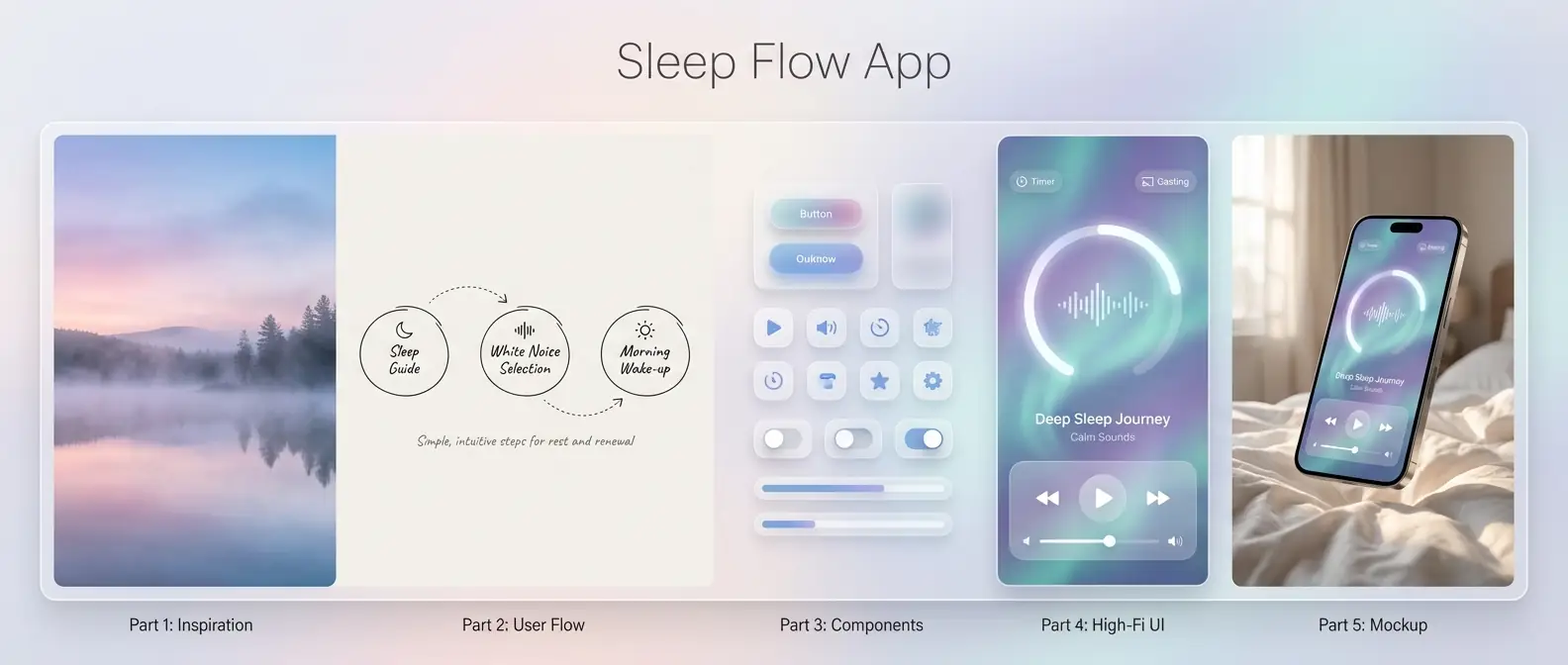
Prompt:
Create a UI/UX case study panoramic image focusing on a [Meditation & Sleep App].
[Part 1: Inspiration] Photography of a misty lake at dawn, soft gradient sky, blend of pink-purple and pale blue, serene.
[Part 2: User Flow] Hand-drawn User Journey Map, simple circles and arrows, labels: Sleep Guide, White Noise Selection, Morning Wake-up.
[Part 3: Components] Glassmorphism component library, translucent frosted cards, soft diffuse shadows, rounded icons.
[Part 4: High-Fi UI] iOS mobile player page UI, huge circular progress bar, background is dynamic flowing aurora gradient, frosted glass playback controls, borderless design.
[Part 5: Mockup] iPhone 15 Pro floating above soft white bed sheets, screen lit displaying the UI, morning light on phone edges.
Style: Healing, transparent, lightweight. Top title "Sleep Flow App".
Analysis:
Focusing on the popular "Glassmorphism" style in C-end applications, the key here is handling transparency textures and soft gradients to create a healing atmosphere.
3. Automotive: EV HMI Infotainment System (Automotive UI)
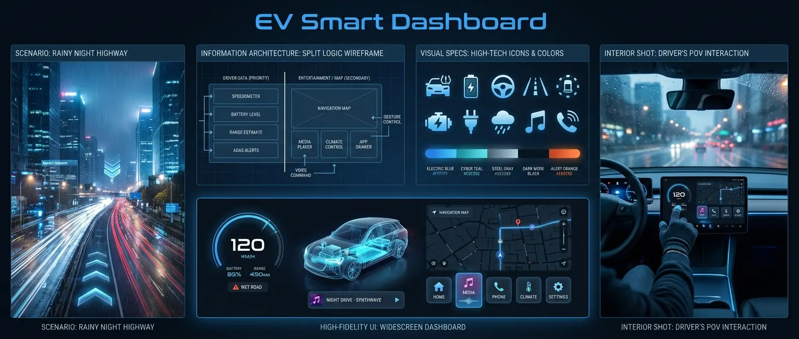
Prompt:
Create a UI/UX case study panoramic image focusing on an [EV HMI Infotainment System].
[Part 1: Scenario] Future city highway at rainy night, flowing light trails, emphasizing speed and navigation needs.
[Part 2: IA] Wireframe layout of car system, emphasizing split logic between driver data (left) and entertainment/map (right).
[Part 3: Visual Specs] High-tech flat icon set, vehicle status icons (tire pressure, battery), cool tech-blue color scheme.
[Part 4: High-Fi UI] Widescreen dashboard UI, 3D car model in center, digital instrument cluster on left, dark map navigation on right, large card-style buttons.
[Part 5: Interior Shot] In-car shot from driver's POV, finger touching the central screen, blurred city view outside window.
Style: Driver-centric safety, high-tech, large typography, legible. Top title "EV Smart Dashboard".
Analysis:
"Automotive UI" is a blue ocean field. The prompt specifically emphasizes "Widescreen" and "3D Car Models," which are iconic elements of this domain.
4. Wearables: Health Monitoring WatchOS (Wearable UI)

Prompt:
Create a UI/UX case study panoramic image focusing on a [Smartwatch Health Monitoring System].
[Part 1: Context] Close-up of a pro runner sprinting on track, sweat, emphasizing heart rate and physical limit.
[Part 2: Interaction] Circular watch face interaction logic, showing Tap, Swipe, Long-press gesture guides.
[Part 3: Data Graphics] Ring progress bar components, vivid heart rate waveforms, high-contrast neon colors (green/orange/red) for intensity zones.
[Part 4: High-Fi UI] Apple Watch Ultra style interface, black background, bold large numbers showing "156 BPM", outer colorful activity rings.
[Part 5: On-Wrist] Close-up shot, smart watch on wrist, screen clearly visible under sunlight, running track background.
Style: High contrast, sporty, intuitive info. Top title "Pro Health WatchOS".
Analysis:
Wearable UI must emphasize "Circular Layouts" and "Black Backgrounds (for power saving)," which are key features distinguishing them from mobile UIs.
5. Gaming: Cyberpunk Game Launcher (Game UI)

Prompt:
Create a UI/UX case study panoramic image focusing on a [Hardcore Sci-Fi Game Launcher].
[Part 1: Game Art] Visually striking cyberpunk character concept art, mechanical limbs, Glitch Art style.
[Part 2: Structure] Modular HUD-style wireframe, slanted lines, complex decorative border designs.
[Part 3: Visual Elements] Buttons with worn metal texture, holographic icon effects, yellow/black warning stripe assets.
[Part 4: High-Fi UI] PC Game Library Home UI, character art breaking the frame, weapon stats panel on right, friend list at bottom, full of tech details.
[Part 5: Gamer View] Screen shot next to RGB mechanical keyboard and mouse, screen displaying the UI, dark room, purple-red ambient light.
Style: Hardcore, destructive, immersive. Top title "Cyber Game Launcher".
Analysis:
Game UI (GUI) does not follow the minimalist principles of typical apps. It pursues "Complexity" and "Atmosphere." The prompt needs to emphasize HUD elements and Glitch styles.
6. Dev Tools: Minimalist AI Code Editor (SaaS UI)

Prompt:
Create a UI/UX case study panoramic image focusing on an [AI-Assisted Code Editor].
[Part 1: Metaphor] Neatly arranged matrix blocks, symbolizing logic and order, pure grey/white tone.
[Part 2: Layout] 3-column layout wireframe: File Tree, Code Editor, AI Chat Sidebar.
[Part 3: Syntax] Syntax Highlighting color scheme, soft pastel tones (lavender, pale blue, mint), rounded code block backgrounds.
[Part 4: High-Fi UI] MacOS style editor UI, minimalist distraction-free mode, an AI auto-complete suggestion box floating near cursor, Fira Code font.
[Part 5: Desk Setup] MacBook Pro on wooden desk, screen showing editor, coffee cup and plant nearby, natural light.
Style: Developer-friendly, rational, efficient, sterile. Top title "Zen Code AI Editor".
Analysis:
For SaaS tools, the design focus is on "Distraction-free" and "Readability," appealing to a rational user base.
7. E-commerce: Luxury Fashion App (Editorial Style)
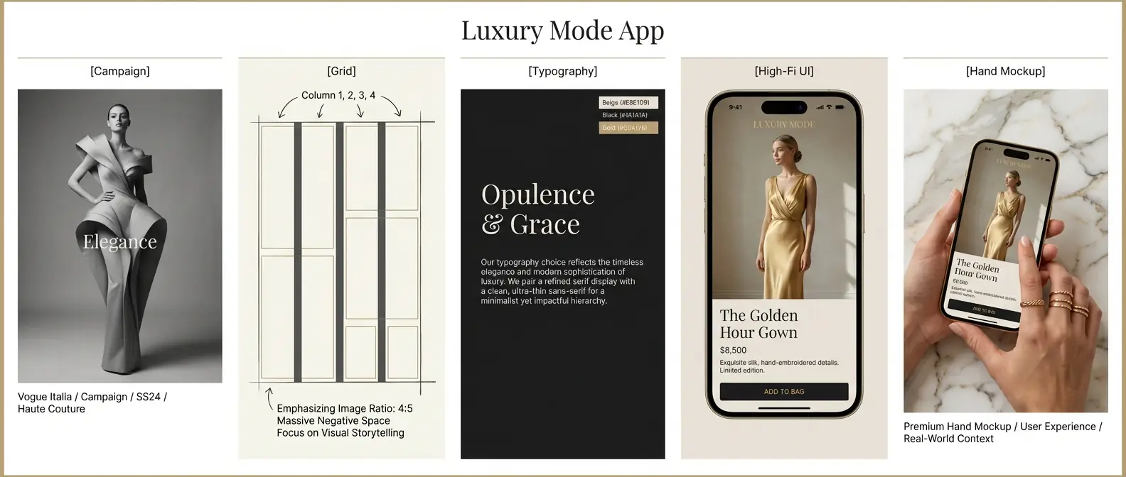
Prompt:
Create a UI/UX case study panoramic image focusing on [High-End Luxury Fashion E-commerce].
[Part 1: Campaign] Black and white fashion photography, model in haute couture, minimal composition, Vogue style.
[Part 2: Grid] Rigorous 4-column grid layout sketch, massive Negative Space, emphasizing image ratio.
[Part 3: Typography] Elegant Serif heading display, paired with ultra-thin Sans-Serif body text, Beige/Black/Gold color palette.
[Part 4: High-Fi UI] Mobile Product Detail Page UI, full-screen background image, floating minimalist "Add to Bag" button at bottom, editorial layout.
[Part 5: Hand Mockup] Female hand with gold rings holding iPhone, screen showing interface, premium marble texture background.
Style: Noble, typography-driven, minimalist. Top title "Luxury Mode App".
Analysis:
The core of Luxury UI is "Negative Space" and "Serif Typography," which is completely different from the dense layouts of standard e-commerce platforms.
8. IoT: Smart Home Control Panel (Smart Home Pad)

Prompt:
Create a UI/UX case study panoramic image focusing on [Whole House Smart Control Pad].
[Part 1: Home Env] Cozy modern living room, warm lighting, comfortable sofa, embodying the warmth of "home".
[Part 2: Module Sketch] Card-style layout wireframe, dividing lights, temp, security into rectangular modules of varying sizes.
[Part 3: Skeuomorphic] Neumorphism or Soft UI style buttons, slight embossed effect, rounded rectangles, warm white color scheme.
[Part 4: High-Fi UI] Wall-mounted tablet UI, left side showing indoor 24°C, right side showing scene modes (Home, Away, Cinema), interface clean and soft.
[Part 5: Wall Shot] Real shot of control panel installed on light grey painted wall, finger touching the central screen, realistic shadows.
Style: Cozy, usable, approachable. Top title "Smart Home Hub".
Analysis:
Smart home panels are usually fixed to walls, so the Mockup in Part 5 must be from a "Wall Perspective" rather than being hand-held.
9. Future Tech: AR Museum Guide (Spatial UI)
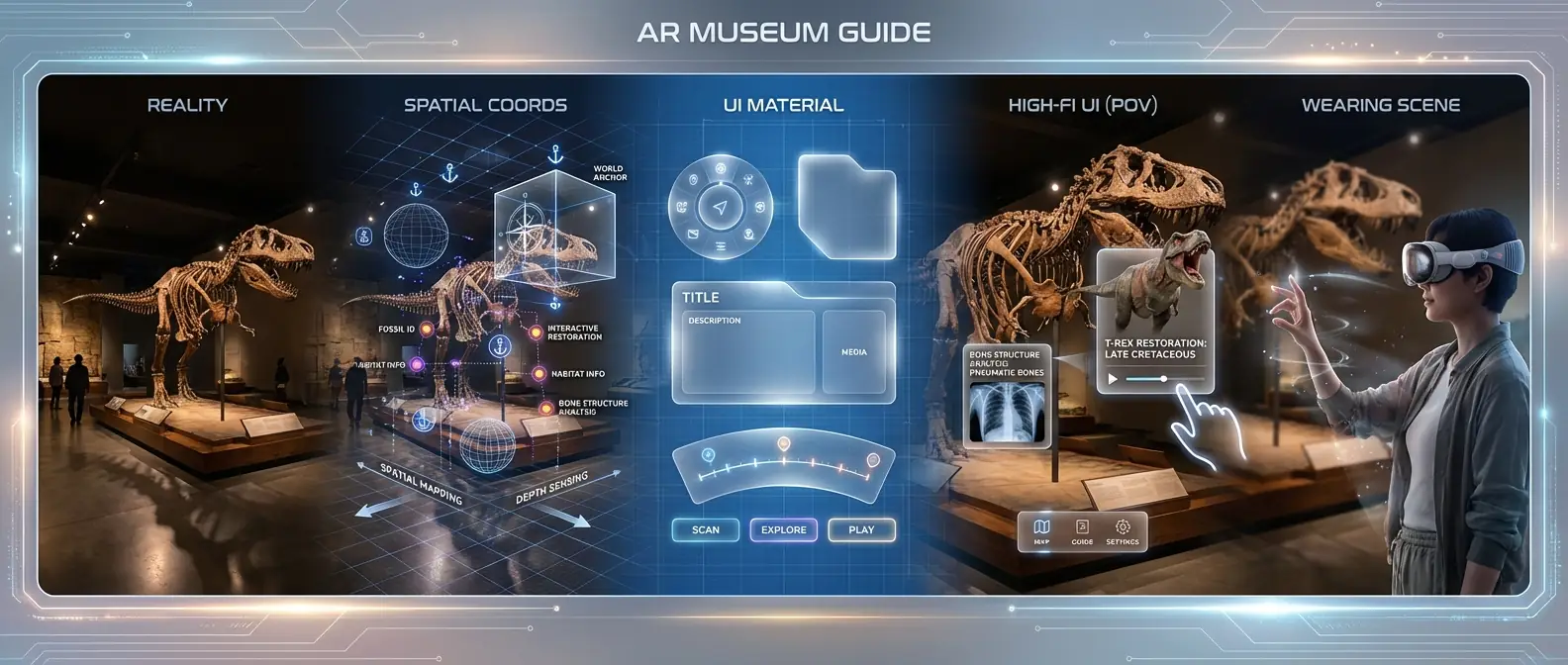
Prompt:
Create a UI/UX case study panoramic image focusing on [AR Augmented Reality Museum Guide].
[Part 1: Reality] Museum exhibition hall, displaying dinosaur fossil skeleton, slightly dim interior.
[Part 2: Spatial Coords] 3D spatial anchor diagram, marking floating positions of virtual info points around the skeleton.
[Part 3: UI Material] Frosted acrylic texture floating panel assets, glowing edges, 60% opacity.
[Part 4: High-Fi UI (POV)] First-person view (POV) of AR interface, transparent info cards floating next to dino skeleton showing 3D restoration animation, cursor at fingertip.
[Part 5: Wearing Scene] Side profile shot of a visitor wearing AR glasses (like Apple Vision Pro), performing hand gestures in mid-air.
Style: Futuristic, spatial computing, mixed reality. Top title "AR Museum Guide".
Analysis:
Spatial Computing is a major trend. Prompts must emphasize "Transparency" and "Floating" sensations to convey the mixed reality experience.
10. Education: Kids English Learning App (Playful UI)

Prompt:
Create a UI/UX case study panoramic image focusing on [Kids English Learning App].
[Part 1: Cartoon World] Colorful vector illustration forest, cute animal characters (bunny, bear), high saturation.
[Part 2: Gamification] Level map wireframe, winding path like Monopoly, marking reward nodes.
[Part 3: Visual Assets] Rounded "Chubby UI" button design, with highlights and 3D volume, bright Yellow/Blue/Orange palette.
[Part 4: High-Fi UI] iPad landscape learning screen, AI teacher character on left, huge interactive word card on right, star reward slot at bottom.
[Part 5: Usage] Child's finger tapping on iPad screen, iPad in a thick shockproof case, colorful kids room background.
Style: Playful, fun, high saturation, large border radius. Top title "Kids Fun Learn".
Analysis:
Kids' UI needs to break the rules of "minimalism," emphasizing "Skeuomorphism" and "Feedback." Buttons should look "Juicy" and clickable.
Nano Banana Pro-Tips for Perfect Portfolios
Handling Text Rendering (Gibberish):
UI interfaces usually contain a lot of text. While Nano Banana is powerful, generating complex body text can still result in "alien language."- Tip: Minimize descriptions of specific long text in your prompt. Use keywords like "Placeholder text" or "Data visualization" to fill space. Focus on letting the model generate Headers and Numbers, which are usually more accurate.
Mockup Realism:
In Part 5 (Mockup), models sometimes just "paste" the UI onto a screen without blending.- Tip: Keywords like "Screen reflection", "Fingerprint smudge", and "Depth of field" can greatly increase the realism of the mockup, avoiding the "cheap Photoshop sticker" look.
Consistency Control:
If you find the color scheme in Part 3 doesn't match the interface in Part 4:- Tip: Enforce a main color at the very beginning of the prompt, e.g., "Main color: Neon Green (#39FF14)", and repeat this color keyword in the description of every Part.
Conclusion
Creating a convincing UI/UX portfolio piece is about more than just a pretty screen; it's about telling the story of how you got there. By using these 5-stage panoramic prompts, you force Nano Banana to think like a designer—considering the mood, structure, system, and final application all at once. Pick a scenario from the list above that resonates with your career goals, customize the prompt with your unique ideas, and start building a portfolio that stands out.
Happy prompting!