A strong product mockup prompt locks the product geometry, package format, information hierarchy, material behavior, camera, lighting, rights-safe copy, and commercial output before generation. The copy-ready examples below turn packaging design prompts, marketing material prompts, and product mockup AI prompt patterns into fifteen distinct fictional-brand tasks. Each visible prompt was sent to GPT Image 2 without pre-emptively removing labels, structure, scenes, or business context, then paired with the reviewed result in the same card.
Use the 15 new evidence-bound examples for current GPT Image 2 production, or browse the separately labeled 25-prompt archive for earlier product-design ideas.
Use a proposal board when reviewers need structure, materials, and annotation in one decision surface. Use an announcement layout when hierarchy and launch copy are the main risk. Use a transparent protective-package studio study when the review depends on contour, pack tension, reflections, and material behavior. The first call should preserve the complete task. Only an observed failure justifies a local retry.
Four steps from packaging brief to reviewed mockup
Lock the productName the fictional product, package form, visible planes, relative scale, and any product geometry that must remain recognizable.
Write the hierarchyList approved brand copy, product name, size, usage cue, and supporting labels in reading order instead of asking for generic packaging text.
Choose the review surfaceMatch the composition to the decision: proposal board, announcement layout, studio package study, shelf system, retail display, or marketplace explainer.
Inspect before retryingCheck geometry, folds, label spelling, product count, material response, clipping, and trade-dress originality. Change one failure-linked variable only after a concrete defect is recorded.
Product mockup prompt parameter guide
Workflow
Input anchor
Format
Hierarchy
Material
Camera / light
Safe text
Avoid
Retail package
Fictional product geometry and package planes
Carton, pouch, bottle, tin, or multipack
Brand → product → size → usage cue
Board, film, glass, metal, paper, or molded fiber
Front or three-quarter view with readable planes and controlled reflections
Approved fictional labels and factual quantity only
Copied trade dress, impossible folds, invented claims, or clipped edges
Mailer / PR kit
Closed form, open form, insert order, and product scale
Mailer, sleeve, tray, tissue, card, and product
Outer message → reveal → insert labels
Corrugated board, coated paper, tissue, and molded pulp
Oblique review angle with soft directional light and visible depth
Fictional launch copy with a clear reading order
Floating inserts, duplicated products, weak hinges, or real campaign language
Shelf / display
SKU family, facing count, shelf width, and viewing distance
Shelf block, counter display, or freestanding unit
Family brand → flavor or variant → size → shelf cue
Printed board, coated pack film, metal frame, or wood fixture
Eye-level retail view with readable fronts and grounded shadows
Original variant names and non-regulated descriptors
Inconsistent packs, unreadable variants, false pricing, or unstable display geometry
Campaign visual
Approved pack render and campaign message
Launch poster, social announcement, marketplace card, or seasonal key visual
Headline → product → supporting line → date or usage cue
Accurate product surfaces plus campaign background treatment
Graphic lockup supported by believable product light and contact shadow
Short fictional copy, verified spelling, and truthful availability language
Fake endorsements, trademark resemblance, tiny filler copy, or detached shadows
Failure corrections before you rerun
The package planes or folds warp
Why it happens: The form is named, but the visible planes, seams, or opening direction are not anchored.
Prompt correction: After an observed geometry failure, change only the failed plane instruction by naming its edge, seam, hinge, and relationship to adjacent panels.
The product identity changes across views
Why it happens: The board requests multiple angles without repeating the same silhouette, proportions, color blocks, and label placement.
Prompt correction: After an observed identity drift, change only the identity anchor sentence and repeat the same geometry, scale, palette, and label position for every view.
One approved word is unreadable
Why it happens: The full copy was preserved, but a specific rendered word or placement failed the OCR and visual check.
Prompt correction: Keep the complete approved copy on the first pass. After an OCR-confirmed failure, change only the failed word instruction or its placement while retaining the remaining hierarchy.
The result resembles existing trade dress
Why it happens: The geometry, palette, or typography is too close to a familiar market pattern.
Prompt correction: After a specific resemblance is observed, change only the implicated geometry, palette, or type treatment and retain the original task, content hierarchy, and output use.
15 copy-ready GPT Image 2 product mockup prompts
Each card contains the complete frozen first-pass instruction and its own output slot. Replace only the fictional product details that belong to your brief, then inspect text, geometry, materials, and rights before commercial use.
Product Design · GPT Image 2 · Prompt 01
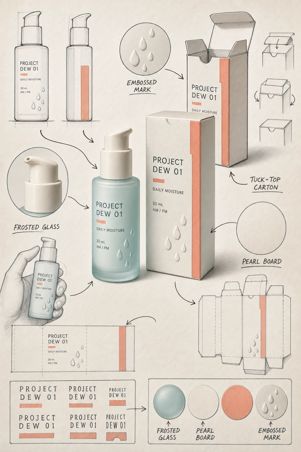
Skincare Carton Proposal Board
For a packaging review that must compare the hero carton, bottle, structure, and approved label hierarchy.
Skincare Carton Proposal Board | Best for: For a packaging review that must compare the hero carton, bottle, structure, and approved label hierarchy. | Prompt EN-C02-01-P01 | Check: PROJECT DEW 01 spelling, bottle/carton scale, tuck-top logic, arrow targets, frosted glass, and safe margins | If it fails: After an observed fold-plane failure, change only the failed carton edge, seam, or tuck relationship and retain the full board.
Expected result
A coherent skincare proposal board that keeps the hero pack, alternate view, structural sketch, callouts, and materials legible.
Copy-ready tested prompt
Task: Create a hand-drawn packaging design proposal board for a fictional daily moisturizer.
Subject: A frosted pale-aqua pump bottle and matching folding carton for the internal prototype identifier PROJECT DEW 01, with pearl-white board, a narrow coral color block, embossed droplets, and a physically plausible tuck-top structure.
Context: A packaging team is reviewing the hero mockup, bottle-to-carton scale, label hierarchy, materials, and fold logic before prototyping.
Style: A high-finish brand concept board that contrasts one realistic commercial product rendering with loose black hand-drawn development sketches, circles, arrows, symbols, lettering trials, and casual handwritten English annotations; realistic paper grain, frosted glass, and restrained editorial color.
Composition: Use a vertical 2:3 board. Place the most complete, eye-catching three-quarter bottle-and-carton finished rendering at the visual center. Arrange around the central hero a front and side elevation, an open-carton structural exploration, a local pump-and-emboss detail, a hand-held scale draft, an unfolded label-layout study, lettering experiments, and a compact material-color palette. Connect related details with dark hand-drawn arrows and circles while keeping a relaxed but ordered rhythm and a clear central focus.
Lighting: Soft studio key light from upper left, broad fill, gentle contact shadows, and controlled highlights that distinguish frosted glass, coated board, and embossing.
Constraints: Use only these exact labels: “PROJECT DEW 01”, “DAILY MOISTURE”, “30 mL”, “AM / PM”, “FROSTED GLASS”, “PEARL BOARD”, “EMBOSSED MARK”, and “TUCK-TOP CARTON”. Use only the quoted labels above. Keep every auxiliary sketch and process region completely free of letters, words, headings, captions, measurements, and numerals; communicate those regions only through line art, arrows, circles, and material swatches. Keep every package plane, seam, cap, pump, arrow, and spatial relationship coherent. Use original geometry, palette, and typography unrelated to existing trade dress; avoid real logos, certification marks, ingredient claims, watermarks, and clipped package edges.
Output: Portrait 2:3 packaging proposal board for an internal design review, with readable English annotations and inspectable finished-product, sketch, material, and structural details.
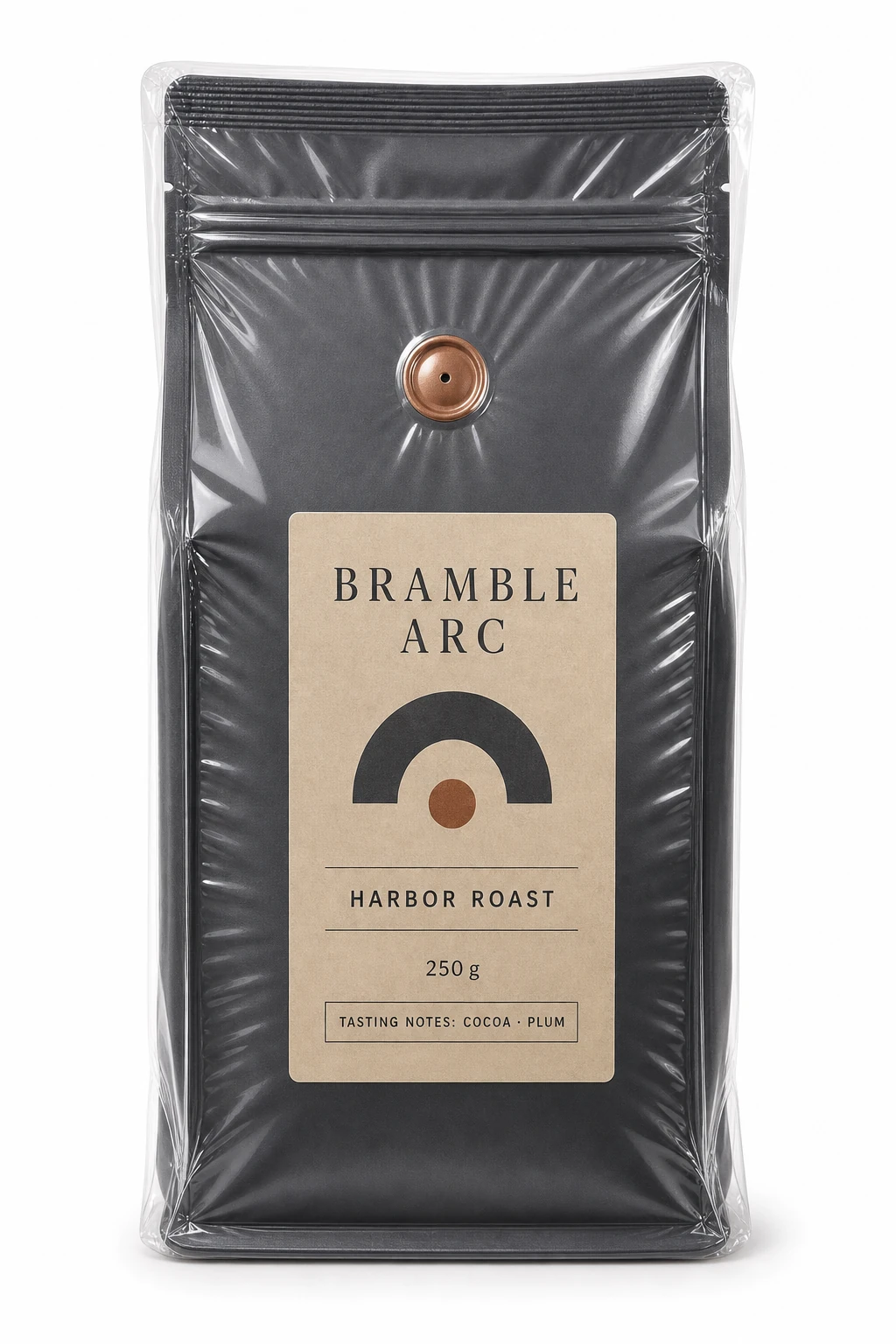
For evaluating a coffee pouch silhouette, printed label, valve, seal, and protective material behavior.
Specialty-Coffee Pouch Studio Study | Best for: For evaluating a coffee pouch silhouette, printed label, valve, seal, and protective material behavior. | Prompt EN-C02-01-P02 | Check: BRAMBLE ARC spelling, valve placement, gusset, film contour, material separation, and full silhouette | If it fails: After an observed film-reflection failure, change only the reflection angle or intensity while retaining the pouch geometry and copy.
Expected result
A tactile coffee pouch mockup whose label remains readable through believable transparent film and controlled reflections.
Copy-ready tested prompt
Task: Produce a vacuum-pack studio product mockup for a fictional specialty-coffee pouch.
Subject: One hyper-realistic matte charcoal stand-up pouch for the fictional brand BRAMBLE ARC, standing vertically with a sand-colored rectangular label, copper degassing valve, resealable top, and broad base gusset. A glossy transparent vacuum sleeve clings tightly to the entire pouch contour, producing visible tension lines and stretched areas while leaving the printed hierarchy visible.
Context: A coffee roaster is reviewing the complete pack silhouette, label scale, valve placement, seal construction, and protective-material behavior for an ecommerce listing.
Style: Premium commercial product photography in sharp focus, with intense matte-paper texture, crisp seal detail, glossy transparent-film tension, and a disciplined original color system.
Composition: Use a tall portrait canvas with a 2-to-3 aspect ratio. Center the one pouch standing vertical and directly front-facing, showing the complete silhouette from sealed top through grounded gusset. Keep the camera square to the front plane and make the taut transparent sleeve conform to the shoulders, valve, seams, label edges, and gusset.
Lighting: Pure white studio background with soft, even bilateral lighting; controlled film reflections reveal tension without obscuring the matte texture or exact copy, with a light contact shadow directly below.
Constraints: Use only these exact labels: “BRAMBLE ARC”, “HARBOR ROAST”, “250 g”, and “TASTING NOTES: COCOA · PLUM”. No additional copy beyond the listed text. Keep the valve, zipper, gusset, film tension, and pouch proportions physically plausible. Use original packaging design; avoid real logos, origin certifications, roast claims, watermarks, torn film, or clipped edges.
Output: Portrait 2:3 front-facing single-object vacuum-pack studio mockup with readable English copy and clearly differentiated pouch, label, valve, and transparent-film materials.
Adjustable parameters
Pouch color, label stock, valve finish, film tension, camera turn, shadow softness
Failure correction
After an observed film-reflection failure, change only the reflection angle or intensity while retaining the pouch geometry and copy.
Review focus
BRAMBLE ARC spelling, valve placement, gusset, film contour, material separation, and full silhouette
Model
GPT Image 2
Product Design · GPT Image 2 · Prompt 03
Tea-Tin Gift Set Announcement
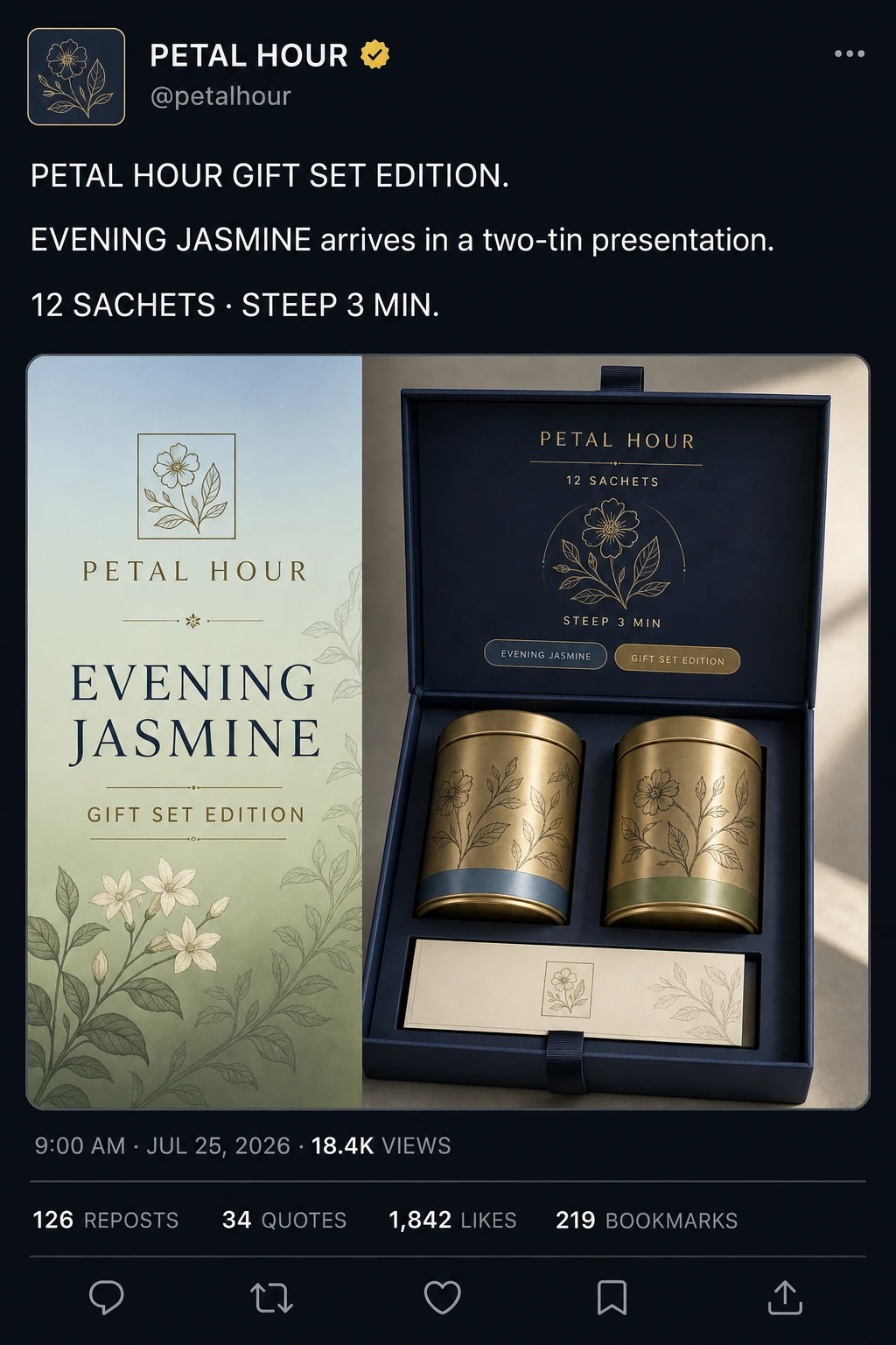
For reviewing a launch card that combines a gift-set lockup, exact copy, and clear product hierarchy.
Tea-Tin Gift Set Announcement | Best for: For reviewing a launch card that combines a gift-set lockup, exact copy, and clear product hierarchy. | Prompt EN-C02-01-P03 | Check: PETAL HOUR spelling, full six-region social shell, tin count, box hinge, card columns, metadata, four stats, five icons, and portrait readability | If it fails: After an observed hierarchy failure, change only the failed headline or supporting-copy position and retain the full product set.
Expected result
A complete dark social post whose header, announcement, embedded tea-set card, metadata, engagement row, and action row remain readable.
Copy-ready tested prompt
Task: Create a complete dark-mode social-feed announcement mockup for a fictional tea-tin gift set.
Subject: The fictional PETAL HOUR account announces a hinged midnight-blue gift box holding two brushed-brass tea tins and a cream tasting card; the tins share an original botanical line pattern and distinct jasmine and pear accent bands.
Context: A direct-to-consumer tea studio needs a realistic social post that preserves the account header, announcement copy, embedded campaign card, metadata, engagement statistics, and action row while showing the complete gift-ready set.
Style: Portrait dark-mode social interface with crisp modern typography and an original neutral visual language that does not imitate a named platform. Inside the embedded card, use a pale-blue-to-sage gradient, refined botanical graphics, realistic metal, paper, and ribbon textures.
Composition: Build the portrait post in this top-to-bottom order. Header: a square botanical-emblem avatar, account name “PETAL HOUR”, an amber verification badge, handle “@petalhour”, and a three-dot menu. Post copy: three separated lines reading “PETAL HOUR GIFT SET EDITION.”, “EVENING JASMINE arrives in a two-tin presentation.”, and “12 SACHETS · STEEP 3 MIN.” Embedded card: a rounded horizontal panel; its left column shows the PETAL HOUR emblem and name, headline “EVENING JASMINE”, and subheadline “GIFT SET EDITION”; its second column shows the complete open gift box. On the box-lid panel place top labels “PETAL HOUR” and “12 SACHETS”, a central botanical emblem, the line “STEEP 3 MIN”, and two small pill labels “EVENING JASMINE” and “GIFT SET EDITION”. Footer: metadata “9:00 AM · JUL 25, 2026 · 18.4K VIEWS”; below a divider, show “126 REPOSTS”, “34 QUOTES”, “1,842 LIKES”, and “219 BOOKMARKS”; below another divider, show in order the outline icons for reply, repost, heart, bookmark, and share.
Lighting: Within the card, use directional soft light from upper right, warm brass highlights, gentle shadow inside the box, and a controlled rim that separates the navy package from the gradient.
Constraints: Use only the exact quoted text above. No additional copy beyond those strings; the pear accent band remains a color-only stripe with no letters or wordmark. Keep the full header, three-part post copy, two-column embedded card, complete gift set, inner-lid hierarchy, metadata, four engagement statistics, and five action icons visible in their stated relationships. Use original artwork and interface geometry; avoid real logos, named-platform marks, health claims, awards, watermarks, clipped copy, or missing interface regions.
Output: Portrait 2:3 full social-feed post mockup with a readable English hierarchy and a complete tea gift-set product card.
After an observed hierarchy failure, change only the failed headline or supporting-copy position and retain the full product set.
Review focus
PETAL HOUR spelling, full six-region social shell, tin count, box hinge, card columns, metadata, four stats, five icons, and portrait readability
Model
GPT Image 2
Product Design · GPT Image 2 · Prompt 04
Candle Mailer Unboxing Board
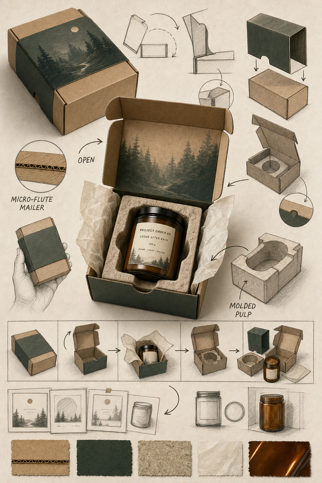
For reviewing the closed mailer, ordered reveal, insert structure, candle jar, and unboxing copy.
Candle Mailer Unboxing Board | Best for: For reviewing the closed mailer, ordered reveal, insert structure, candle jar, and unboxing copy. | Prompt EN-C02-01-P04 | Check: PROJECT EMBER 04 spelling, jar count, hinge direction, cradle fit, arrow order, corrugation, and full panel visibility | If it fails: After an observed unboxing-order failure, change only the failed arrow or state relationship while retaining every package component.
Expected result
A complete mailer board that explains the closed, open, and component states without losing package structure or copy.
Copy-ready tested prompt
Task: Create a hand-drawn packaging proposal board for a candle subscription mailer and its unboxing sequence.
Subject: A kraft micro-flute mailer with a deep-forest paper sleeve, molded-pulp candle cradle, amber glass jar, cream tissue, and an internal PROJECT EMBER 04 prototype scent label.
Context: A packaging team is reviewing the closed form, opening direction, insert fit, reveal order, material choices, and brand copy before a shipping test.
Style: A warm high-finish brand concept board that contrasts one realistic commercial package rendering with loose dark hand-drawn sketches, circles, arrows, symbols, lettering trials, and casual handwritten English annotations; tactile recycled materials and calm woodland color.
Composition: Use a vertical 2:3 board. Place the most complete opened mailer, fitted candle, tissue, and sleeve as the polished central hero. Arrange around the central hero a closed-mailer angle, a hinge and sleeve exploration, an empty insert structural sketch, a hand-held scale draft, a closed-to-open-to-component unboxing sequence, a label-layout experiment, and a compact strip of material swatches. Link each state with dark hand-drawn arrows and circles while keeping a relaxed but ordered rhythm and a clear central focus.
Lighting: Soft angled daylight with warm fill, visible corrugation, amber-glass reflections, tissue translucency, and a grounded shadow under the central finished product.
Constraints: Use only these exact labels: “PROJECT EMBER 04”, “CEDAR AFTER RAIN”, “220 g”, “POUR · LIGHT · PAUSE”, “OPEN”, “MOLDED PULP”, and “MICRO-FLUTE MAILER”. Use only the quoted labels above. Keep every auxiliary sketch and process region completely free of letters, words, headings, captions, measurements, and numerals; communicate those regions only through line art, arrows, circles, and material swatches. Keep the hinge, sleeve, cradle, jar scale, arrow order, and insert fit physically coherent. Use original geometry and palette; avoid real logos, shipping certifications, fragrance claims, watermarks, duplicated central products, and clipped panels.
Output: Portrait 2:3 mailer proposal board for internal design review. Place “PROJECT EMBER 04”, “CEDAR AFTER RAIN”, “220 g”, and “POUR · LIGHT · PAUSE” together on the central hero jar label only. Place “OPEN” beside the lid-direction arrow, “MOLDED PULP” beside the pulp cradle, and “MICRO-FLUTE MAILER” beside the corrugated swatch. Do not repeat any quoted label in the surrounding label-layout experiment, sketches, process sequence, or material swatches; those auxiliary regions remain nonverbal.
Adjustable parameters
Mailer board grade, sleeve color, insert shape, jar finish, reveal order, annotation density
Failure correction
After an observed unboxing-order failure, change only the failed arrow or state relationship while retaining every package component.
Review focus
PROJECT EMBER 04 spelling, jar count, hinge direction, cradle fit, arrow order, corrugation, and full panel visibility
Model
GPT Image 2
Product Design · GPT Image 2 · Prompt 05
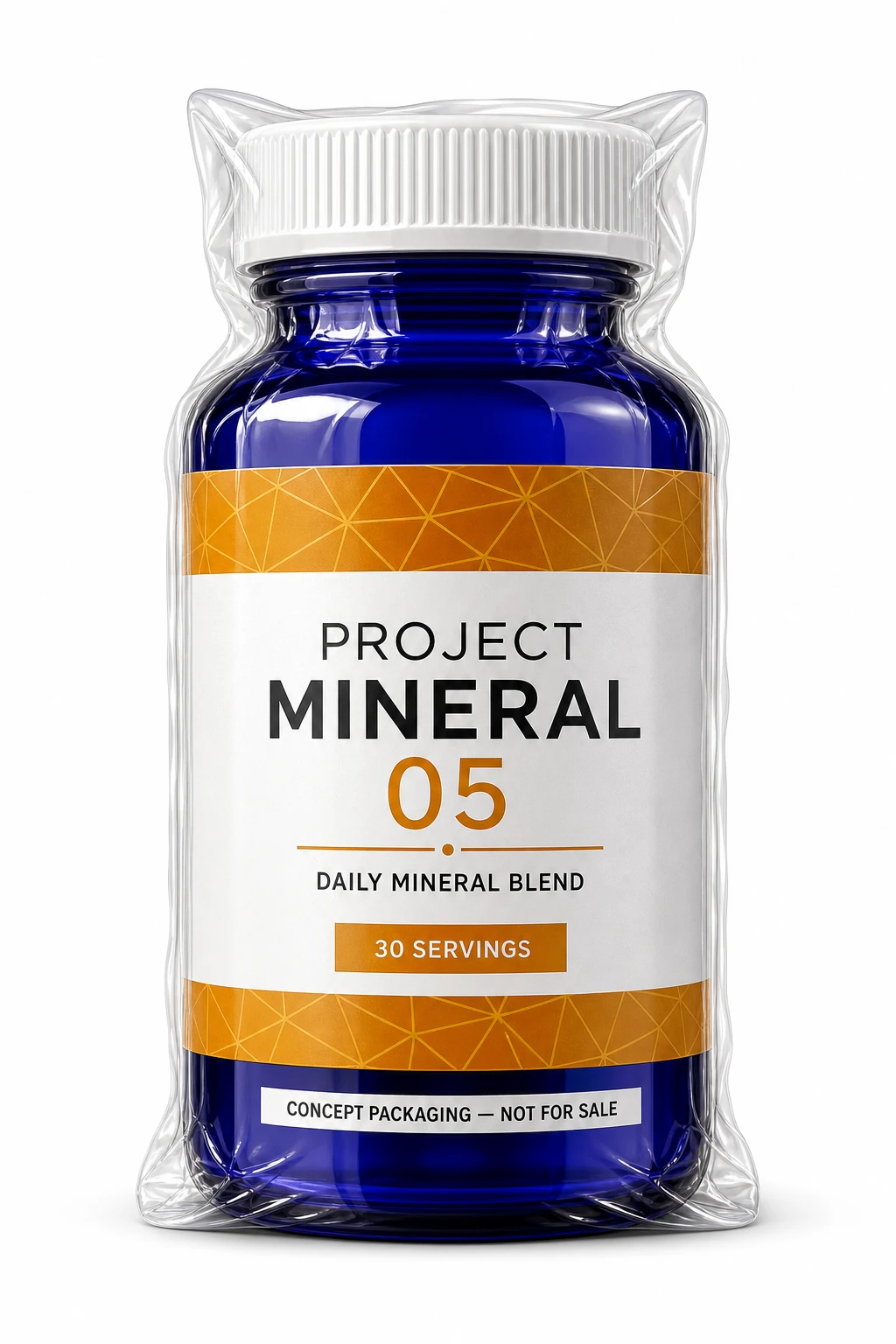
Supplement Bottle Vacuum-Pack Study
For evaluating one supplement bottle silhouette, concept copy, glass, cap, and vacuum-film behavior without efficacy or compliance claims.
Supplement Bottle Vacuum-Pack Study | Best for: For evaluating one supplement bottle silhouette, concept copy, glass, cap, and vacuum-film behavior without efficacy or compliance claims. | Prompt EN-C02-01-P05 | Check: PROJECT MINERAL 05 spelling, disclosure legibility, bottle silhouette, cap shape, film contour, and grounded shadow | If it fails: After an observed film or label failure, change only the failed reflection angle or label placement while retaining the bottle geometry and copy.
Expected result
A credible single-bottle concept mockup that keeps the disclosure visible through taut transparent film.
Copy-ready tested prompt
Task: Create a vacuum-pack studio product mockup for a fictional supplement bottle.
Subject: One hyper-realistic cobalt glass bottle for PROJECT MINERAL 05, standing vertically with a ribbed white cap, a saffron geometric label band, and a non-therapeutic concept label. Glossy transparent vacuum packaging clings tightly around the bottle, cap ribs, shoulder, label edges, and base, creating visible tension lines and stretched areas.
Context: A packaging team is reviewing the bottle silhouette, cap construction, label hierarchy, glass texture, and concept-status disclosure before any regulatory work.
Style: Premium commercial product photography in sharp focus, with intense cobalt-glass depth, molded cap texture, crisp factual typography, and glossy transparent-film tension.
Composition: Use a tall portrait canvas with a 2-to-3 aspect ratio. Center the one bottle standing vertical and directly front-facing, showing the complete cap-to-base silhouette. Keep the camera square to the label plane and let the taut film reveal every contour without hiding the copy.
Lighting: Pure white studio background with soft, even bilateral lighting; controlled highlights separate cobalt glass, white cap, printed label, and glossy film, with a light contact shadow directly below.
Constraints: Use only these exact labels: “PROJECT MINERAL 05”, “DAILY MINERAL BLEND”, “30 SERVINGS”, and “CONCEPT PACKAGING — NOT FOR SALE”. No additional copy beyond the listed text. Keep bottle, cap, film tension, and label placement coherent. Use original trade dress; avoid real logos, medical or performance claims, seals, dosage directions, watermarks, extra packages, and clipped edges.
Output: Portrait 2:3 front-facing single-object vacuum-pack studio mockup with readable concept copy and inspectable glass, cap, label, and transparent-film materials.
Adjustable parameters
Bottle color, cap ribbing, saffron label accent, film tension, front-plane alignment, contact shadow
Failure correction
After an observed film or label failure, change only the failed reflection angle or label placement while retaining the bottle geometry and copy.
Review focus
PROJECT MINERAL 05 spelling, disclosure legibility, bottle silhouette, cap shape, film contour, and grounded shadow
Model
GPT Image 2
Product Design · GPT Image 2 · Prompt 06
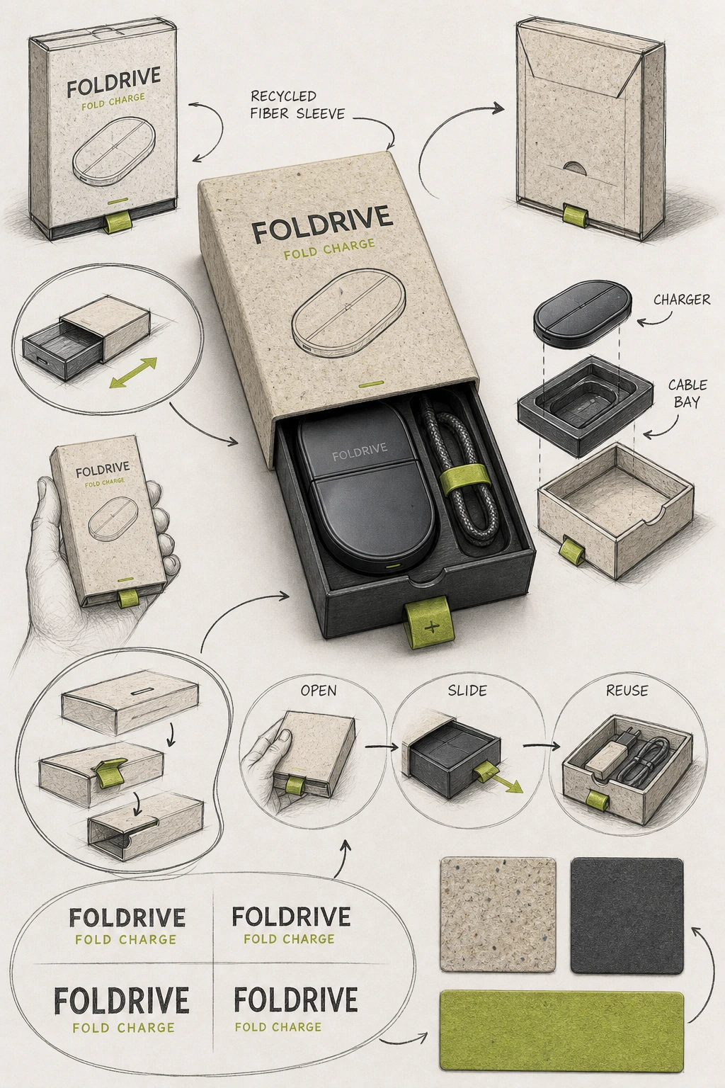
Sustainable Electronics Sleeve Board
For reviewing a fiber sleeve, sliding tray, cable bay, folding logic, and reuse instructions.
Sustainable Electronics Sleeve Board | Best for: For reviewing a fiber sleeve, sliding tray, cable bay, folding logic, and reuse instructions. | Prompt EN-C02-01-P06 | Check: FOLDRIVE spelling, OPEN · SLIDE · REUSE order, tray travel, cable bay, device count, and fold detail | If it fails: After an observed tray-direction failure, change only the failed opening arrow or tray endpoint and retain the complete board.
Expected result
A clear sleeve-and-tray review board with a coherent opening sequence, material story, and part placement.
Copy-ready tested prompt
Task: Build a hand-drawn packaging proposal board for a sustainable sleeve around a fictional folding wireless charger.
Subject: A speckled molded-fiber outer sleeve, charcoal sliding tray, compact oval charger, braided cable bay, and paper pull tab for the original brand FOLDRIVE.
Context: A consumer-electronics team is reviewing protection, tray travel, part placement, reuse instructions, material finish, and retail presentation before a drop-test prototype.
Style: A precise high-finish industrial-design concept board that contrasts one realistic commercial package rendering with loose dark hand-drawn sketches, arrows, circles, symbols, lettering trials, and casual handwritten English annotations; tactile fiber, matte device surfaces, and an original graphite-and-lime system.
Composition: Use a vertical 2:3 board. Place the complete closed sleeve with its tray partially open and the charger visible as the polished central hero. Arrange around the central hero a front and rear package angle, a tray-travel sketch, an exploded charger-and-cable-bay study, a hand-held scale draft, a fold-and-tab exploration, an OPEN · SLIDE · REUSE sequence, a lettering-layout trial, and material swatches. Connect related parts with dark hand-drawn arrows and circles while preserving a relaxed but ordered rhythm and a clear visual center.
Lighting: Neutral soft studio lighting with shallow contact shadows, a controlled device edge highlight, visible fiber flecks, and enough contrast for arrows and labels.
Constraints: Use only these exact labels: “FOLDRIVE”, “FOLD CHARGE”, “RECYCLED FIBER SLEEVE”, “OPEN”, “SLIDE”, “REUSE”, “CHARGER”, and “CABLE BAY”. Use only the quoted labels above, and visibly include “RECYCLED FIBER SLEEVE”. Communicate every auxiliary sketch and process region with line art, arrows, circles, and material swatches; keep newly invented headings, captions, measurements, and numerals out of the result. Keep tray direction, sleeve opening, cable bay, pull tab, device scale, arrows, and spatial relationships coherent. Use original device and package geometry; avoid real logos, certification marks, compatibility claims, watermarks, duplicated central products, and clipped views.
Output: Portrait 2:3 sustainable electronics packaging proposal board with readable English annotations and inspectable finished-product, sketch, sleeve, tray, device, and fold details.
After an observed tray-direction failure, change only the failed opening arrow or tray endpoint and retain the complete board.
Review focus
FOLDRIVE spelling, OPEN · SLIDE · REUSE order, tray travel, cable bay, device count, and fold detail
Model
GPT Image 2
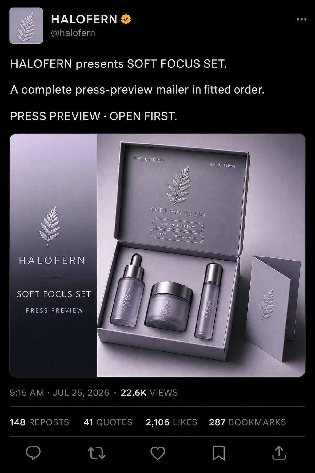
Product Design · GPT Image 2 · Prompt 07
Beauty PR Mailer Announcement
For presenting an open PR mailer, product set, reveal message, and editorial launch hierarchy.
Beauty PR Mailer Announcement | Best for: For presenting an open PR mailer, product set, reveal message, and editorial launch hierarchy. | Prompt EN-C02-01-P07 | Check: HALOFERN spelling, full six-region social shell, three product forms, insert fit, card columns, metadata, four stats, five icons, and portrait readability | If it fails: After an observed product-count failure, change only the failed insert occupancy instruction and retain the announcement hierarchy.
Expected result
A complete dark social post whose header, announcement, embedded PR-mailer card, metadata, engagement row, and action row remain readable.
Copy-ready tested prompt
Task: Create a complete dark-mode social-feed announcement mockup for a fictional beauty PR mailer.
Subject: The fictional HALOFERN account announces an open lavender-gray rigid mailer containing a serum bottle, cream jar, and slim mist bottle in a fitted insert; the lid carries the launch message and a folded press card sits beside the set.
Context: A beauty communications team needs a realistic social post that preserves the account header, announcement copy, embedded campaign card, metadata, engagement statistics, and action row while showing the full press-preview kit and reveal order.
Style: Portrait dark-mode social interface with crisp modern typography and an original neutral visual language that does not imitate a named platform. Inside the embedded card, use a pale-lilac-to-charcoal gradient, realistic coated board, satin glass, anodized caps, paper, and botanical embossing.
Composition: Build the portrait post in this top-to-bottom order. Header: a square fern-emblem avatar, account name “HALOFERN”, an amber verification badge, handle “@halofern”, and a three-dot menu. Post copy: three separated lines reading “HALOFERN presents SOFT FOCUS SET.”, “A complete press-preview mailer in fitted order.”, and “PRESS PREVIEW · OPEN FIRST.” Embedded card: a rounded horizontal panel; its left column shows the HALOFERN emblem and name, headline “SOFT FOCUS SET”, and subheadline “PRESS PREVIEW”; its second column shows the complete open mailer. On the lid panel place top labels “HALOFERN” and “OPEN FIRST”, a central fern emblem, the line “SOFT FOCUS SET”, and two small pill labels “SERUM + CREAM” and “MIST + PRESS CARD”. Footer: metadata “9:15 AM · JUL 25, 2026 · 22.6K VIEWS”; below a divider, show “148 REPOSTS”, “41 QUOTES”, “2,106 LIKES”, and “287 BOOKMARKS”; below another divider, show in order the outline icons for reply, repost, heart, bookmark, and share.
Lighting: Within the card, use a large diffused key from upper left, gentle lavender fill, controlled highlights on glass and caps, and a grounded shadow beneath the open mailer.
Constraints: Use only the exact quoted text above. No additional copy beyond those strings. Keep the full header, three-part post copy, two-column embedded card, three product forms, fitted insert, lid hierarchy, metadata, four engagement statistics, and five action icons visible in their stated relationships. Use original artwork and interface geometry; avoid real logos, named-platform marks, ingredient or efficacy claims, awards, watermarks, extra products, clipped copy, or missing interface regions.
Output: Portrait 2:3 full social-feed post mockup with readable English launch copy and a complete beauty PR-mailer product card.
After an observed product-count failure, change only the failed insert occupancy instruction and retain the announcement hierarchy.
Review focus
HALOFERN spelling, full six-region social shell, three product forms, insert fit, card columns, metadata, four stats, five icons, and portrait readability
Model
GPT Image 2
Product Design · GPT Image 2 · Prompt 08
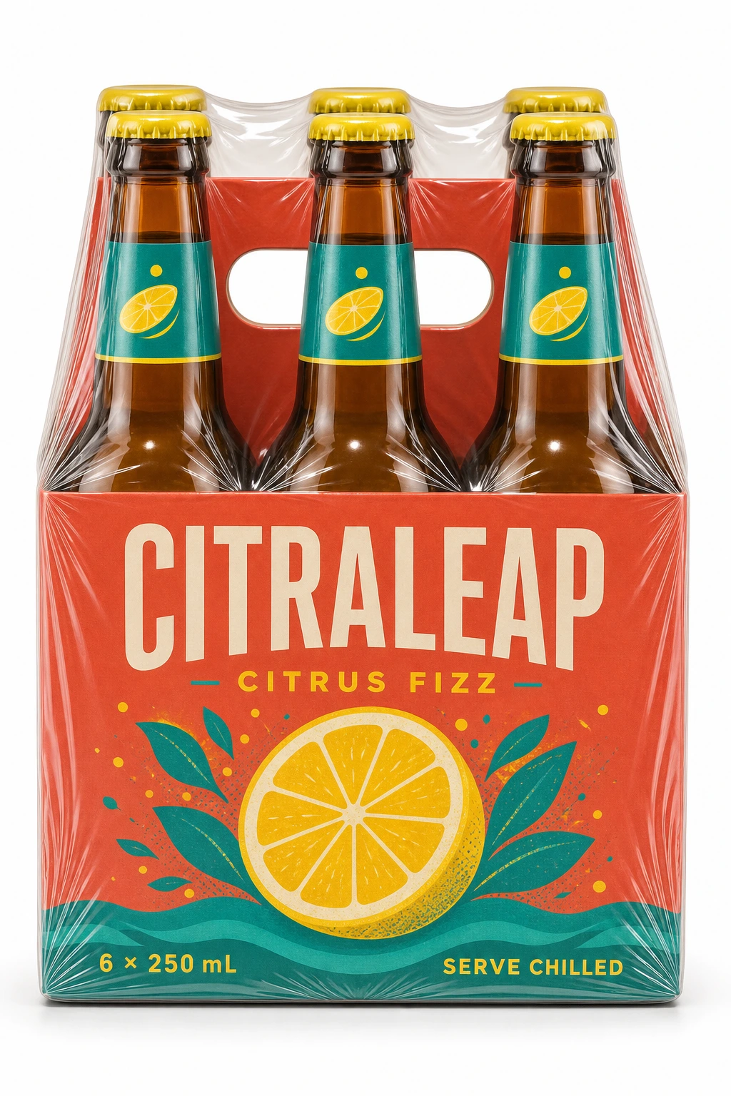
Craft-Soda Six-Pack Studio Study
For checking a multipack carrier, bottle spacing, printed copy, glass, caps, and protective wrap.
Craft-Soda Six-Pack Studio Study | Best for: For checking a multipack carrier, bottle spacing, printed copy, glass, caps, and protective wrap. | Prompt EN-C02-01-P08 | Check: CITRALEAP spelling, six bottles, cap row, handle, carrier walls, wrap contour, and full pack visibility | If it fails: After an observed bottle-count failure, change only the failed bottle-position sentence and retain the carrier, copy, and lighting.
Expected result
A complete six-pack study with stable bottle count, believable carrier geometry, readable copy, and controlled film reflections.
Copy-ready tested prompt
Task: Produce a vacuum-pack studio product mockup of a fictional craft-soda six-pack carrier.
Subject: One hyper-realistic upright CITRALEAP six-pack carrier as a single packaged retail object, standing vertically with six amber glass bottle tops, citrus-yellow caps, teal neck labels, a centered oval handle opening, and coral front artwork. Glossy transparent vacuum wrap clings tightly around the unified carrier, bottle shoulders, cap row, handle, front panel, and base, creating visible tension lines and stretched areas.
Context: A beverage packaging team is reviewing the unified multipack silhouette, bottle spacing, label hierarchy, handle structure, glass color, and protective-wrap behavior for a retail presentation.
Style: Premium commercial product photography in sharp focus, with intense glass, printed-board, cap, and glossy-film textures and vivid original color blocking.
Composition: Use a tall portrait canvas with a 2-to-3 aspect ratio. Center the one carrier standing vertical and directly front-facing, showing its complete top-to-base silhouette. Keep the camera square to the front panel and preserve the aligned bottle positions, handle opening, cap row, and grounded base while the taut film conforms to the entire packaged unit.
Lighting: Pure white studio background with soft, even bilateral lighting; controlled reflections reveal amber glass, board texture, and film tension, with a light contact shadow directly below.
Constraints: Use only these exact labels: “CITRALEAP”, “CITRUS FIZZ”, “6 × 250 mL”, and “SERVE CHILLED”. No additional copy beyond the listed text; CITRALEAP must appear without any trademark, registration, or copyright symbol beside it. Keep six bottle positions, carrier walls, handle, caps, labels, wrap tension, and pack geometry coherent. Use original trade dress; avoid real logos, nutrition or health claims, deposit marks, watermarks, missing bottles, extra bottles, and clipped edges.
Output: Portrait 2:3 front-facing single-object vacuum-pack studio mockup with readable English copy and inspectable glass, board, caps, handle, and transparent-wrap materials.
Adjustable parameters
Bottle glass color, cap color, carrier board, handle shape, wrap tension, camera height
Failure correction
After an observed bottle-count failure, change only the failed bottle-position sentence and retain the carrier, copy, and lighting.
Review focus
CITRALEAP spelling, six bottles, cap row, handle, carrier walls, wrap contour, and full pack visibility
Model
GPT Image 2
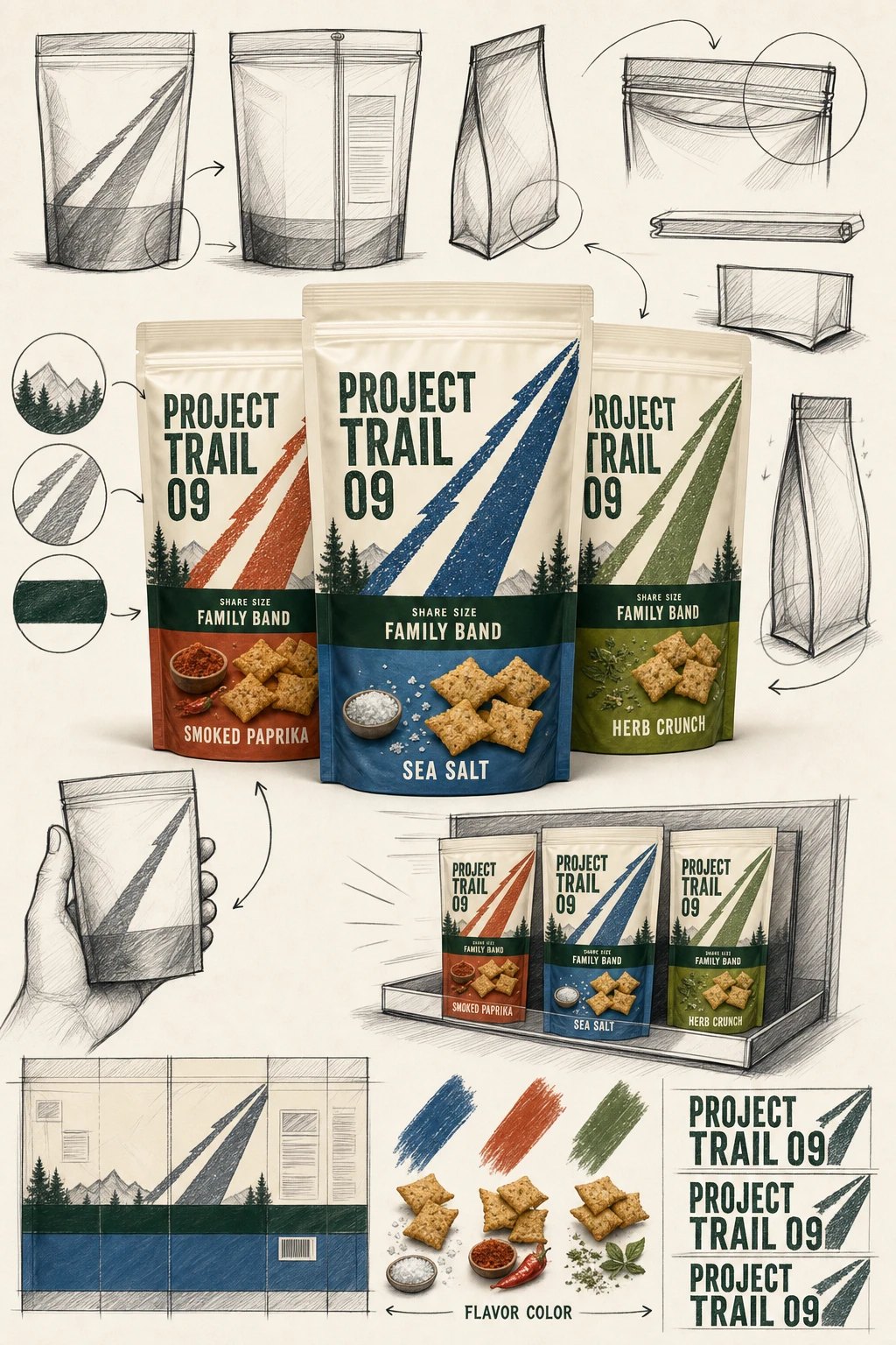
Product Design · GPT Image 2 · Prompt 09
Snack-Family Shelf Architecture Board
For comparing three SKU fronts, family consistency, flavor coding, shelf block, and structural details.
Snack-Family Shelf Architecture Board | Best for: For comparing three SKU fronts, family consistency, flavor coding, shelf block, and structural details. | Prompt EN-C02-01-P09 | Check: PROJECT TRAIL 09 spelling, three unique flavors, shared family band, shelf order, seals, arrows, and label consistency | If it fails: After an observed flavor-mapping failure, change only the failed flavor-to-color assignment and retain the family architecture.
Expected result
A clear family system whose shared architecture and three flavor distinctions survive both close review and shelf distance.
Copy-ready tested prompt
Task: Create a hand-drawn packaging architecture proposal board for a fictional family of three baked snack pouches.
Subject: Three PROJECT TRAIL 09 stand-up pouches sharing a cream upper field, bold diagonal trail mark, dark-green family band, and distinct flavor colors for sea salt, smoked paprika, and herb crunch.
Context: A brand and retail team is reviewing family consistency, flavor distinction, front-panel hierarchy, pouch construction, and shelf-block visibility before print testing.
Style: An energetic high-finish brand concept board that contrasts one realistic commercial family rendering with loose dark hand-drawn sketches, circles, arrows, symbols, lettering trials, and casual handwritten English annotations; realistic flexible film and original geometric graphics.
Composition: Use a vertical 2:3 board. Place the complete three-pouch flavor family as the polished central hero with one lead pouch slightly forward. Arrange around the central hero front-and-back angle sketches, a crimp-seal and gusset structural exploration, a hand-held scale draft, a small retail shelf-block study, an unfolded label-layout experiment, family-mark lettering trials, and a flavor-color palette. Link common and variant features with dark hand-drawn arrows and circles while keeping a relaxed but ordered rhythm and a clear visual center.
Lighting: Even retail-studio light with soft pouch reflections, visible crimp seals and gussets, grounded shadows, and clear color separation.
Constraints: Use only these exact labels: “PROJECT TRAIL 09”, “SEA SALT”, “SMOKED PAPRIKA”, “HERB CRUNCH”, “SHARE SIZE”, “FAMILY BAND”, and “FLAVOR COLOR”. Use only the quoted labels above. Keep every auxiliary sketch and process region completely free of letters, words, headings, captions, measurements, and numerals; communicate those regions only through line art, arrows, circles, and material swatches. Keep three pouch fronts, shelf order, seals, gussets, shared graphics, arrows, and spatial relationships coherent. Use original trade dress; avoid real logos, nutrition claims, pricing, awards, watermarks, duplicate flavors, and clipped packs.
Output: Portrait 2:3 snack-family packaging proposal board for internal design review, with only the quoted exact package labels readable; auxiliary sketches, the coherent shelf study, and flexible-pack details use nonverbal line art only.
After an observed flavor-mapping failure, change only the failed flavor-to-color assignment and retain the family architecture.
Review focus
PROJECT TRAIL 09 spelling, three unique flavors, shared family band, shelf order, seals, arrows, and label consistency
Model
GPT Image 2
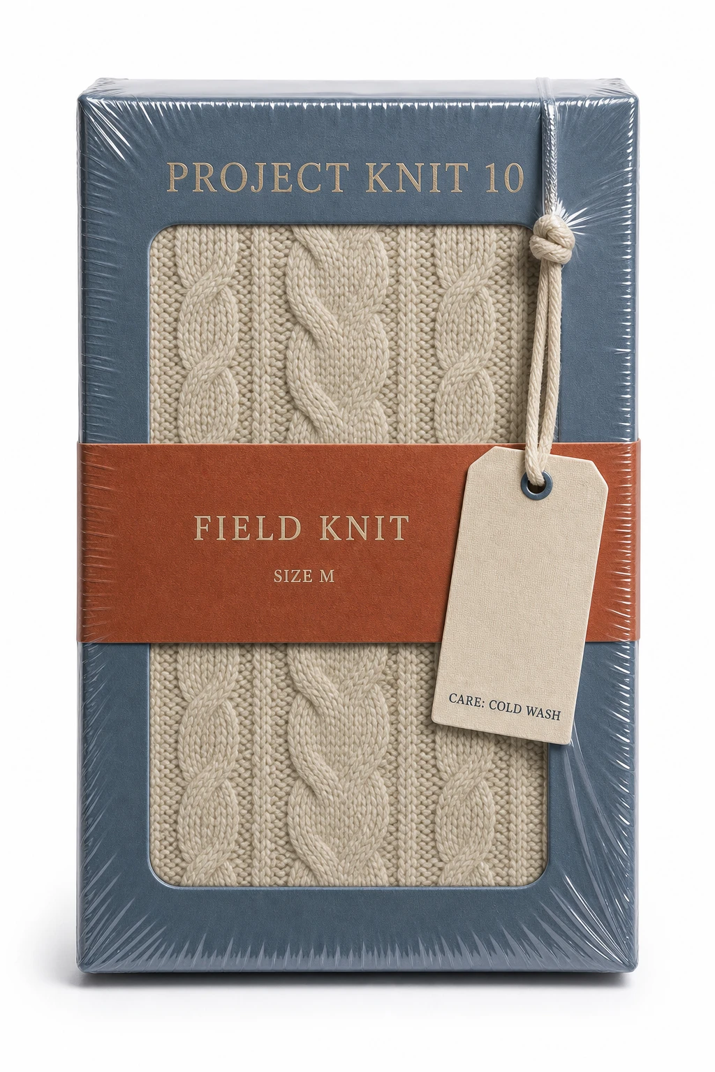
Product Design · GPT Image 2 · Prompt 10
Knitwear Gift Box Vacuum-Pack Study
For evaluating one upright apparel gift box, exterior hierarchy, tactile board, hangtag, and vacuum-film behavior.
Knitwear Gift Box Vacuum-Pack Study | Best for: For evaluating one upright apparel gift box, exterior hierarchy, tactile board, hangtag, and vacuum-film behavior. | Prompt EN-C02-01-P10 | Check: PROJECT KNIT 10 spelling, box silhouette, knit emboss, tag cord, care line, film contour, and grounded shadow | If it fails: After an observed tag-legibility failure, change only the tag position or local reflection and preserve every other box feature.
Expected result
A tactile single-box apparel mockup whose exterior hierarchy and materials remain visible through taut transparent film.
Copy-ready tested prompt
Task: Create a vacuum-pack studio product mockup for a fictional knitwear gift box.
Subject: One hyper-realistic slate-blue rigid PROJECT KNIT 10 gift box standing vertically, closed, with an oatmeal knit-texture embossed panel, a rust paper belly band, and a cream cotton hangtag tied close to the front face. Glossy transparent vacuum packaging clings tightly to the lid seam, corners, embossed texture, belly band, cord, tag, and base, creating visible tension lines and stretched areas.
Context: An apparel team is reviewing the complete box silhouette, exterior hierarchy, tactile material cues, hangtag relationship, and protective-material behavior for an ecommerce detail page.
Style: Premium commercial product photography in sharp focus, with intense rigid-board, knit emboss, paper-band, cotton-cord, and glossy transparent-film texture in an original coastal palette.
Composition: Use a tall portrait canvas with a 2-to-3 aspect ratio. Center the one closed box standing vertical and directly front-facing, showing the complete top-to-base silhouette. Keep the camera square to the front panel and make the taut film conform to every edge and attached tag without obscuring the copy.
Lighting: Pure white studio background with soft, even bilateral lighting; controlled film reflections reveal board, emboss, paper, and cord textures, with a light contact shadow directly below.
Constraints: Use only these exact labels: “PROJECT KNIT 10”, “FIELD KNIT”, “SIZE M”, and “CARE: COLD WASH”. No additional copy beyond the listed text. Keep the lid seam, embossed panel, belly band, tag, cord, box edges, and protective film coherent. Use original trade dress; avoid real logos, fiber-certification claims, watermarks, extra packages, floating tags, and clipped edges.
Output: Portrait 2:3 front-facing single-object vacuum-pack studio mockup with readable English copy and inspectable board, emboss, paper, cord, and transparent-film materials.
Adjustable parameters
Box blue, knit emboss, paper-band rust, tag cord, film tension, front-plane alignment
Failure correction
After an observed tag-legibility failure, change only the tag position or local reflection and preserve every other box feature.
Review focus
PROJECT KNIT 10 spelling, box silhouette, knit emboss, tag cord, care line, film contour, and grounded shadow
Model
GPT Image 2
Product Design · GPT Image 2 · Prompt 11
Takeaway Packaging Suite Campaign Tile
For presenting hot, cold, and side packaging as one coherent original restaurant system.
Takeaway Packaging Suite Campaign Tile | Best for: For presenting hot, cold, and side packaging as one coherent original restaurant system. | Prompt EN-C02-01-P11 | Check: PROJECT LUNCH 11 spelling, full six-region social shell, five pack formats, HOT/COLD mapping, ORDER 018, metadata, four stats, five icons, and portrait readability | If it fails: After an observed format-label mismatch, change only the failed label placement and retain every pack in the suite.
Expected result
A complete dark social post whose header, announcement, embedded takeaway-suite card, metadata, engagement row, and action row remain readable.
Copy-ready tested prompt
Task: Create a complete dark-mode social-feed announcement mockup for a fictional takeaway packaging suite.
Subject: The internal prototype account PROJECT LUNCH 11 announces a kraft hot-food clamshell, white cold bowl with clear lid, narrow side carton, paper cup, and folded napkin, all using an original cobalt grid and tangerine dot system.
Context: A neighborhood restaurant group needs a realistic social post that preserves the account header, announcement copy, embedded campaign card, metadata, engagement statistics, and action row while proving the hot, cold, side, and drink formats form one pickup system.
Style: Portrait dark-mode social interface with crisp modern typography and an original neutral visual language that does not imitate a named platform. Inside the embedded card, use a cobalt-to-tangerine gradient with realistic kraft board, coated paper, clear plastic, and original geometric branding.
Composition: Build the portrait post in this top-to-bottom order. Header: a square grid-and-dot avatar, account name “PROJECT LUNCH 11”, an amber verification badge, handle “@projectlunch11”, and a three-dot menu. Post copy: three separated lines reading “PROJECT LUNCH 11 LUNCH SET is ready.”, “HOT, COLD, SIDE, and DRINK formats share one pickup system.”, and “ORDER 018 · PACKED TOGETHER.” Embedded card: a rounded horizontal panel; its left column shows the PROJECT LUNCH 11 emblem and name, headline “LUNCH SET”, and subheadline “ORDER 018”; its second column shows the complete package suite as one grounded lockup. On the clamshell-lid panel place top labels “PROJECT LUNCH 11” and “ORDER 018”, a central grid-and-dot emblem, the line “LUNCH SET”, and two small pill labels “HOT” and “COLD”. Footer: metadata “11:30 AM · JUL 25, 2026 · 31.2K VIEWS”; below a divider, show “214 REPOSTS”, “52 QUOTES”, “2,784 LIKES”, and “361 BOOKMARKS”; below another divider, show in order the outline icons for reply, repost, heart, bookmark, and share.
Lighting: Within the card, use bright soft overhead light with gentle frontal fill, controlled clear-lid reflections, visible paper texture, and attached contact shadows beneath every pack.
Constraints: Use only the exact quoted text above. No additional copy beyond those strings. Keep the full header, three-part post copy, two-column embedded card, five package formats, lid hierarchy, metadata, four engagement statistics, and five action icons visible in their stated relationships. Use original artwork and interface geometry; avoid real logos, named-platform or delivery-platform marks, food claims, prices, watermarks, extra packs, clipped copy, or missing interface regions.
Output: Portrait 2:3 full social-feed post mockup with readable English format labels and a complete takeaway-suite product card.
After an observed format-label mismatch, change only the failed label placement and retain every pack in the suite.
Review focus
PROJECT LUNCH 11 spelling, full six-region social shell, five pack formats, HOT/COLD mapping, ORDER 018, metadata, four stats, five icons, and portrait readability
Model
GPT Image 2
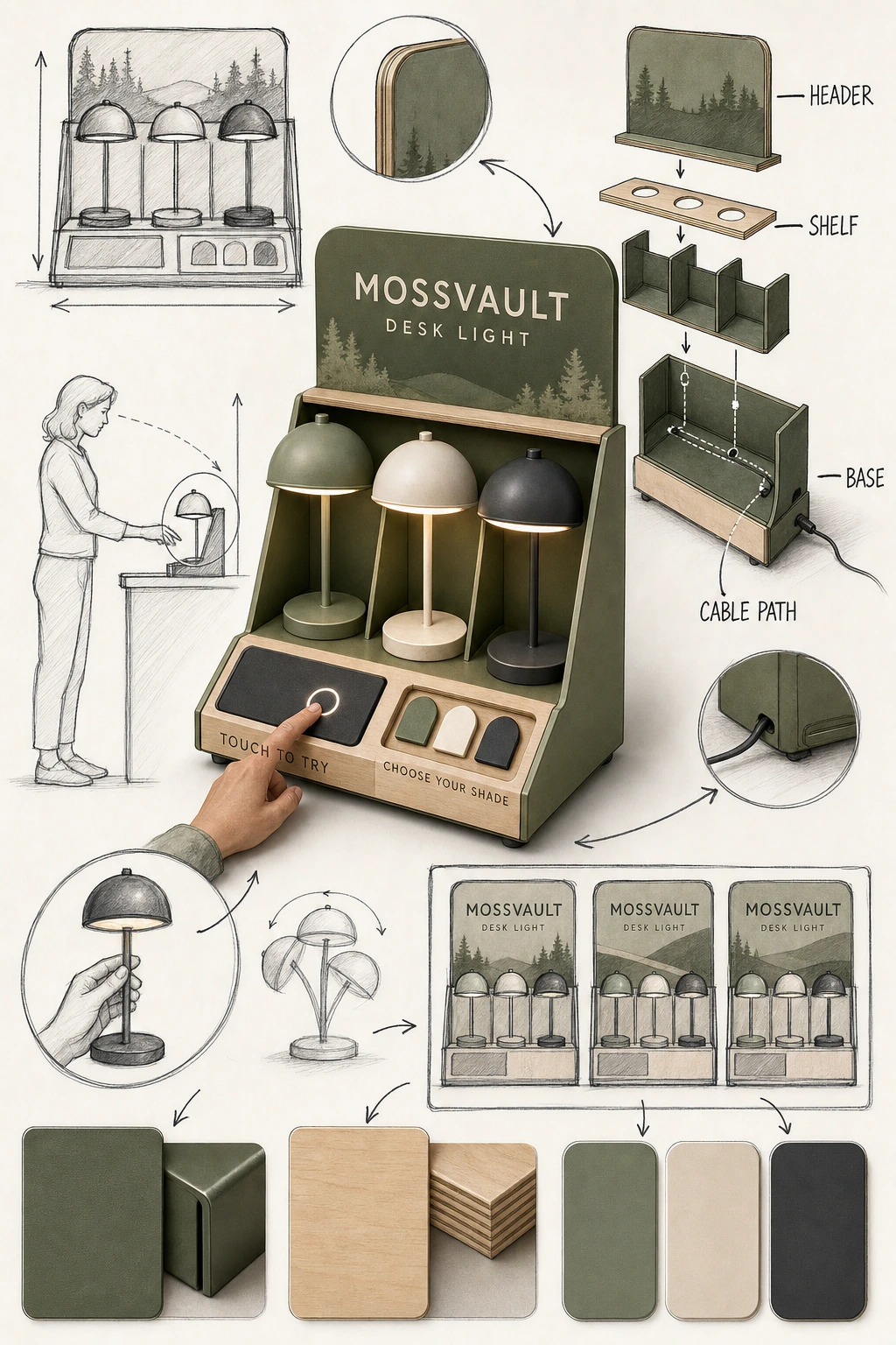
Product Design · GPT Image 2 · Prompt 12
Retail Display Concept Board
For reviewing a counter display, product bays, sign hierarchy, shopper reach, and material assembly.
Retail Display Concept Board | Best for: For reviewing a counter display, product bays, sign hierarchy, shopper reach, and material assembly. | Prompt EN-C02-01-P12 | Check: MOSSVAULT spelling, three lights, TOUCH TO TRY placement, product bays, cable path, and stable fixture geometry | If it fails: After an observed assembly-order failure, change only the failed exploded-part position or arrow and retain the assembled view.
Expected result
A fabrication-oriented display board that explains the shopper-facing lockup and the fixture structure in one review surface.
Copy-ready tested prompt
Task: Create a hand-drawn retail-display proposal board for a fictional rechargeable desk light.
Subject: A compact MOSSVAULT counter unit made from moss-green powder-coated metal and birch plywood, holding three original dome-shaped desk lights with a touch-demo pad, shade swatches, and a removable header card.
Context: A retail design team is reviewing product capacity, shopper reach, message hierarchy, fixture materials, assembly, cable routing, and counter footprint before fabrication.
Style: A polished high-finish retail concept board that contrasts one realistic commercial fixture rendering with loose dark hand-drawn sketches, circles, arrows, symbols, lettering trials, and casual handwritten English annotations; realistic metal, wood, and soft-touch plastic in an original natural-tech palette.
Composition: Use a vertical 2:3 board. Place the complete assembled counter display with its three lights as the polished central hero. Arrange around the central hero a front elevation, a side and shopper-reach sketch, an exploded header-shelf-base-cable-path study, a hand-held scale draft of one light, a lettering-layout experiment for the header, and metal-wood-shade swatches. Connect related parts with dark hand-drawn arrows and circles while keeping a relaxed but ordered rhythm and a clear visual center.
Lighting: Neutral retail key light with broad fill, soft lamp glows, visible birch grain, restrained metal highlights, and a grounded shadow beneath the central fixture.
Constraints: Use only these exact labels: “MOSSVAULT”, “DESK LIGHT”, “TOUCH TO TRY”, “CHOOSE YOUR SHADE”, “HEADER”, “SHELF”, “BASE”, and “CABLE PATH”. Use only the quoted labels above. Keep every auxiliary sketch and process region completely free of letters, words, headings, captions, measurements, and numerals; communicate those regions only through line art, arrows, circles, and material swatches. Keep three lights, product bays, header, touch pad, cable route, arrows, assembly order, and spatial relationships coherent. Use original product and fixture geometry; avoid real logos, prices, electrical claims, watermarks, unstable parts, duplicated central displays, and clipped views.
Output: Portrait 2:3 retail-display proposal board with readable English annotations and inspectable finished-product, sketch, assembly, materials, reach, and product-capacity details.
After an observed assembly-order failure, change only the failed exploded-part position or arrow and retain the assembled view.
Review focus
MOSSVAULT spelling, three lights, TOUCH TO TRY placement, product bays, cable path, and stable fixture geometry
Model
GPT Image 2
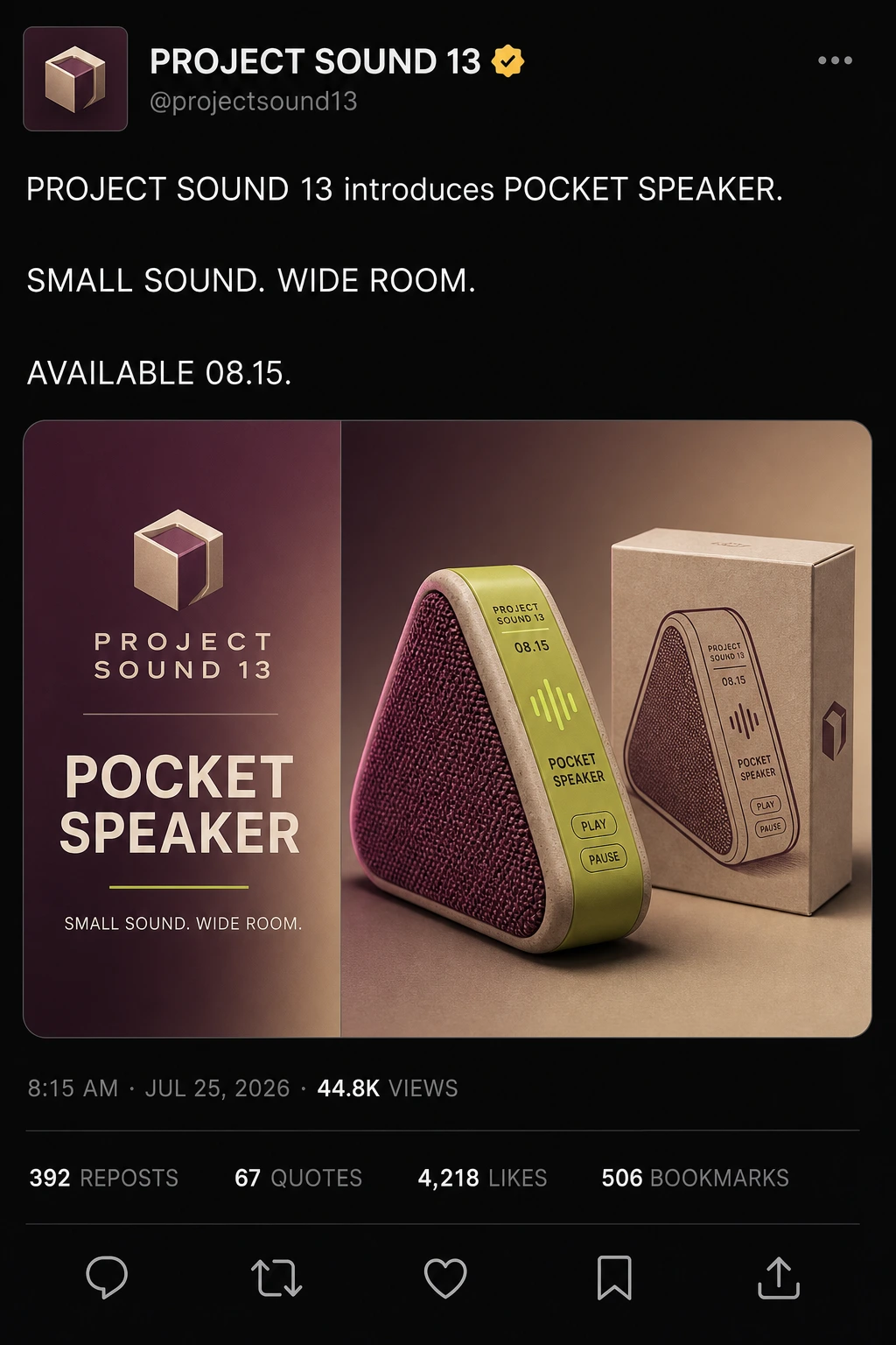
Product Design · GPT Image 2 · Prompt 13
Speaker Launch Social Post Mockup
For combining a fictional compact speaker, full social-post shell, campaign copy, release cue, and believable product lighting.
Speaker Launch Social Post Mockup | Best for: For combining a fictional compact speaker, full social-post shell, campaign copy, release cue, and believable product lighting. | Prompt EN-C02-01-P13 | Check: PROJECT SOUND 13 spelling, full six-region social shell, slogan punctuation, 08.15 date, speaker geometry, card columns, metadata, four stats, five icons, and portrait readability | If it fails: After an observed headline-readability failure, change only the failed line size or contrast and retain the product lockup.
Expected result
A complete dark social post whose header, announcement, embedded speaker card, metadata, engagement row, and action row remain readable.
Copy-ready tested prompt
Task: Create a complete dark-mode social-feed product-launch mockup for a fictional compact wireless speaker.
Subject: The internal prototype account PROJECT SOUND 13 announces one original pocket speaker shaped as a rounded triangular prism with a woven plum grille, sand-colored frame, lime control ridge, and small matching carton.
Context: A consumer-audio team needs a realistic social post that preserves the account header, announcement copy, embedded campaign card, metadata, engagement statistics, and action row while introducing the product, package, campaign line, and availability date.
Style: Portrait dark-mode social interface with crisp modern typography and an original neutral visual language that does not imitate a named platform. Inside the embedded card, use a plum-to-sand gradient, refined product rendering, tactile woven fabric, matte polymer, and lime accents.
Composition: Build the portrait post in this top-to-bottom order. Header: a square prism-emblem avatar, account name “PROJECT SOUND 13”, an amber verification badge, handle “@projectsound13”, and a three-dot menu. Post copy: three separated lines reading “PROJECT SOUND 13 introduces POCKET SPEAKER.”, “SMALL SOUND. WIDE ROOM.”, and “AVAILABLE 08.15.” Embedded card: a rounded horizontal panel; its left column shows the PROJECT SOUND 13 emblem and name, headline “POCKET SPEAKER”, and subheadline “SMALL SOUND. WIDE ROOM.”; its second column shows the complete speaker with its small carton. On the speaker control-panel graphic place top labels “PROJECT SOUND 13” and “08.15”, a central lime sound-wave symbol, the line “POCKET SPEAKER”, and two small pill labels “PLAY” and “PAUSE”. Footer: metadata “8:15 AM · JUL 25, 2026 · 44.8K VIEWS”; below a divider, show “392 REPOSTS”, “67 QUOTES”, “4,218 LIKES”, and “506 BOOKMARKS”; below another divider, show in order the outline icons for reply, repost, heart, bookmark, and share.
Lighting: Within the card, use sculpted magenta edge light, soft warm frontal fill, a narrow lime reflection on the control ridge, and grounded shadows tying speaker and carton to one surface.
Constraints: Use only the exact quoted text above. No additional copy beyond those strings. Keep the full header, three-part post copy, two-column embedded card, speaker-and-carton lockup, control-panel hierarchy, metadata, four engagement statistics, and five action icons visible in their stated relationships. Use original industrial design and interface geometry; avoid real logos, named-platform marks, connectivity claims, awards, watermarks, extra devices, floating shadows, clipped copy, or missing interface regions.
Output: Portrait 2:3 full social-feed post mockup with readable English campaign copy and a complete speaker-and-carton product card.
After an observed headline-readability failure, change only the failed line size or contrast and retain the product lockup.
Review focus
PROJECT SOUND 13 spelling, full six-region social shell, slogan punctuation, 08.15 date, speaker geometry, card columns, metadata, four stats, five icons, and portrait readability
Model
GPT Image 2
Product Design · GPT Image 2 · Prompt 14
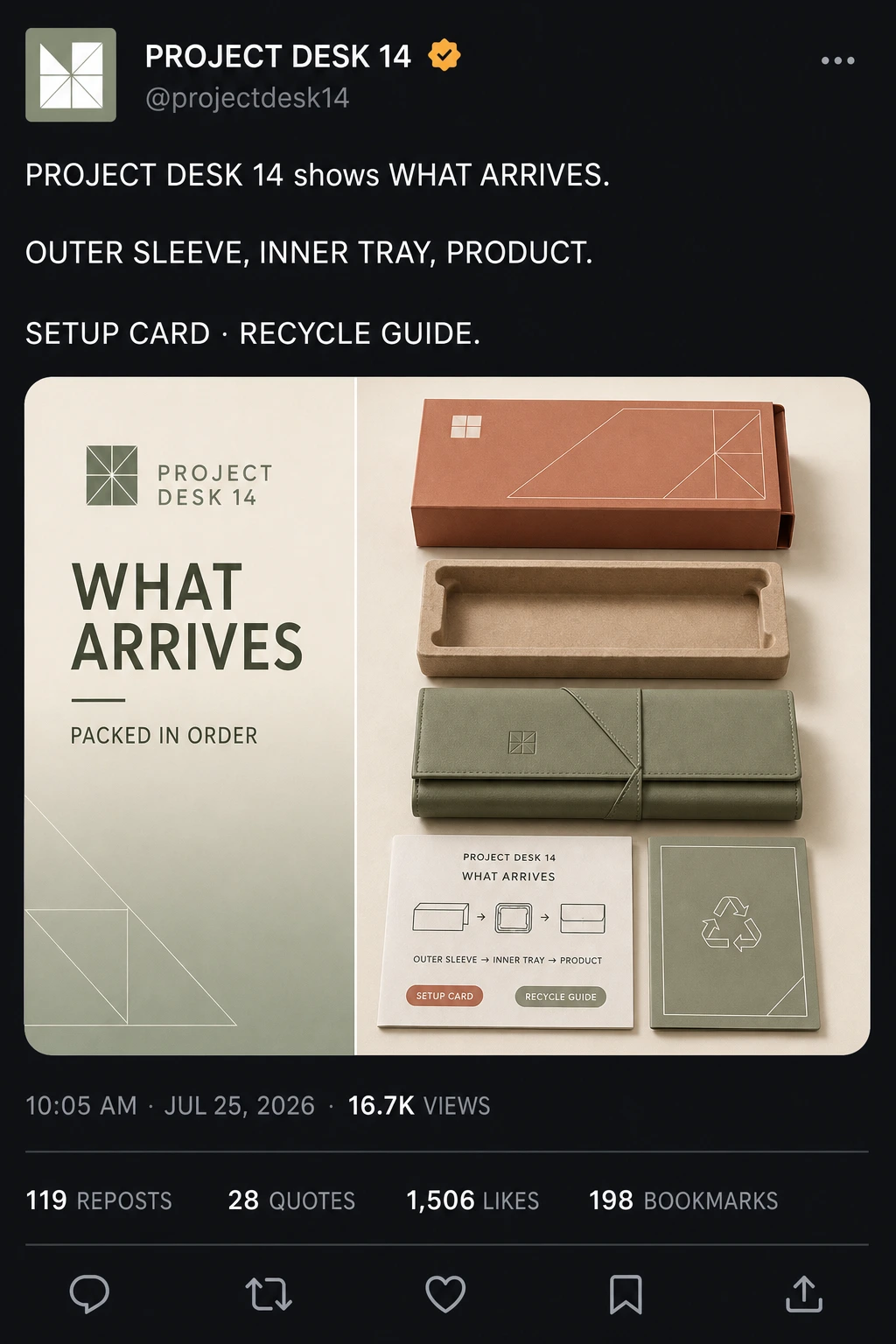
What-Arrives Social Post Mockup
For showing what arrives, the nesting order, exact component labels, and recycling guidance inside a complete social-post shell.
What-Arrives Social Post Mockup | Best for: For showing what arrives, the nesting order, exact component labels, and recycling guidance inside a complete social-post shell. | Prompt EN-C02-01-P14 | Check: PROJECT DESK 14 spelling, full six-region social shell, sleeve-tray-product order, card columns, metadata, four stats, five icons, and portrait readability | If it fails: After an observed nesting-order failure, change only the failed component position or label alignment and retain the complete inventory.
Expected result
A complete dark social post whose header, announcement, embedded what-arrives card, metadata, engagement row, and action row remain readable.
Copy-ready tested prompt
Task: Create a complete dark-mode social-feed what-arrives mockup for a fictional foldable desk organizer.
Subject: The internal prototype account PROJECT DESK 14 explains an original organizer package containing a terracotta outer sleeve, molded-fiber inner tray, folded sage product, paper setup card, and compact recycling guide.
Context: An ecommerce team needs a realistic social post that preserves the account header, announcement copy, embedded product card, metadata, engagement statistics, and action row while setting accurate package and nesting expectations without unverified claims.
Style: Portrait dark-mode social interface with crisp modern typography and an original neutral visual language that does not imitate a named platform. Inside the embedded card, use a cream-to-sage gradient, realistic paper and molded-fiber textures, and practical original geometric packaging graphics.
Composition: Build the portrait post in this top-to-bottom order. Header: a square folded-grid avatar, account name “PROJECT DESK 14”, an amber verification badge, handle “@projectdesk14”, and a three-dot menu. Post copy: three separated lines reading “PROJECT DESK 14 shows WHAT ARRIVES.”, “OUTER SLEEVE, INNER TRAY, PRODUCT.”, and “SETUP CARD · RECYCLE GUIDE.” Embedded card: a rounded horizontal panel; its left column shows the PROJECT DESK 14 emblem and name, headline “WHAT ARRIVES”, and subheadline “PACKED IN ORDER”; its second column shows the nested package opened in sequence. On the setup-card panel place top labels “PROJECT DESK 14” and “WHAT ARRIVES”, a central nesting diagram, the line “OUTER SLEEVE → INNER TRAY → PRODUCT”, and two small pill labels “SETUP CARD” and “RECYCLE GUIDE”. Footer: metadata “10:05 AM · JUL 25, 2026 · 16.7K VIEWS”; below a divider, show “119 REPOSTS”, “28 QUOTES”, “1,506 LIKES”, and “198 BOOKMARKS”; below another divider, show in order the outline icons for reply, repost, heart, bookmark, and share.
Lighting: Within the card, use broad soft studio light, gentle contact shadows under separated components, visible paper grain, matte molded fiber, and restrained highlights on the organizer.
Constraints: Use only the exact quoted text above. No additional copy beyond those strings. Keep the full header, three-part post copy, two-column embedded card, sleeve-tray-product nesting order, setup-card hierarchy, metadata, four engagement statistics, and five action icons visible in their stated relationships. Use original geometry and interface design; avoid real logos, named-platform or marketplace badges, durability or sustainability claims, watermarks, missing components, extra components, clipped labels, or missing interface regions.
Output: Portrait 2:3 full social-feed post mockup with readable English component labels and a complete what-arrives product card.
After an observed nesting-order failure, change only the failed component position or label alignment and retain the complete inventory.
Review focus
PROJECT DESK 14 spelling, full six-region social shell, sleeve-tray-product order, card columns, metadata, four stats, five icons, and portrait readability
Model
GPT Image 2
Product Design · GPT Image 2 · Prompt 15
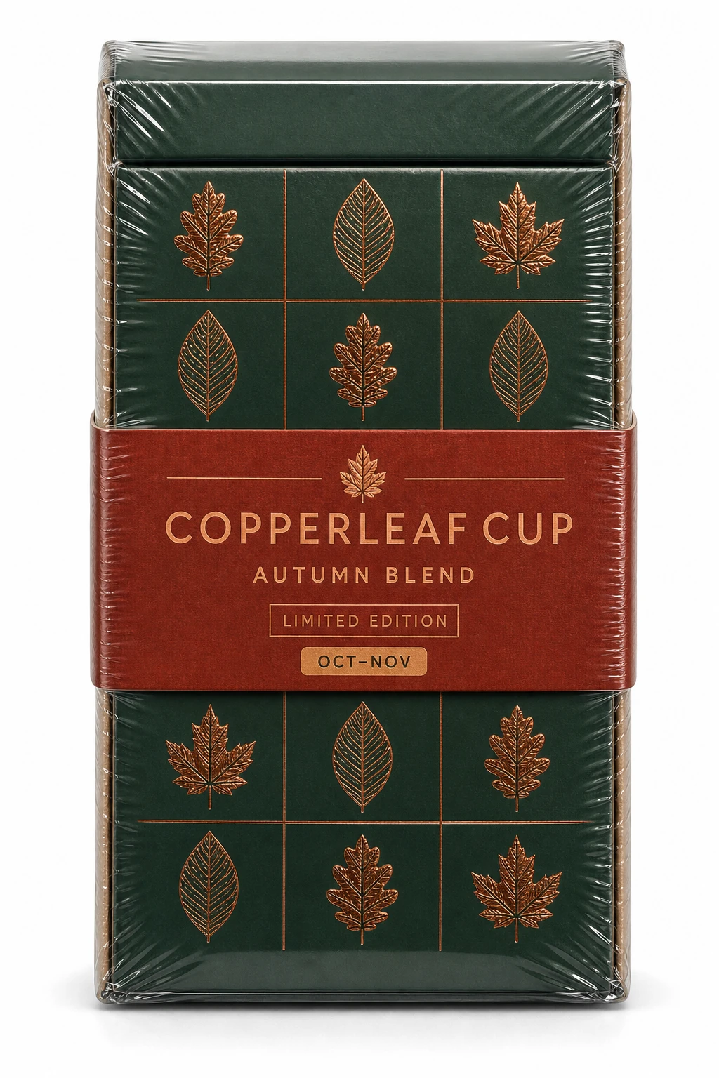
Seasonal Coffee Gift Carton Vacuum-Pack Study
For checking one seasonal coffee gift carton, exact date window, hierarchy, board texture, and vacuum-film behavior.
Seasonal Coffee Gift Carton Vacuum-Pack Study | Best for: For checking one seasonal coffee gift carton, exact date window, hierarchy, board texture, and vacuum-film behavior. | Prompt EN-C02-01-P15 | Check: COPPERLEAF CUP spelling, OCT–NOV window, carton silhouette, leaf-grid consistency, film behavior, and grounded shadow | If it fails: After an observed hierarchy or film failure, change only the failed label position or reflection and preserve the complete carton.
Expected result
A coherent single-carton seasonal mockup with readable dates, consistent graphics, and taut protective-film behavior.
Copy-ready tested prompt
Task: Create a vacuum-pack studio product mockup for a fictional seasonal coffee gift carton.
Subject: One hyper-realistic deep-green rigid COPPERLEAF CUP gift carton standing vertically, with a rust-red belly band, copper leaf-grid pattern, tactile kraft side edges, and an autumn campaign hierarchy. Glossy transparent vacuum packaging clings tightly around the carton faces, lid seam, belly-band edges, leaf embossing, corners, and base, creating visible tension lines and stretched areas.
Context: A café team is reviewing the complete seasonal package silhouette, exact date window, graphic hierarchy, carton construction, and protective-material behavior for a limited campaign.
Style: Premium commercial product photography in sharp focus, with intense rigid-board, kraft-edge, metallic-ink, belly-band, and glossy transparent-film texture in an original autumn palette.
Composition: Use a tall portrait canvas with a 2-to-3 aspect ratio. Center the one carton standing vertical and directly front-facing, showing the complete top-to-base silhouette. Keep the camera square to the front panel and make the taut film reveal every package contour without obscuring the copy.
Lighting: Pure white studio background with soft, even bilateral lighting; controlled reflections reveal the green board, copper ink, rust paper, and film tension, with a light contact shadow directly below.
Constraints: Use only these exact labels: “COPPERLEAF CUP”, “AUTUMN BLEND”, “LIMITED EDITION”, and “OCT–NOV”. No additional copy beyond the listed text. Keep the carton, lid seam, belly band, leaf grid, film tension, labels, and contact point coherent. Use original trade dress; avoid real logos, flavor or origin claims, urgency claims, watermarks, extra packages, and clipped edges.
Output: Portrait 2:3 front-facing single-object vacuum-pack studio mockup with readable English copy and inspectable paper, board, metallic ink, and transparent-film materials.
Adjustable parameters
Carton green, belly-band rust, copper leaf grid, date copy, film tension, front-plane alignment
Failure correction
After an observed hierarchy or film failure, change only the failed label position or reflection and preserve the complete carton.
Review focus
COPPERLEAF CUP spelling, OCT–NOV window, carton silhouette, leaf-grid consistency, film behavior, and grounded shadow
Model
GPT Image 2
Previously published product-design prompt archive (25)
The original source-backed 25 prompts and their 27 input/output images remain visible below as a read-only archive. They are not counted among the 15 current evidence-bound GPT Image 2 cards or the ItemList schema.
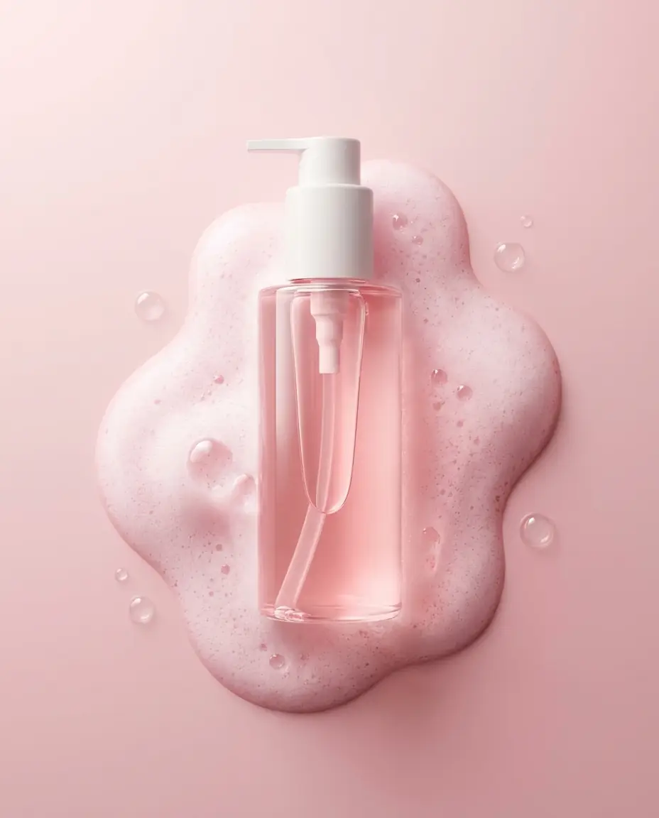
Luminous Skincare: Luxury Cleanser Bottle with Foam Bubbles
Premium minimalist skincare product photography. A translucent pink liquid cleanser bottle with a white pump dispenser placed vertically at the center of the frame. The bottle rests inside an organic pool of soft pink foamy bubbles, with airy soap lather spreading outward in smooth, rounded shapes. Small transparent bubbles float around the foam surface. Clean matte pastel pink background with subtle gradient. Soft diffused top lighting with gentle rim light creates a luminous glow through the liquid, highlighting the pump tube inside the bottle. Sharp focus, high clarity, realistic liquid refraction, smooth plastic and glass textures, luxury beauty advertising style, modern cosmetic branding, ultra-realistic, 8K detail, high dynamic range. --ar 4:5
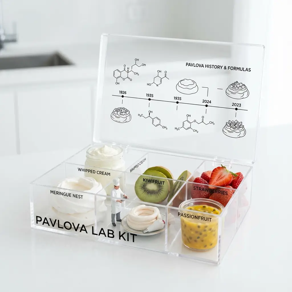
Creative Product Concept: Pavlova Lab Kit in Apple Style
A catchy 'Pavlova Lab Kit' in a clear acrylic organizer box with hinged lid. Input: Deconstructed Pavlova (Meringue nest, Whipped cream, Kiwifruit slices, Strawberries, Passionfruit pulp). Ingredients are raw and fresh. Graphic Style: Black line-art chemical formulas and timeline of Pavlova history printed on the lid and table. Minimalist sans-serif labels. A tiny 1:35 scale pastry chef figure inside the box is assembling the pavlova. Background: Blurred high-end white minimalist kitchen. Lighting: High-Key Clinical, bright diffuse daylight. 'Apple Product Photography' aesthetic.
Premium Japanese-style product poster in 16:9 landscape format, editorial design showcasing yuzu citrus juice skin packaging concept with sophisticated visual storytelling. LEFT SIDE (40% of canvas): Hero product - one large yuzu juice skin package displayed vertically with dramatic soft lighting, showing ultra-realistic yuzu peel texture wrapped around rectangular container, textured golden-yellow skin with natural bumps and dimples covering entire surface, rough organic texture with subtle oil glands visible, looks exactly like real yuzu citrus skin stretched over package. Below: one cross-sectioned fresh yuzu showing pale yellow creamy flesh with seeds. Japanese typography vertically aligned: 柚子スキン (Yuzu Skin) in elegant thin gothic font. Subtitle: 果汁皮膚 / 柚子 in refined style. Small design philosophy text in Japanese. CENTER (30% of canvas): Generous white negative space (Ma - 間), minimal geometric elements with delicate thin lines, floating text: 自然な素材 (natural materials), subtle minimalist brand mark, very subtle yuzu peel texture pattern in background at low opacity. RIGHT SIDE (30% of canvas): Two yuzu juice skin packages arranged artistically at different angles and heights, one whole fresh yuzu with natural textured golden skin, typography: Natural Packaging / 自然な包装, tagline: The skin is the package / 皮膚が包装である, detail callouts pointing to textured peel surface. DESIGN PRINCIPLES: Abundant white space, asymmetrical balance, Wabi-sabi aesthetic, Muji/Noritake editorial minimalism. COLOR PALETTE: golden yuzu tones, pure white background, pale yellow accent from flesh. PHOTOGRAPHY: Soft diffused studio lighting, ultra-sharp macro details showing textured peel, photorealistic rendering. CRITICAL: The yuzu skin packaging must look incredibly realistic - actual organic textured golden-yellow surface with natural bumps and oil glands, rough natural appearance, NOT plastic. 16:9 widescreen, high-end Japanese product poster, gallery quality.
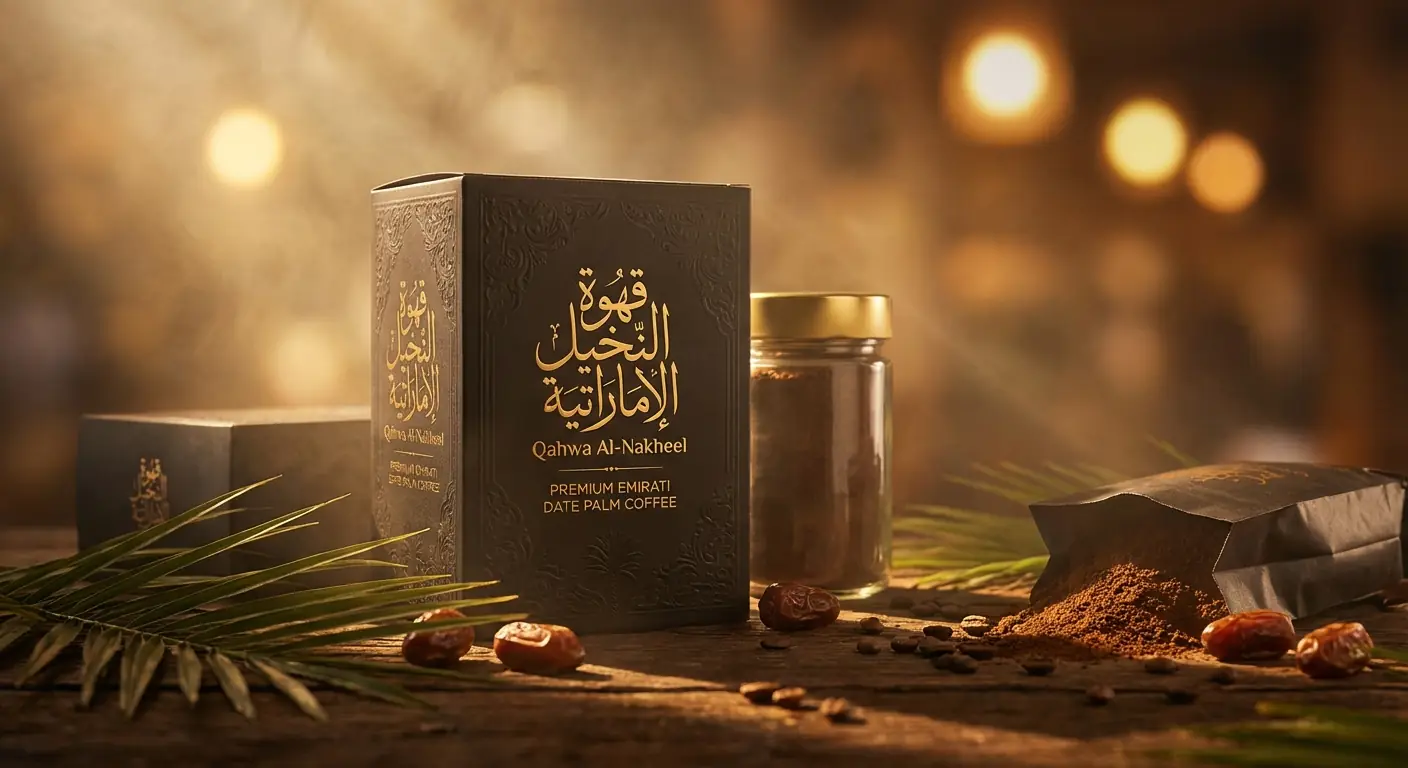
Premium Emirati date palm coffee luxury package, premium commercial hero shot, ultra-photorealistic 8K detail, studio-grade global illumination, controlled volumetric light beams shaping the product silhouette, soft rim lighting for edge separation, physically accurate material rendering, micro-surface imperfections visible, ray-traced reflections on glossy and matte surfaces, subtle atmospheric haze, shallow depth of field with clean bokeh, cinematic color grading with neutral whites and warm highlights, professional product photography aesthetic, high-end advertising look. Golden Arabic calligraphy on packaging, dates and palm leaves as decorative elements.
Vintage Camera Lens Collection Still Life Product Photography
by nanoprompts.org
Archived output image
Input required:
No input image required
Archived prompt
**Prompt:**
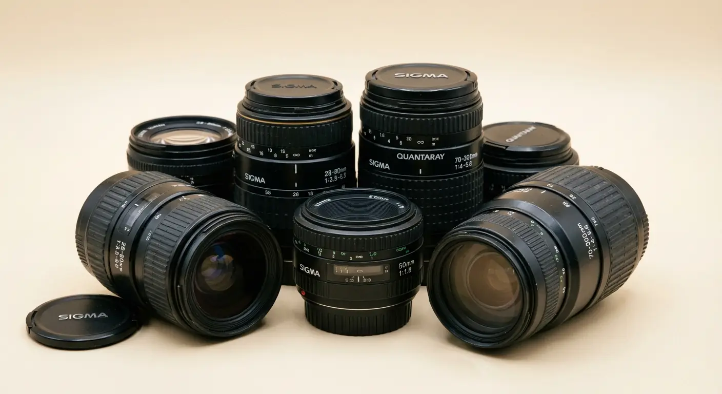
A still life product photograph of a collection of vintage SLR camera lenses arranged on a plain, seamless light beige studio background. Various black lenses, including brands like Sigma and Quantaray with visible focal length markings (e.g., 28-80mm) and lens caps, are grouped together. Soft, diffused studio lighting highlights the textures of the plastic barrels, rubber grip rings, and the glass elements. Shallow depth of field, focusing on the central lenses.
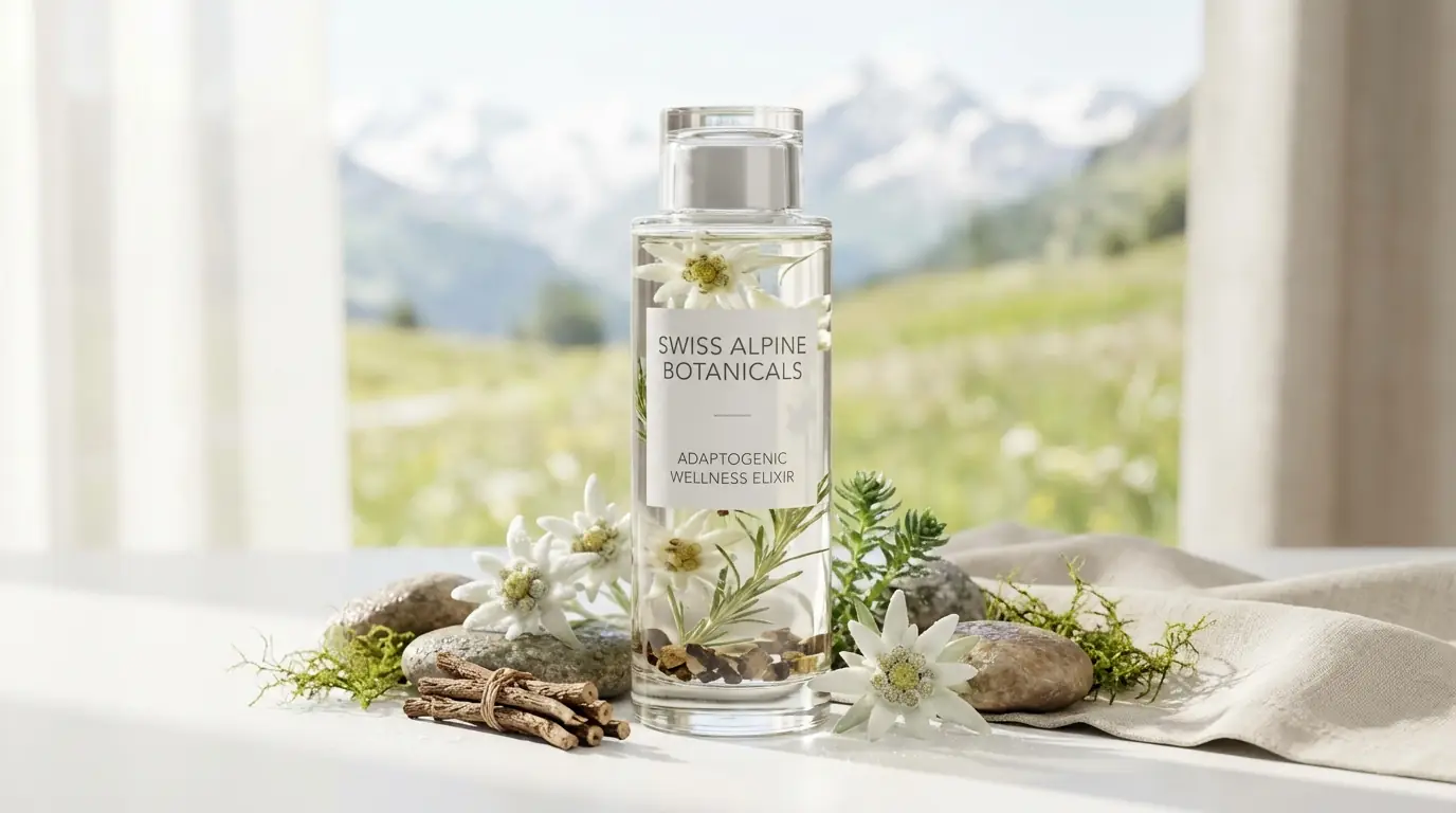
SWISS ALPINE BOTANICALS is launching a new functional wellness elixir featuring adaptogenic Swiss alpine herbs and natural energy ingredients. As the Creative Director, create a complete high-end promotional shot. The aesthetic should be premium, minimalist, and nature-inspired, featuring the sleek glass bottle with Swiss mountain spring water, organic edelweiss extract, and rhodiola root. Clean white background, soft natural lighting, botanical elements, luxury product photography style, 8K resolution.
KATHMANDU Leather Duffle: High-End Editorial Studio Photography with Unconventional Design
by nanoprompts.org
Archived output image
Input required:
No input image required
Archived prompt
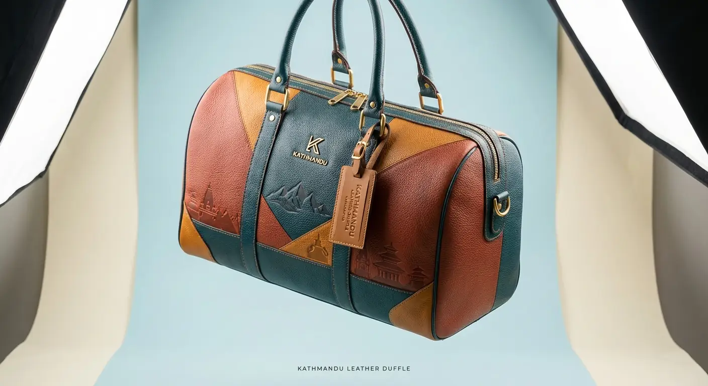
KATHMANDU luxury leather duffle bag, high-end editorial studio photograph. The duffle bag, designed with a unique, unconventional color palette and unexpected patterns or graphics relevant to KATHMANDU, is suspended against a seamless, soft pastel studio background with gentle, diffused lighting. The premium pebbled leather texture is prominent, with KATHMANDU logos and signature motifs integrated into the design. Polished metal hardware and a small leather luggage tag are visible. The scene is lit with professional softbox lighting, creating soft shadows and highlights. Shot with a shallow depth of field, the bag is in sharp focus. At the bottom, small, minimalist typography reads "KATHMANDU LEATHER DUFFLE".
Hyperrealistic Transparent Black Glass 3D Object: Futuristic Minimalist Floating Design
by nanoprompts.org
Archived output image
Input required:
No input image required
Archived prompt
Create a hyperrealistic 3D rendered object in an ultra-modern transparent black aesthetic. The subject features a sleek, futuristic, minimalistic floating design made of transparent black glass or polymer material with a smooth curved texture and high-gloss finish that shows partial internal reflections. The visual language conveys cutting-edge sophistication. Lighting consists of rim light and directional top light at high intensity, creating soft diffuse glow underneath with sharp specular highlights and reflections across transparent surfaces. The color palette is dominated by pure black, very dark grey, and near-black tones with accents of pure white and medium grey, creating very high contrast with an overall dark, glossy, and luminous tone. The rendering style is 3D hyperrealistic with ultra-high resolution quality and depth effects showing floating volumetric space with layered reflections. The background is a pure dark void with the object centered and floating, emphasizing transparency and dramatic lighting in a 1:1 aspect ratio composition.
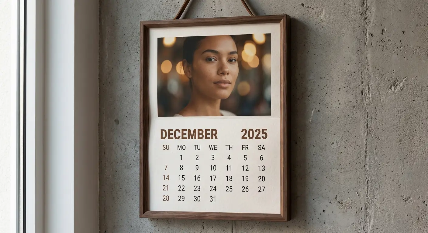
Premium Wall Calendar Design with Portrait Photo and December 2025 Layout
by nanoprompts.org
Archived output image
Input required:
Upload a portrait photo
Archived prompt
Create a realistic wall calendar hanging on a textured concrete wall, framed in a warm wooden frame. The top half features my uploaded portrait photo in a soft cinematic style, shallow depth of field, warm bokeh lights in the background, natural skin tones, calm confident expression. The bottom half displays a clean, modern calendar layout for December 2025, with bold month text on the left and year on the right, neatly aligned date grid below, Sundays to Saturdays clearly labeled. Minimal beige and brown color palette, elegant typography, realistic paper texture, soft natural sunlight casting gentle shadows, premium lifestyle photography look, ultra-high resolution.
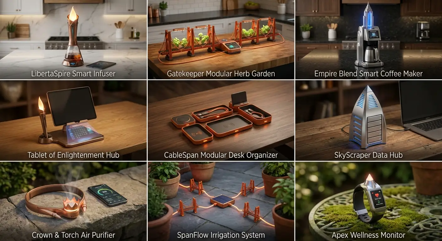
Transform US Landmarks into Smart Home Devices: 3x3 Grid Product Photography
by nanoprompts.org
Archived output image
Input required:
No input image required
Archived prompt
Step 1: Select 3 famous architectural landmarks of the United States (Statue of Liberty, Golden Gate Bridge, Empire State Building)
Step 2: Deeply analyze geometry, structural principles, material appearances, proportions, and symbolic features.
Step 3: Scale concepts down dramatically and fuse elements into 9 distinct everyday high-tech home or personal devices (kitchen, desk, wellness, garden).
Step 4: Ensure each invention solves a real 2025 consumer pain point with smart features (app control, sustainability, modularity).
Step 5: Produce a 3x3 grid of premium product photography on relevant surfaces (marble counter, oak desk), shallow DOF, luxurious lighting, catchy inventive names underneath. Include subtle UI glows or motion hints for functionality. include names
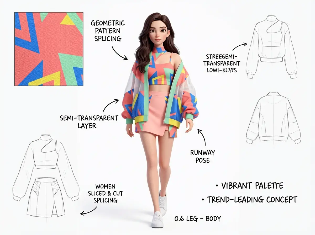
Pixar 3D Fashion Mood Board: Geometric Abstract Pattern Streetwear Design
by nanoprompts.org
Archived output image
Input required:
No input image required
Archived prompt
4:3 aspect ratio. A professional and detailed fashion Pixar 3D style mood board, presented in a clean, high-resolution style, depicting a slender and tall white female model with 0.6 leg-to-body ratio. The model appears in a standard runway walking pose, stepping forward, showcasing a modern and vibrant streetwear look against a pure white background. The entire outfit features geometric abstract patterns in vibrant colors (coral pink, electric blue, sunshine yellow, and mint green) as the textile design. She wears a unique cropped top with a high mock neck design, geometric cutout on the left shoulder exposing skin, and a thin spaghetti strap on the right side, both adorned with the signature pattern. Over it, she has a loose, boxy bomber-style jacket with dropped shoulders, wide sleeves, and ribbed cuffs. The jacket is based on large areas of coral pink and electric blue geometric patterned fabric, with prominent placement of mint green and yellow pattern fabric splicing, while covered with a layer of unique semi-transparent white fabric flowing ethereally from around the waist, adding layers and dreamy quality. The bottom is a sliced-cut silhouette skirt in light coral pink shade, also incorporating patterned fabric splicing. The entire look is finished with clean white sneakers. The model has deep brown long hair with slight natural waves, freely falling around her shoulders and face. She has delicate features, an oval face shape, understated makeup, natural eyebrows, deep expressive eyes, and soft pink lip color. Her expression is neutral, calm yet confident. The lighting is soft, bright, and even studio photography lighting, bringing gentle sheen to the fabrics and delicately outlining the garment contours and model's features, while casting minimal soft shadows to add depth and dimension. White design canvas dotted with additional design elements: 3-4 minimalist pencil line design sketches distributed on the right side and lower left of the frame. In the upper left corner position, there is an enlarged color detail box showing the precise texture of the fabric pattern. The background is scattered with various handwritten notes and annotations in black ink - designer's comments, bringing the overall professional design concept board visual effect. The overall atmosphere is elegant, artistic, and trend-leading.
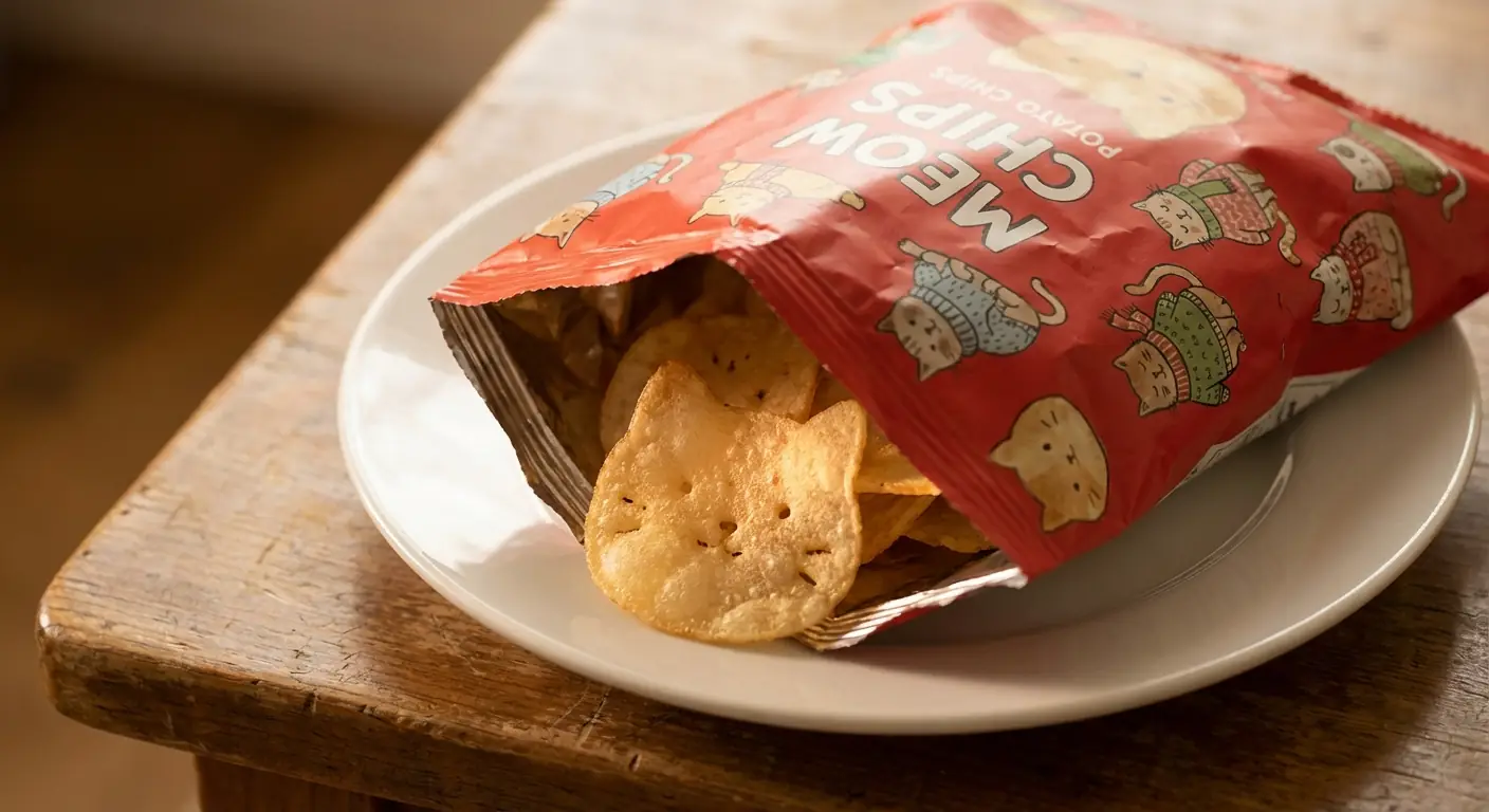
Adorable Cat-Shaped Potato Chips in Cat-Themed Packaging with Translucent Effect
by nanoprompts.org
Archived output image
Input required:
No input image required
Archived prompt
A close-up scene under warm indoor lighting: an adorable cat-themed potato chip bag sits open on a white plate placed on a wooden table. The bag is red and decorated with cute illustrated cats in a soft, comforting style. Inside, it is filled with uniquely shaped chips — each chip is shaped like a cat's head, complete with cute eyes, a mouth, and whiskers. The chips have a golden, crispy appearance, and they are extremely thin, allowing the light to shine through them with a beautiful, delicate effect. Shallow depth of field, vivid detail, realistic photography style, macro effect, soft natural lighting, high resolution; the overall atmosphere is warm, cute, playful, and highly creative.
Pizza-Themed Stationery Collection with 7 Creative Items and Hand-Lettered Labels
by nanoprompts.org
Archived output image
Input required:
No input image required
Archived prompt
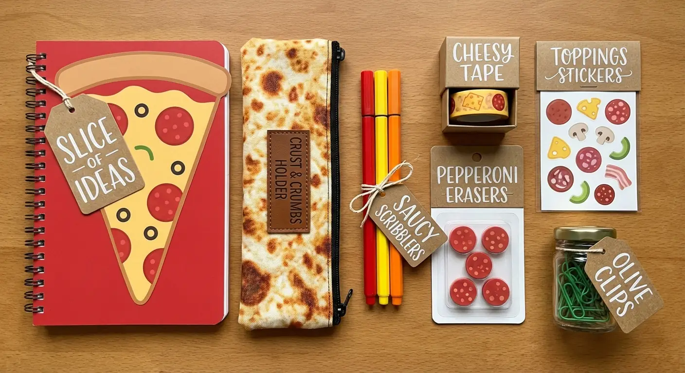
Create a 7-item stationery collection inspired by pizza, featuring hand-lettered labels indicating each item's use.
Premium Beverage Commercial Photography with Dynamic Liquid Splash and Ice
by nanoprompts.org
Archived output image
Input required:
No input image required
Archived prompt
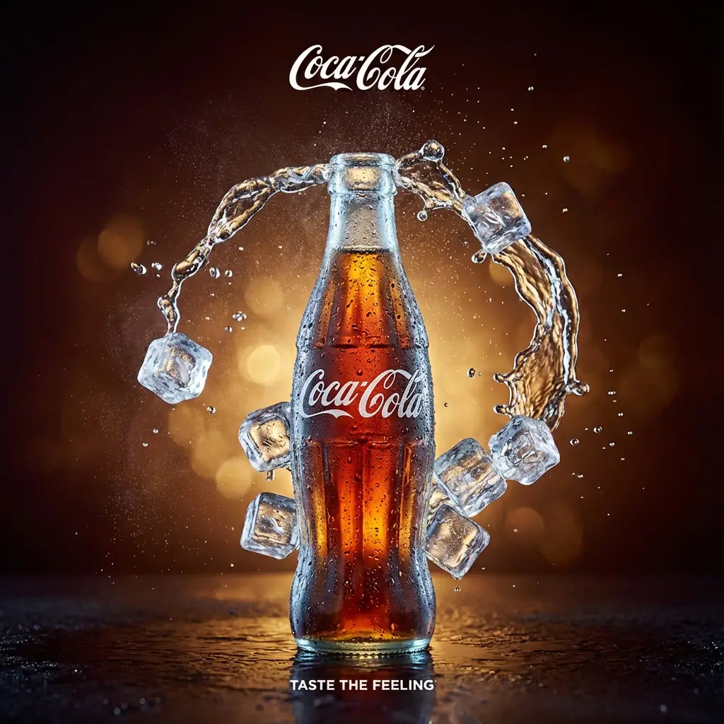
{
  "aspect_ratio": "1:1",
  "creative_direction": {
    "style": "High-end commercial photography, cinematic, hyper-realistic, luxurious.",
    "mood": "Intense refreshment, premium, energetic but controlled, dramatic.",
    "key_focus": "The irresistible coldness and explosive taste of the product."
  },
  "subject": {
    "hero": "A single glass bottle of Coca-Cola, center-stage.",
    "details": "Extreme condensation, real water droplets running down the glass, looks incredibly cold and frosty. The liquid inside glows with a rich caramel amber light."
  },
  "action_and_fx": {
    "splash": "A dynamic, sculptural arch of liquid and ice cubes erupting *around* and *behind* the bottle, framing it rather than obscuring it. The splash is elegant, not chaotic.",
    "ice": "Crystal clear, sharp ice cubes caught in motion within the liquid arch, catching the light like diamonds.",
    "particles": "Fine mist and effervescent bubbles suspended in the air to enhance atmosphere."
  },
  "lighting": {
    "type": "Dramatic, high-contrast cinematic lighting (Rembrandt lighting on bottle).",
    "colors": "Warm golden backlighting combined with cool, crisp key lighting on the front of the bottle and ice to emphasize temperature contrast."
  },
  "environment": {
    "background": "Deep, dark, atmospheric mahogany and amber gradient. Subtle, luxurious bokeh effects, no harsh rays or distracting elements. Infinite depth.",
    "surface": "The bottle rests on a dark, wet, reflective surface."
  },
  "branding & composition": {
    "hierarchy": "Product first, Brand second, Message third.",
    "logo_placement": "Elegant, white Coca-Cola script logo placed at the top center, smaller than before, refined and premium.",
    "slogan_placement": "Subtle 'TASTE THE FEELING' text in white, centered below the bottle, smaller font size.",
    "framing": "A tight, powerful central composition optimized for square format, drawing the eye directly to the bottle."
  }
}
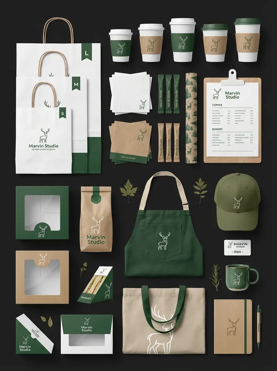
A massive, ultra-detailed brand ecosystem flat lay. Brand: Marvin Studio, Industry: Artisan Bakery & Coffee, Visual theme: Nordic Forest, Minimalist, Warm. Item categories: Packaging (shopping bags S/M/L, cake boxes, coffee bean pouch, sandwich wedge box, pastry box); Dining essentials (coffee cups with sleeves, paper napkins, sugar packets, tray liner paper, menu board); Staff uniform (folded green apron, embroidered baseball cap, staff name tag); Merchandise (canvas tote bag, ceramic mug, branded notebook, ballpoint pen). Visual style: Clean vector mockup with realistic texture mapping. Color palette: Forest Green (dominant), Matte White (sub-dominant), Kraft Paper Brown (texture), Beige (accent). Logo style: Minimalist line-art deer. Composition: Dense knolling, solid dark charcoal background (#1A1A1A), 90-degree top-down orthographic view. High detail level, premium texture quality, 3:4 aspect ratio.
Brand Flat Lay Photography: Mango Fruit Tea Theme with Distinct Material Textures
by nanoprompts.org
Archived output image
Input required:
No input image required
Archived prompt
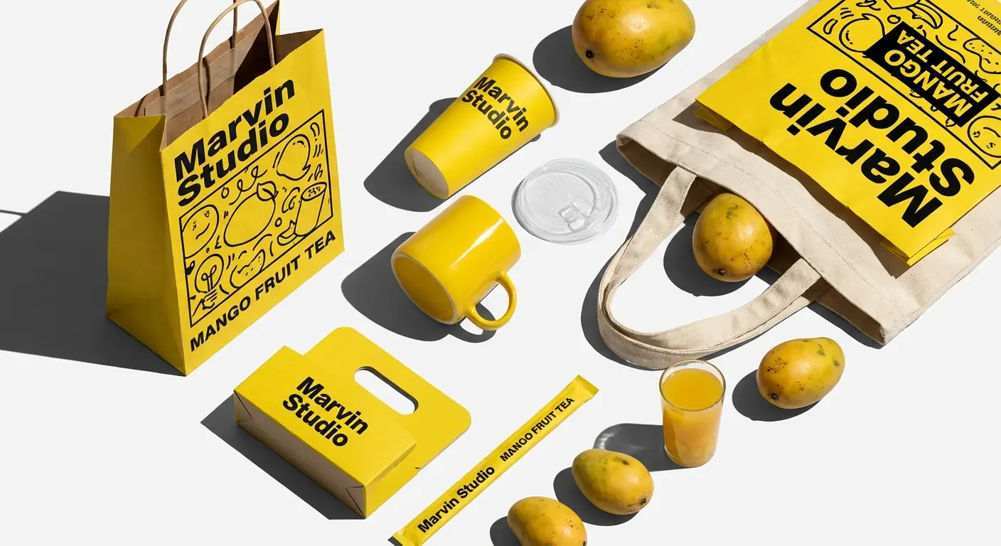
A high-contrast brand flat lay with distinct material textures. A vibrant yellow brand identity collection arranged in dynamic knolling. Brand: Marvin Studio, Theme: Mango Fruit Tea, Graphics: Pop-art doodles and bold black lines. Material mapping: Paper items (shopping bag, cup carrier, straw wrapper) with matte finish and slight paper grain; Glossy items (ceramic mug, plastic cup lid) with high gloss and sharp specular highlights; Fabric items (tote bag) with coarse canvas weave; Organic items (fresh mangoes) with waxy fruit skin. Lighting: Hard sunlight/direct flash with sharp defined pitch black cast shadows from top-left to bottom-right. Composition: Scattered knolling style, isometric/high-angle perspective, clean white studio backdrop. Vibrant colors, 4K resolution.
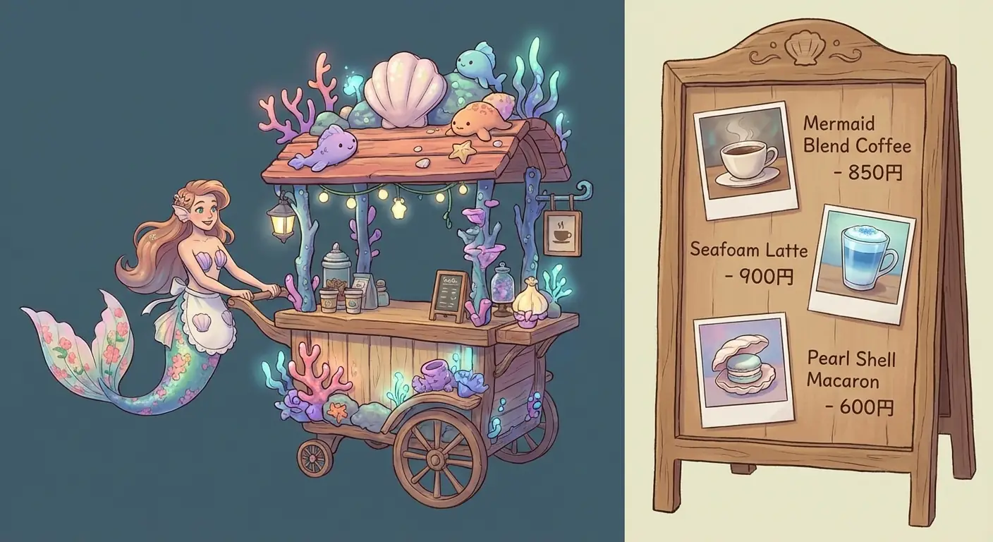
3D Cartoon Cafe Wagon Menu Design with Product Photography
by nanoprompts.org
Archived output image
Input required:
No input image required
Archived prompt
On the left side, a cafe wagon made with 3D game models is depicted, styled in 3D cartoon fashion. The protagonist is a mermaid. On the right quarter, menu photos with prices are arranged, showing 2 types of coffee and 1 type of dessert. The overall art style is delicate and healing, with a high-design composition, rendered in high resolution.
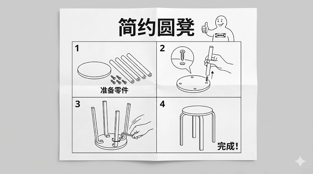
IKEA style furniture assembly instructions, full page layout, black and white line drawing, minimalist vector style. 1. Top title area: In the center of the top of the paper, clearly write the product name in bold black text: "Simple Round Stool". Next to it, draw a classic cartoon character smiling and giving a thumbs up.
2. Step breakdown (2x2 grid layout):
Top left (Step 1): The screen displays the parts list. It shows 1 round wooden board (seat), 4 identical cylindrical wooden legs, and 6 screws. Next to it, label in Chinese: "Prepare Parts".
Top right (Step 2): The chair seat is flipped upside down. A hand is inserting a wooden leg into a hole in the base. There is a magnifying glass bubble next to it showing details of the screw aligned with the hole.
Bottom left (Step 3): All 4 legs are inserted, and a hand is holding an L-shaped wrench to tighten the last screw. The action has dynamic lines.
Bottom right (Step 4): Assembly complete. The chair is flipped back to the front and stands firmly on the ground. Next to it is a large Chinese text: "Done!".
Overall texture: The paper surface has slight creases, even lighting, sharp and clear text and lines.
Ratio 16:9
Tiny diorama shop for [BRAND]. Roof made of oversized [PRODUCT], big [BRAND] logo sign above the window, vendor handing a [PRODUCT] to a customer, ground covered with many [PRODUCT]. Hand-made polymer-clay look, studio macro photo, soft light, shallow depth of field, vertical 3:4
Ultra-realistic product photo.
Subject: virtual holographic character [CHARACTER], floating above a circular hologram projector Ø120 mm placed on a modern desk.

Projection source rules:
- If input reference is a 3D object → show a desktop 3D scanner beside the projector.
  Place the reference object on the scanner plate.
  The hologram above the projector is generated from this scanned object.
- If input reference is a 2D image → show a modern PC with monitor on the desk.
  Display the reference image on the monitor screen.
  The hologram above the projector is generated from this screen content.

Hologram rendering rules:
- Character always appears as a semi-transparent volumetric image, background faintly visible through.
- No beams, no particles, no solid statue surfaces.
- Balanced anatomy (1/7–1/8 head-to-body ratio), correct proportions.
- Natural pose with clear silhouette.
- Hair, outfit folds, and accessories visible but translucent.
- Face crisp and expressive, readable at 1000 px crop.
- No copyrighted characters, no branded designs, no IP logos.

Environment: modern desk with projector base + conditional device (scanner or monitor).
Camera: 85–100 mm lens, 3/4 hero angle, eye-level, f/11–f/16, ISO100, tripod.
Lighting: desk softly illuminated; holographic figure defined only by volumetric light.
Background: seamless black studio with subtle reflections.

Output: 4:5, 2048×2560.

Negative: text-free, watermark-free, logo-free, brand-free, copyrighted characters, franchise IP, trademarked designs, resin, PVC, physical statue, opaque surfaces, toy gloss, beams, scanlines, dots, distortion, extra digits.
Sampling: deterministic, seed=12345, temperature=0.
A photorealistic image of an ultra-detailed sculpture of the subject in image made of shining marble. The sculpture should display smooth and reflective marble surface, emphasizing its luster and artistic craftsmanship. The design is elegant, highlighting the beauty and depth of marble. The lighting in the image should enhance the sculpture's contours and textures, creating a visually stunning and mesmerizing effect
Product mockup prompt FAQ
What belongs in a product mockup prompt?
Specify the task, fictional or authorized product, commercial context, visual style, composition, lighting, constraints, and output. For packaging, also lock geometry, material, label hierarchy, approved copy, visible planes, scale, and the review decision the image must support.
Can I use an existing product photo?
Yes, when you own the image or have permission to use and transform it. State which product geometry, label placement, colors, and proportions must stay unchanged, and confirm that people, trademarks, locations, and licensed assets in the input are authorized for the intended use.
How do I keep packaging text readable?
Write the approved copy in reading order, quote the exact labels, give each line a clear role, and reserve enough physical label area in the composition. Review the result visually and with OCR. If one word fails, preserve the full first-pass evidence and make a local correction to that word or placement only.
How do I avoid copying another brand?
Use original names, geometry, palette, typography, iconography, and material combinations. Treat public prompt examples as pattern references, not assets to reproduce. Compare the result against familiar category leaders and reject any output whose overall trade dress could cause confusion.
Which aspect ratio fits packaging reviews?
Landscape 3:2 works well for proposal boards, product families, retail displays, and marketplace explainers. A taller frame can help a single carton or poster, while square suits social launch cards. Choose the ratio from the review surface instead of forcing every package into one layout.
Are Nano Banana product prompts and GPT Image 2 prompts interchangeable?
The same eight-element brief is a useful starting structure, but model behavior, editing controls, text rendering, and input-image handling can differ. These current examples were generated with GPT Image 2; treat the older Nano Banana archive as idea history and revalidate any prompt before production.