15 tested Nano Banana 2 examples

Transparent Glass Profile Card Prompts

Transparent glass profile card prompts tell an image model how to combine a fictional identity, legible interface hierarchy, translucent material, controlled refraction, and a presentation scene. The 15 free examples on this page were generated with Nano Banana 2 and each one defines the task, subject, context, style, composition, lighting, constraints, and output. Start by choosing the card purpose, then replace the fictional name, short labels, palette, and support surface. Keep text on a lightly frosted zone, reserve glow for the outer rim, and state the exact number of cards so the result stays readable, original, and easy to crop for a portfolio or campaign.

Build creator cards, portfolio identities, event profiles, original gaming panels, and an accessible light/dark comparison without copying a real platform.

Glassmorphism profile card parameter guide

Use this compact table before editing any prompt. It keeps an AI profile card design readable while preserving the transparent material effect.

DecisionRecommended starting pointChange whenAvoid
MaterialFrosted glass with a clear rimText needs a calmer surfaceFully transparent text zones
ContrastNear-white type on a dark tintBuilding a light-mode cardMid-gray type on clear glass
CompositionOne card, three-quarter viewShowing a layout systemMultiple overlapping cards
LightingSoft key plus colored rimThe palette needs emphasisHard glare across text
Output4:5 portrait, 1KA banner needs more widthCropping card edges

15 transparent glass profile card prompts and results

Every prompt below is visible, copyable, and paired with its own generated output. The collection ranges from a neon glass card prompt to a calm digital business card prompt, with distinct palettes and physical presentations.

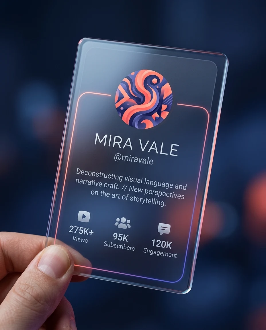
Content Creator Profile Card made with transparent glass profile card prompts and Nano Banana 2

Prompt 01 · T1-P01

Content Creator Profile Card

Best for: A creator needs a polished vertical profile visual for a media kit without copying a real platform.

Task: Generate a premium transparent glass profile card visual. Subject: a fictional video essay creator named Mira Vale, with an abstract coral-and-indigo avatar, the short handle “@miravale”, a two-line bio about visual storytelling, and three simple creator metrics. Context: a standalone personal media-kit cover with no organization, network, platform, or sponsor identity. Style: photorealistic glassmorphism with precise UI hierarchy, rounded corners, subtle chromatic refraction, and restrained neon accents. Composition: one vertical card centered in a 4:5 frame, tilted eight degrees, held at the lower corner by one natural hand, with ample negative space and no overlapping panels. Lighting: soft cool key light from upper left, coral rim light, dim navy studio bokeh. Constraints: the only identity text is “Mira Vale” and “@miravale”; show no header label, network name, company name, logo, domain, email, watermark, extra fingers, duplicate text, or glare over the profile details, and keep every card edge visible. Output: one 1024×1280 Web-ready portrait image with crisp material detail and a clearly readable fictional profile hierarchy.

Expected result: A single coral-edged creator card held against a dark studio background.

Adjust: accent=coral/indigo | avatar=abstract portrait | tilt=8° | ratio=4:5

Failure correction: If text or fingers distort, add “reduce UI copy to the listed fields, show exactly one hand with five natural fingers, keep text on a lightly frosted panel.”

Content Creator Profile Card | A creator needs a polished vertical profile visual for a media kit without copying a real platform. | T1-P01 | Check card outline, type zone, refraction, and brand safety.
Designer Portfolio Card made with transparent glass profile card prompts and Nano Banana 2

Prompt 02 · T1-P02

Designer Portfolio Card

Best for: A product designer wants a case-study cover that feels tactile and modern.

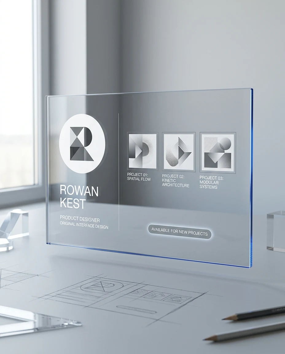
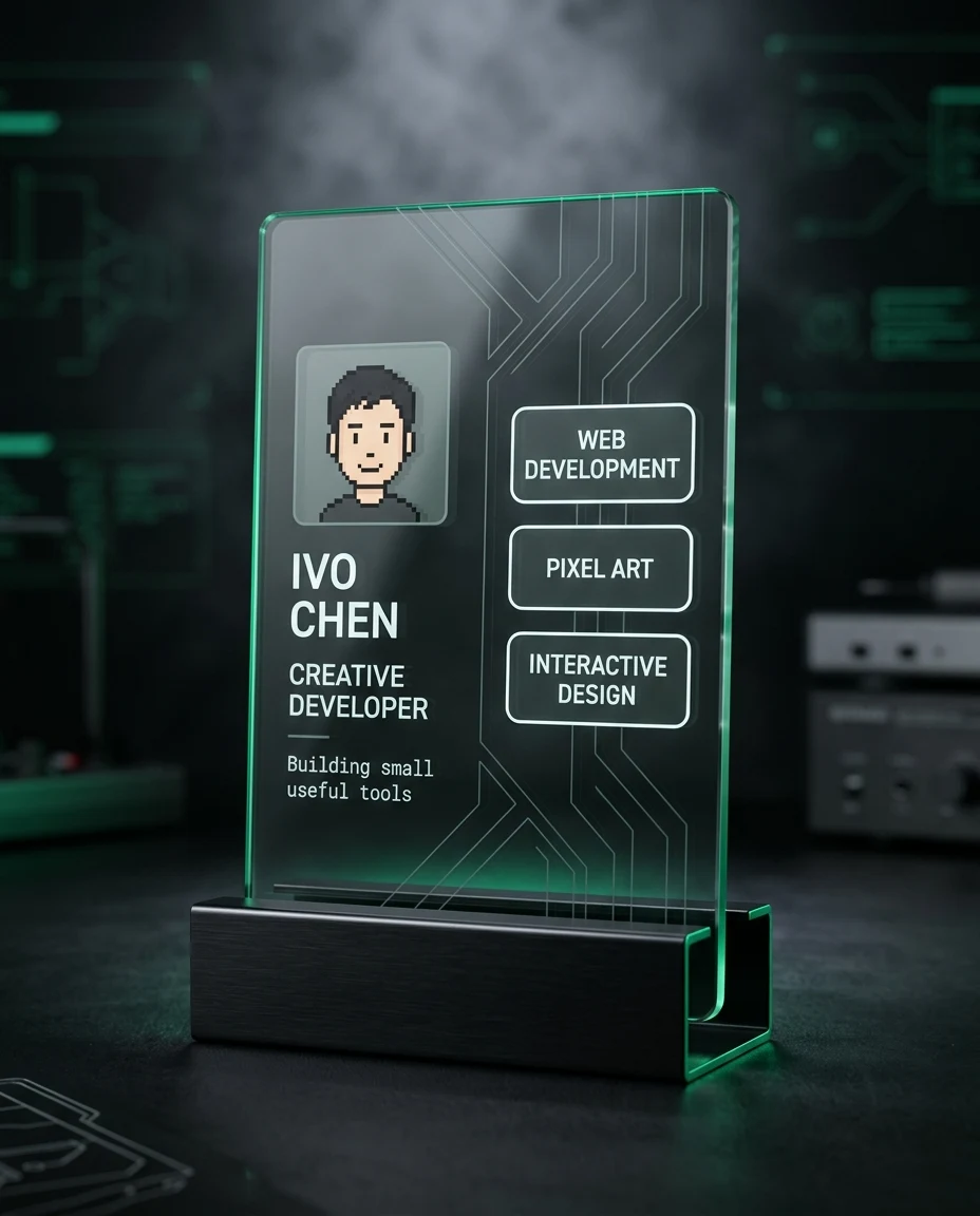
Task: Create a transparent glass portfolio profile card for an original interface designer. Subject: fictional designer Rowan Kest, a geometric monochrome avatar, role label “Product Designer”, three tiny project thumbnails represented only by abstract shapes, and a short availability badge. Context: the hero image of a personal portfolio case study. Style: refined editorial glassmorphism, Swiss-inspired grid, smoke-gray acrylic, cobalt blue edge light, minimal sans-serif interface. Composition: a large landscape card floating above a matte drafting table, photographed from a gentle overhead three-quarter angle; align the identity block left and the abstract work strip right. Lighting: broad daylight from a studio window with a narrow cobalt rim and soft contact shadow. Constraints: no real company marks, no copied product screens, no device mockup, no illegible paragraphs, no fingerprints, no clipped corners, and no second card. Output: one 4:5 portrait image at 1024×1280 showing the complete card, sharp UI spacing, and realistic glass thickness.

Expected result: A smoky portfolio card floating over a clean design desk.

Adjust: glass=smoke gray | accent=cobalt | camera=overhead 30° | ratio=4:5

Failure correction: If the work strip becomes fake screenshots, add “replace all project previews with unlabeled circles, blocks, and line patterns.”

Designer Portfolio Card | A product designer wants a case-study cover that feels tactile and modern. | T1-P02 | Check card outline, type zone, refraction, and brand safety.
Developer Identity Card made with transparent glass profile card prompts and Nano Banana 2

Prompt 03 · T1-P03

Developer Identity Card

Best for: A developer needs an original identity graphic for a technical profile page.

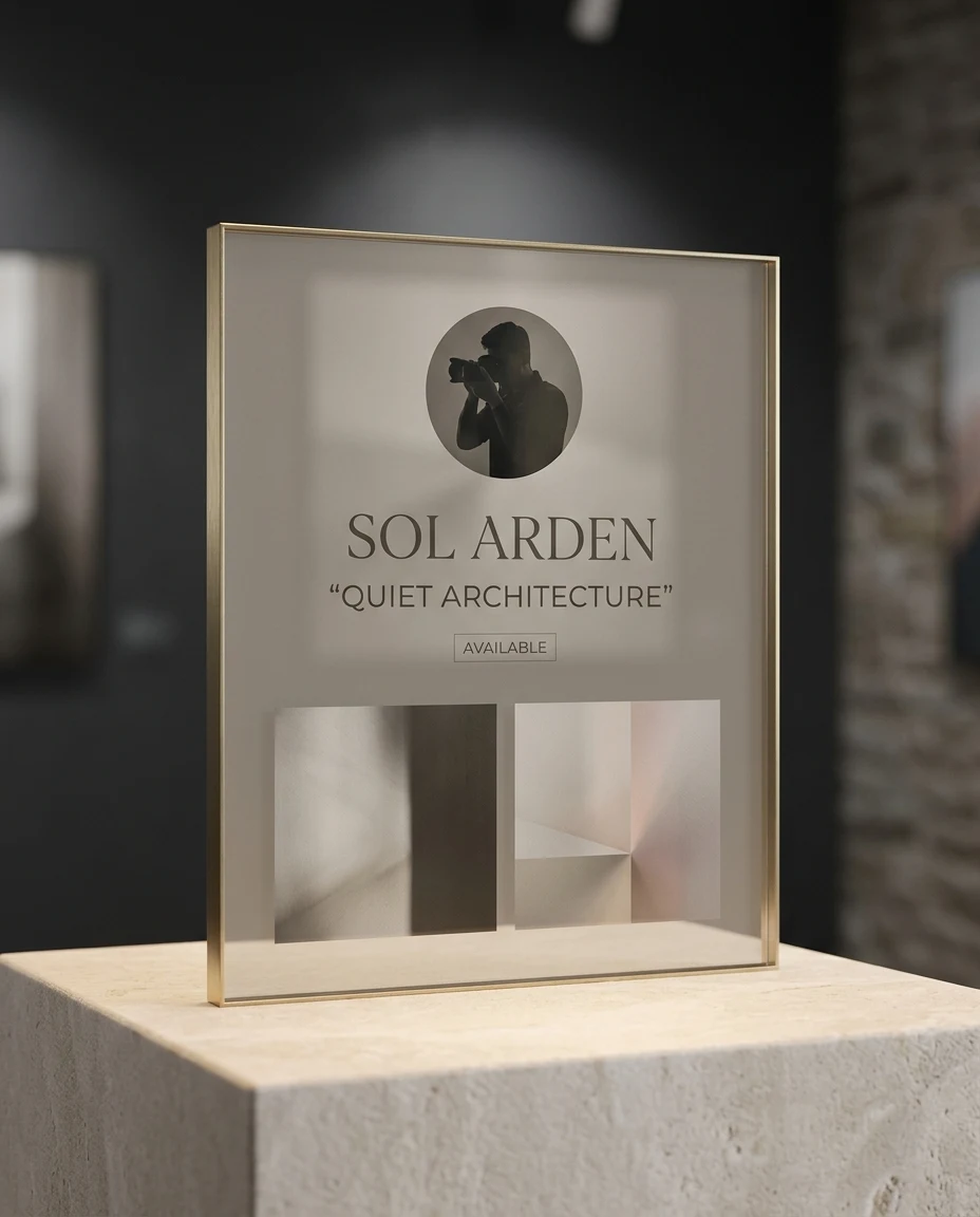
Task: Render a transparent glass developer identity card. Subject: fictional developer Ivo Chen, a simple pixel-inspired avatar, role “Creative Developer”, three skill chips, and a compact status line reading “Building small useful tools”. Context: a dark technical portfolio landing page for an independent maker. Style: clean cyber-minimal glass UI, graphite tint, emerald edge emission, subtle etched circuit pattern used as decoration rather than a logo. Composition: one horizontal card resting upright on a black metal stand, viewed straight on with slight depth visible along the right edge; identity at left, skill chips at right. Lighting: controlled black-box studio light, soft white frontal fill, emerald underglow, faint haze behind the card. Constraints: no source-code paragraphs, no real software logos, no terminal brands, no watermark, no extra cards, no blown highlights, and keep the stand physically plausible. Output: one 1024×1280 portrait render with the entire card centered and the interface large enough to read at mobile width.

Expected result: A graphite developer card on a stand with emerald underglow.

Adjust: tint=graphite | accent=emerald | support=metal stand | ratio=4:5

Failure correction: If the circuitry overwhelms the identity, add “make the etched circuit pattern five-percent opacity and keep it outside the text zones.”

Developer Identity Card | A developer needs an original identity graphic for a technical profile page. | T1-P03 | Check card outline, type zone, refraction, and brand safety.
Photographer Portfolio Card made with transparent glass profile card prompts and Nano Banana 2

Prompt 04 · T1-P04

Photographer Portfolio Card

Best for: A photographer wants a premium contact card that foregrounds imagery without using real work.

Task: Generate a transparent glass photographer profile card. Subject: fictional photographer Sol Arden, a circular silhouette avatar, specialty “Quiet Architecture”, two abstract image swatches with no recognizable location, and one small status label reading “Available”. Context: a portfolio leave-behind displayed in a gallery reception. Style: elegant museum-grade acrylic, warm neutral tint, fine brass edge, restrained editorial typography, subtle grain in the background only. Composition: one square glass card standing on a pale stone plinth, camera at eye level, identity on the upper half and two tonal swatches along the bottom. Lighting: soft gallery spotlight from above, warm bounce from the stone, delicate brass rim reflection, deep charcoal backdrop. Constraints: show no email address, URL, domain, social handle, QR code, contact details, camera brand, famous building, real photograph, duplicated card, floating UI, unreadable microtext, or cropped edge. Output: one 4:5 portrait image at 1024×1280 with realistic transparent material and a calm luxury mood.

Expected result: A brass-edged photography card on a pale gallery plinth.

Adjust: base=stone | edge=brass | mood=gallery quiet | ratio=4:5

Failure correction: If the glass disappears into the background, add “increase the warm rim reflection and add a faint frosted interior panel behind the identity.”

Photographer Portfolio Card | A photographer wants a premium contact card that foregrounds imagery without using real work. | T1-P04 | Check card outline, type zone, refraction, and brand safety.
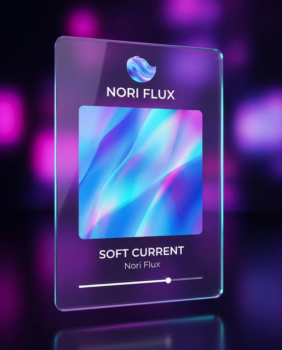
Musician Release Card made with transparent glass profile card prompts and Nano Banana 2

Prompt 05 · T1-P05

Musician Release Card

Best for: An independent musician needs a fictional release-profile visual without imitating a streaming service.

Task: Create a transparent glass musician profile and release card. Subject: fictional electronic musician Nori Flux, an abstract wave avatar, artist label, release title “Soft Current”, and one simple playback progress line without controls copied from any service. Context: a social announcement for an original ambient single. Style: luminous glassmorphism, translucent violet acrylic, cyan-magenta edge dispersion, soft volumetric atmosphere, minimal custom interface. Composition: a single tall card suspended above a dark reflective surface, slight low camera angle, avatar and artist name at top, abstract cover square centered, release title below. Lighting: violet backlight, cyan side rim, soft frontal fill, blurred magenta practical lights in the distance. Constraints: no real streaming logos, no recognizable album art, no headphones brand, no copyrighted lyrics, no extra cards, no watermark, and keep the interface sparse and readable. Output: one 1024×1280 4:5 portrait image with the full floating card and a distinct violet-cyan palette.

Expected result: A suspended violet music card with an abstract cover tile.

Adjust: palette=violet/cyan | cover=abstract wave | camera=low 10° | ratio=4:5

Failure correction: If the design resembles a known app, add “use a fully original arrangement with no familiar icons or platform navigation.”

Musician Release Card | An independent musician needs a fictional release-profile visual without imitating a streaming service. | T1-P05 | Check card outline, type zone, refraction, and brand safety.
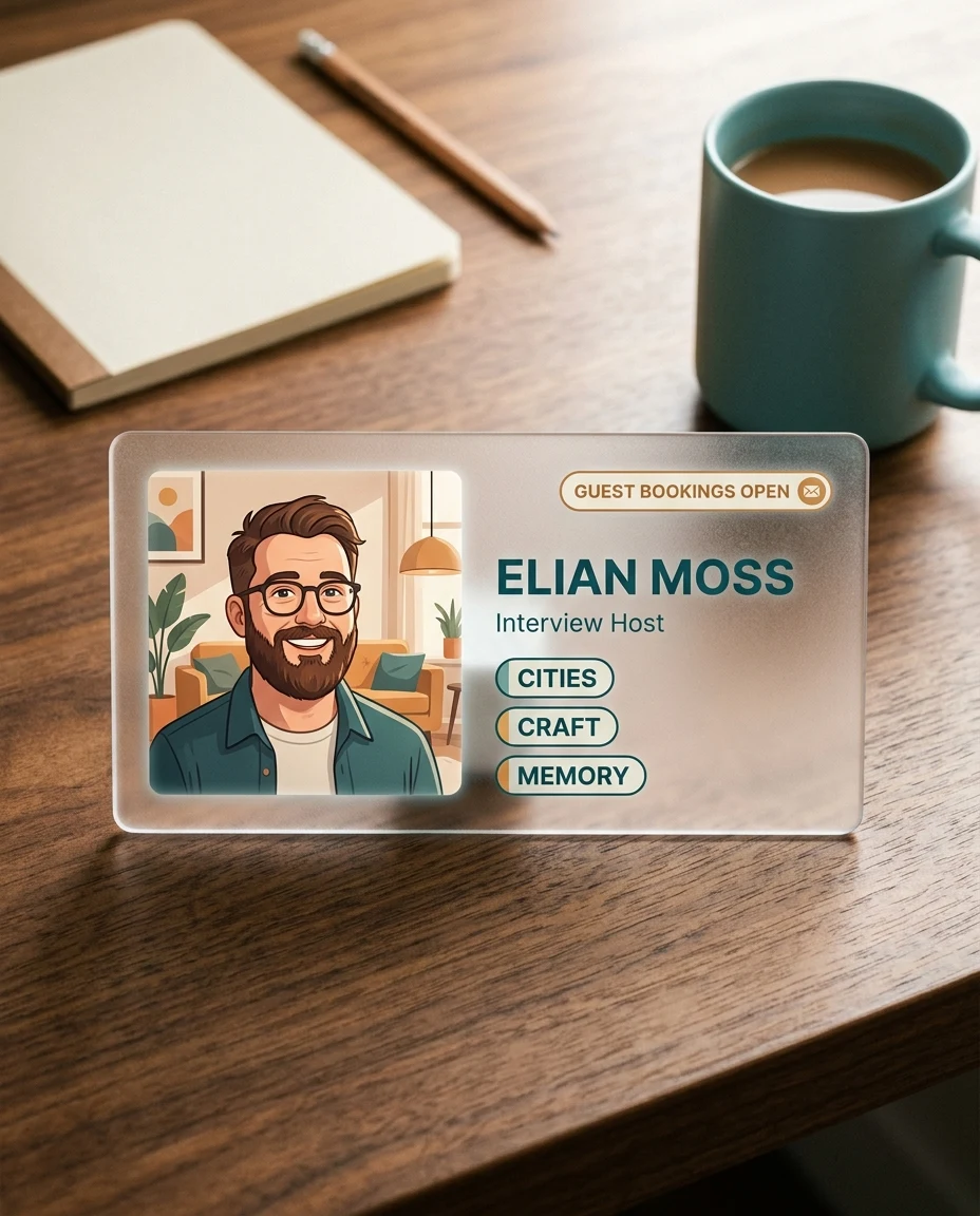
Podcast Host Card made with transparent glass profile card prompts and Nano Banana 2

Prompt 06 · T1-P06

Podcast Host Card

Best for: A podcast host wants a guest-booking profile graphic with clear topic cues.

Task: Design a transparent glass podcast host profile card. Subject: fictional host Elian Moss, a warm illustrated avatar, role label “Interview Host”, three topic tags—cities, craft, and memory—and a small “Guest bookings open” badge. Context: a standalone press profile for an independent interview podcast with no program or network name. Style: tactile frosted glass, rounded editorial interface, amber and teal accents, friendly contemporary illustration, no platform mimicry. Composition: one unmistakably wide landscape card, width about eighty percent of the 4:5 canvas and height about forty percent, placed horizontally on a walnut desk beside an unbranded ceramic cup and a blank paper notebook; keep the card as the dominant subject. Lighting: warm morning window light from the right, soft teal fill from the background, gentle shadow under the glass. Constraints: no show title, network name, logo, microphone brand, copied podcast-player controls, domain, email, dense paragraph text, extra hands, glare across the badge, vertical card, or cropped card. Output: one 4:5 portrait image at 1024×1280 containing a clearly horizontal host card with readable topic hierarchy and realistic frosted edges.

Expected result: An amber-teal host card on a warm desk scene.

Adjust: surface=walnut | accent=amber/teal | props=cup/notebook | ratio=4:5

Failure correction: If props compete with the card, add “reduce props to soft out-of-focus shapes occupying less than twenty percent of the frame.”

Podcast Host Card | A podcast host wants a guest-booking profile graphic with clear topic cues. | T1-P06 | Check card outline, type zone, refraction, and brand safety.
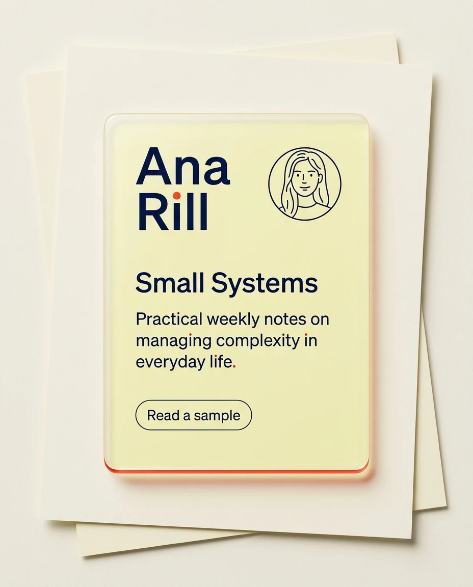
Newsletter Author Card made with transparent glass profile card prompts and Nano Banana 2

Prompt 07 · T1-P07

Newsletter Author Card

Best for: A newsletter writer needs a compact subscription-profile illustration for a landing page.

Task: Generate a transparent glass newsletter author card. Subject: fictional writer Ana Rill shown as the primary identity in large type beside a line-drawn avatar; place the secondary newsletter title “Small Systems” below her name, followed by a one-sentence promise about practical weekly notes and a simple rounded “Read a sample” label. Context: the hero visual for an independent newsletter signup page. Style: bright glassmorphism on a paper-like background, clear acrylic with pale lemon tint, navy type, red-orange micro accents, crisp editorial spacing. Composition: one portrait card lying slightly raised above layered cream paper sheets, camera overhead, Ana Rill and her avatar in the top third, the newsletter title and message in the center, and generous empty space. Lighting: diffuse daylight, soft paper bounce, a subtle red-orange rim on the lower edge, minimal shadow. Constraints: the author name “Ana Rill” must be clearly visible and larger than “Small Systems”; no real newsletter platform, email-service logo, domain, long body copy, glass glare over words, extra card, watermark, or cropped corner. Output: one 1024×1280 4:5 image that unmistakably reads as Ana Rill’s author profile card.

Expected result: A lemon-tinted author card above layered cream paper.

Adjust: background=cream paper | accent=red-orange | view=overhead | ratio=4:5

Failure correction: If the card looks opaque, add “show clear refracted paper edges beneath the acrylic while preserving a frosted text panel.”

Newsletter Author Card | A newsletter writer needs a compact subscription-profile illustration for a landing page. | T1-P07 | Check card outline, type zone, refraction, and brand safety.
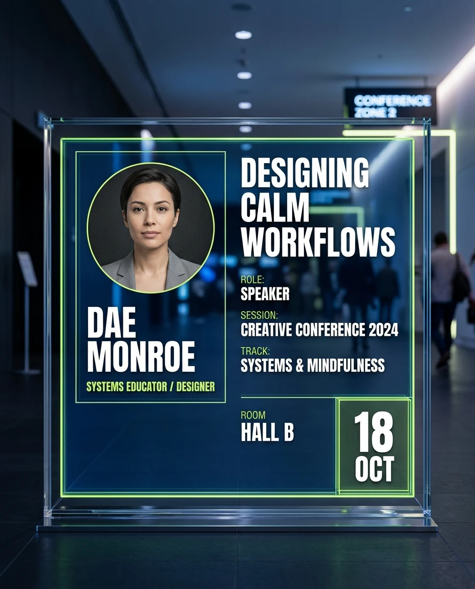
Event Speaker Card made with transparent glass profile card prompts and Nano Banana 2

Prompt 08 · T1-P08

Event Speaker Card

Best for: An organizer needs a fictional speaker card that can anchor an event agenda.

Task: Create a transparent glass event speaker profile card. Subject: fictional systems educator Dae Monroe, a neutral studio avatar, session title “Designing Calm Workflows”, role line, date “18 OCT”, and room label “Hall B”. Context: a fictional creative conference schedule display. Style: architectural glass UI, deep blue tint, electric lime edge, bold modular typography, polished event-identity aesthetic without borrowing an existing conference brand. Composition: one wide card mounted in a freestanding clear frame, photographed frontally in a dark venue corridor; portrait block left, session details right, date isolated in the lower corner. Lighting: cool overhead venue light, lime rim from behind, soft face-level fill, controlled reflections. Constraints: no real event name, no sponsor logo, no famous speaker, no crowd faces, no duplicate date, no clipped frame, and no unreadable decorative text. Output: one 4:5 portrait image at 1024×1280 showing the full display and clear session hierarchy.

Expected result: A blue-lime speaker card displayed in a dark venue corridor.

Adjust: frame=freestanding | accent=lime | layout=portrait left | ratio=4:5

Failure correction: If the date repeats or mutates, add “display the date exactly once as 18 OCT and omit all other numbers.”

Event Speaker Card | An organizer needs a fictional speaker card that can anchor an event agenda. | T1-P08 | Check card outline, type zone, refraction, and brand safety.
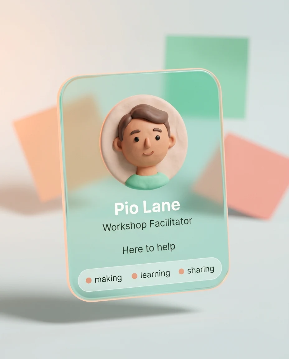
Community Member Card made with transparent glass profile card prompts and Nano Banana 2

Prompt 09 · T1-P09

Community Member Card

Best for: A private learning group wants welcoming member cards with no social-platform branding.

Task: Render a transparent glass community member profile card. Subject: fictional member Pio Lane, a soft clay-style avatar, role “Workshop Facilitator”, three interest dots for making, learning, and sharing, and a friendly status “Here to help”. Context: an onboarding directory for a fictional peer-learning circle. Style: playful soft glass, rounded pill shapes, mint tint, peach edge glow, simple clay illustration, inclusive and approachable interface. Composition: one rounded-square card standing at a slight angle among three blurred colored paper shapes; center the avatar above the role and arrange interest dots along the bottom. Lighting: large softbox from front, peach rim from rear left, airy pale-gray background, low contrast shadow. Constraints: no real community logo, no platform icons, no badges implying verification, no extra profile cards, no text outside the card, no distorted avatar features, and no crop. Output: one 1024×1280 4:5 portrait image with a clearly distinct mint-and-peach visual identity.

Expected result: A mint community card with a clay avatar and peach glow.

Adjust: avatar=clay style | tint=mint | accent=peach | ratio=4:5

Failure correction: If the clay avatar becomes photorealistic, add “use simplified handcrafted clay forms with no realistic skin texture.”

Community Member Card | A private learning group wants welcoming member cards with no social-platform branding. | T1-P09 | Check card outline, type zone, refraction, and brand safety.
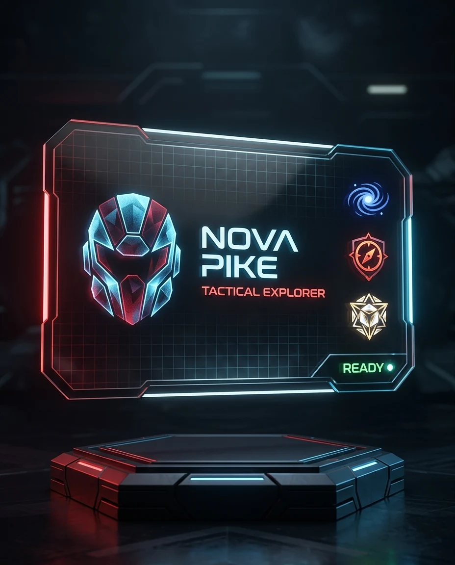
Gamer Profile Card made with transparent glass profile card prompts and Nano Banana 2

Prompt 10 · T1-P10

Gamer Profile Card

Best for: A player wants an original gaming identity visual with no protected game or console references.

Task: Generate a transparent glass gamer profile card for an original science-fiction identity. Subject: fictional player Nova Pike, a helmet-shaped abstract avatar with no character likeness, role “Tactical Explorer”, three geometric achievement symbols, and status “Ready”. Context: a custom gaming community profile screen. Style: high-contrast smoked glass, angular corners, red and ice-blue edge light, subtle holographic grid, premium esports energy without any existing team language. Composition: one landscape card floating above a dark hexagonal pedestal, camera slightly below center, avatar left, identity center, abstract achievements right. Lighting: red rim from left, ice-blue rim from right, narrow white key on the front, dark atmospheric background. Constraints: no game title, no console logo, no copyrighted character, no weapon, no real team crest, no extra card, no watermark, and no tiny illegible statistics. Output: one 4:5 portrait image at 1024×1280 with the entire card and pedestal visible.

Expected result: A smoked red-blue gamer card above a hexagonal pedestal.

Adjust: edge=red/ice blue | support=hex pedestal | mood=competitive | ratio=4:5

Failure correction: If protected character motifs appear, add “replace all figurative symbols with plain circles, triangles, and hexagons.”

Gamer Profile Card | A player wants an original gaming identity visual with no protected game or console references. | T1-P10 | Check card outline, type zone, refraction, and brand safety.
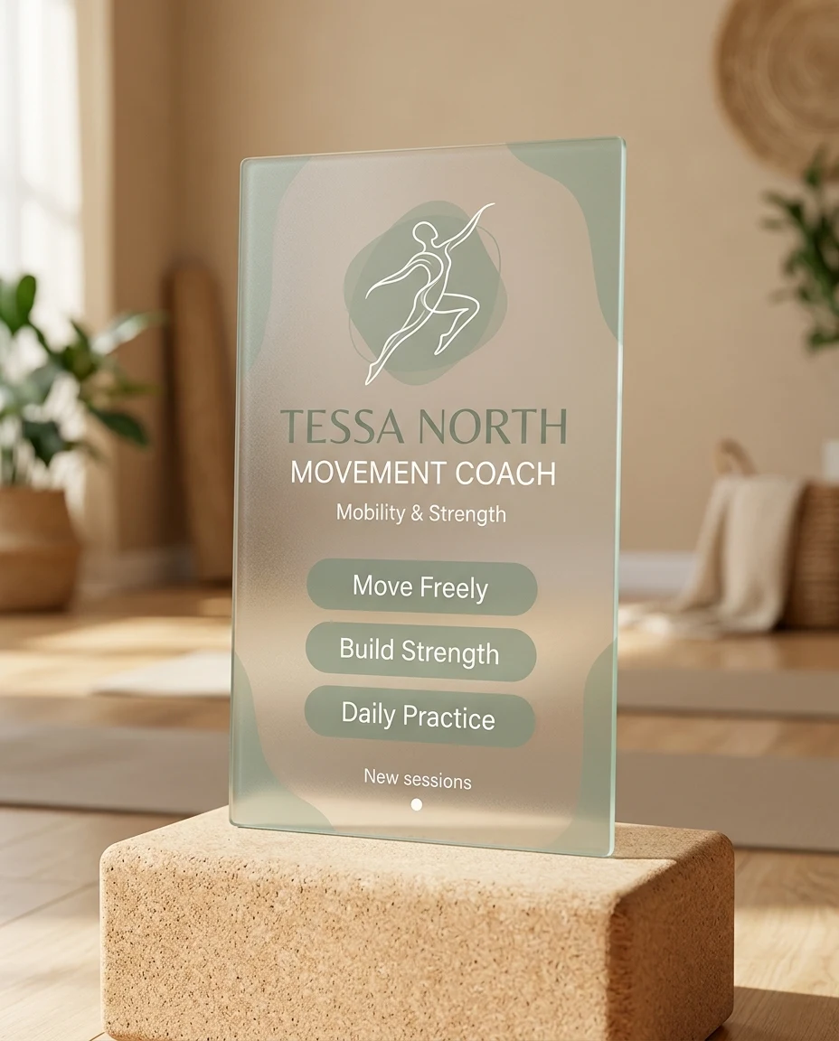
Fitness Coach Card made with transparent glass profile card prompts and Nano Banana 2

Prompt 11 · T1-P11

Fitness Coach Card

Best for: A fictional coach needs a clean service card for a wellness landing page.

Task: Create a transparent glass movement coach profile card. Subject: fictional coach Tessa North, an abstract motion-line avatar, specialty “Mobility & Strength”, exactly three service chips reading “Move Freely”, “Build Strength”, and “Daily Practice”, plus a small booking status “New sessions”. Context: a calm general-fitness studio website, not a transformation or health advertisement. Style: clear frosted glass with sage tint, warm sand background, restrained organic curves, modern wellness editorial design. Composition: one tall card leaning against a pale cork yoga block, front-facing enough to read, avatar at top, the three exact service chips stacked in the middle, booking status at bottom. Lighting: soft late-afternoon window light, warm bounce from the floor, gentle sage rim, no dramatic contrast. Constraints: no words about joints, health, therapy, treatment, recovery, pain, medicine, or rehabilitation; no medical symbol, real gym brand, body-before-after imagery, medical claim, exaggerated physique, extra card, watermark, hard glare, or cropped block. Output: one 1024×1280 4:5 portrait image with natural material texture and only the three neutral movement services.

Expected result: A sage coach card leaning against a cork yoga block.

Adjust: tint=sage | support=cork block | lighting=soft afternoon | ratio=4:5

Failure correction: If the scene turns into a gym advertisement, add “remove exercise equipment and show only the card, cork block, and warm neutral studio.”

Fitness Coach Card | A fictional coach needs a clean service card for a wellness landing page. | T1-P11 | Check card outline, type zone, refraction, and brand safety.
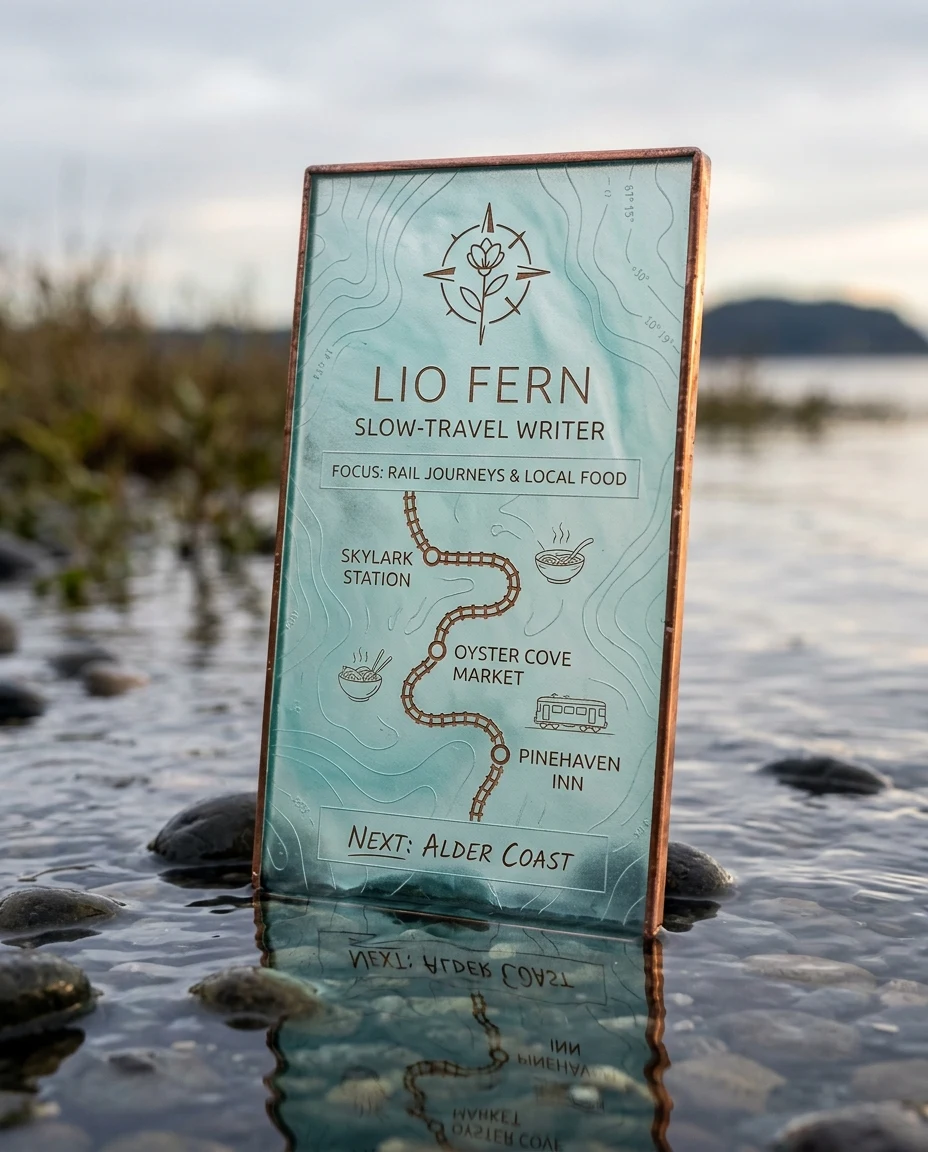
Travel Creator Card made with transparent glass profile card prompts and Nano Banana 2

Prompt 12 · T1-P12

Travel Creator Card

Best for: A travel storyteller wants a route-profile card without a real destination brand.

Task: Generate a transparent glass travel creator profile card. Subject: fictional slow-travel writer Lio Fern, a simple compass-flower avatar, focus “Rail Journeys & Local Food”, three abstract route points, and a short note “Next: Alder Coast”. Context: an editorial travel journal cover using only invented place names. Style: translucent sea-glass material, turquoise tint, copper edge, subtle contour-line pattern, refined field-journal aesthetic. Composition: one vertical card standing in shallow water over smooth dark stones, viewed at a low three-quarter angle; identity at top, route line through the middle, note at the bottom. Lighting: soft overcast daylight, copper sunset reflection on one edge, clean turquoise refraction through the water. Constraints: no airline logo, no real map, no famous landmark, no passport, no duplicated route point, no extra card, no watermark, and keep water below the text area. Output: one 4:5 portrait image at 1024×1280 with the complete sea-glass card sharply defined.

Expected result: A turquoise sea-glass travel card among dark shoreline stones.

Adjust: material=sea glass | edge=copper | setting=shallow water | ratio=4:5

Failure correction: If a real map appears, add “use one abstract curved line and three unlabeled circular points only.”

Travel Creator Card | A travel storyteller wants a route-profile card without a real destination brand. | T1-P12 | Check card outline, type zone, refraction, and brand safety.
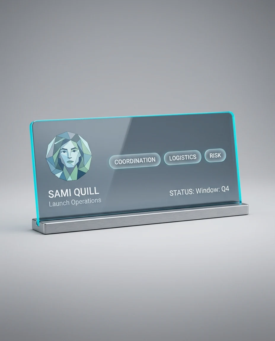
Product Launch Team Card made with transparent glass profile card prompts and Nano Banana 2

Prompt 13 · T1-P13

Product Launch Team Card

Best for: A fictional software team needs a coordinated member-profile card for a launch page.

Task: Design a transparent glass product-launch team member card. Subject: fictional operations lead Sami Quill, a geometric avatar, role “Launch Operations”, exactly three responsibility chips reading “Coordination”, “Logistics”, and “Risk”, plus status “Window: Q4”. Context: a standalone fictional product-launch team profile with no software interface. Style: enterprise glassmorphism, clear slate acrylic, cyan edge, simple open spacing, confident but understated technology aesthetic. Composition: one unmistakably wide landscape card, width about eighty-five percent of the 4:5 canvas and height about forty percent, inserted horizontally into a slim brushed-aluminum base; avatar and role left, the three chips centered, status right. Lighting: neutral studio key, cyan back rim, plain soft-gray gradient background, subtle grounding shadow. Constraints: no product name, company logo, dashboard, wireframe, chart, grid pattern, app panel, copied screen, stock ticker, extra card, watermark, duplicated chip, vertical card, or text outside the card. Output: one 1024×1280 4:5 portrait image containing a clearly horizontal single profile card and its complete metal base.

Expected result: A slate-cyan team card seated in a brushed metal base.

Adjust: tint=slate | edge=cyan | support=metal base | ratio=4:5

Failure correction: If the layout becomes a dashboard, add “keep one profile card with exactly three small responsibility chips and no charts.”

Product Launch Team Card | A fictional software team needs a coordinated member-profile card for a launch page. | T1-P13 | Check card outline, type zone, refraction, and brand safety.
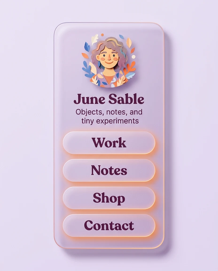
Link-in-Bio Card made with transparent glass profile card prompts and Nano Banana 2

Prompt 14 · T1-P14

Link-in-Bio Card

Best for: An independent maker wants one compact destination card instead of a platform-branded link page.

Task: Create a transparent glass link-in-bio profile card. Subject: fictional maker June Sable, a cut-paper avatar, one-line description “Objects, notes, and tiny experiments”, and four large destination labels: Work, Notes, Shop, Contact. Context: a mobile-first personal landing page with an original navigation system. Style: soft lilac glassmorphism, layered paper-cut shapes, plum type, warm orange edge glow, cheerful independent-publisher aesthetic. Composition: one tall rounded card centered upright against a pale lavender background; avatar and description at top, four evenly spaced destination buttons below, no surrounding phone mockup. Lighting: diffuse frontal light, warm orange rim from lower right, soft shadow directly behind the card. Constraints: no real link service name, no social icons, no QR code, no extra links, no extra card, no watermark, no overlapping buttons, and keep all labels large. Output: one 4:5 portrait image at 1024×1280 with a complete mobile-friendly card and distinct lilac-orange palette.

Expected result: A lilac link card with four large original destination buttons.

Adjust: tint=lilac | accent=orange | buttons=4 | ratio=4:5

Failure correction: If extra buttons appear, add “show exactly four rounded buttons labeled Work, Notes, Shop, Contact in that order.”

Link-in-Bio Card | An independent maker wants one compact destination card instead of a platform-branded link page. | T1-P14 | Check card outline, type zone, refraction, and brand safety.

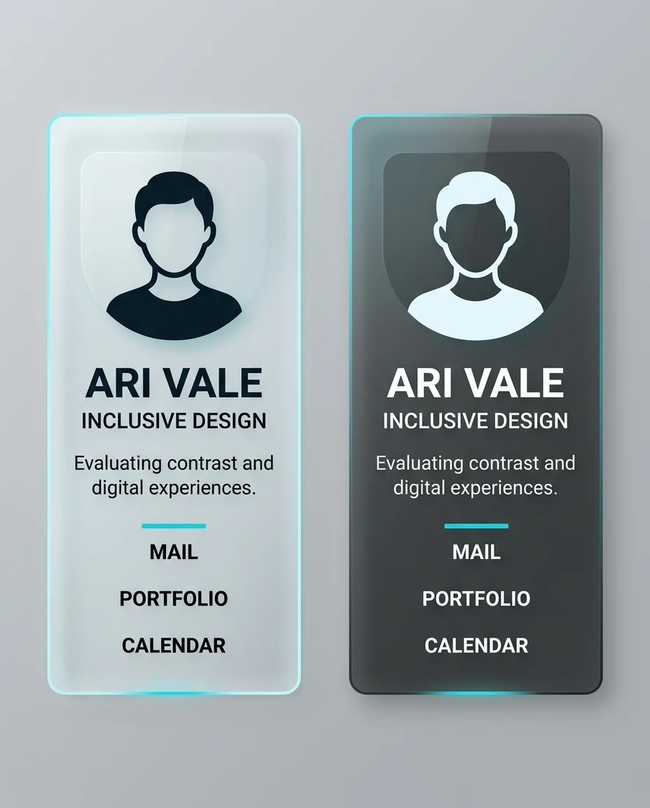
Accessible Light and Dark Card Pair made with transparent glass profile card prompts and Nano Banana 2

Prompt 15 · T1-P15

Accessible Light and Dark Card Pair

Best for: A designer needs a visual accessibility comparison while keeping one logical result image.

Task: Generate one accessibility comparison image showing light and dark versions of the same transparent glass profile card. Subject: fictional accessibility consultant Ari Vale, a simple high-contrast avatar, role “Inclusive Design”, one short bio line, and exactly three generic contact labels reading “Mail”, “Portfolio”, and “Calendar”. Context: a design-system documentation example for evaluating contrast and glare. Style: precise professional glassmorphism, WCAG-minded visual hierarchy, one cool-white card and one charcoal card with the same cyan accent and identical structure. Composition: exactly two tall cards in one horizontal row within the 4:5 image, equal size and spacing, straight-on view, light version on the left and dark version on the right, with empty background above and below; never use a grid. Lighting: broad even studio light, restrained cyan rim, no bokeh, no specular highlight over any type. Constraints: show exactly one light card and exactly one dark card, no third or fourth card, no 2×2 arrangement, no repeated row, no real brand or platform name, no social-network label, no logo, no certification mark, no accessibility claim score, no color-only status cue, no low-contrast gray text, no duplicated fields, no watermark, and keep both full card outlines visible. Output: one 1024×1280 portrait comparison image containing only the two matching cards with readable high-contrast type.

Expected result: A controlled side-by-side light/dark card comparison with consistent content.

Adjust: variants=light/dark | accent=cyan | view=straight | ratio=4:5

Failure correction: If layouts differ, add “duplicate the exact same avatar position, labels, spacing, and card dimensions; change only surface tint and text polarity.”

Accessible Light and Dark Card Pair | A designer needs a visual accessibility comparison while keeping one logical result image. | T1-P15 | Check card outline, type zone, refraction, and brand safety.

Common failure fixes

Transparent profile card prompt FAQ

What makes a transparent profile card readable?

Use a lightly frosted text zone, strong type contrast, short labels, generous spacing, and edge lighting that stays outside the copy area. Fully clear glass often loses text against a detailed background.

Which model are these prompts tested with?

These transparent glass profile card prompts were produced and checked with Nano Banana 2, whose API model identifier is gemini-3.1-flash-image. The evidence record ties every visible prompt to its exact generated asset.

Can I use a real social network layout?

Use an original hierarchy instead. Real logos, familiar navigation patterns, and copied interface details create brand and IP risk while making the result less reusable.

How do I fix distorted interface text?

Request fewer fields, shorten every label, increase the frosted area behind copy, and regenerate. If exact wording is business-critical, add final typography in a design tool after generation.

Is glassmorphism accessible?

It can be, but transparency alone does not guarantee accessibility. Maintain strong contrast, avoid glare through text, provide non-color cues, and test both light and dark contexts.

What aspect ratio works best?

A 4:5 portrait frame suits profile-card showcases because it leaves room for the complete card and its environment on mobile. Use 1:1 for a compact gallery and 16:9 for a wide hero.

Continue building your prompt workflow